On June 13, 2025, the new building of St. Elisabeth Hospital in Eutin was ceremonially opened and officially put into operation. With one of Germany’s largest palliative care units and one of the state’s largest geriatric wards, the hospital is setting new standards in the care of older and seriously ill patients.
Despite its considerable size, the hospital reports that it was not difficult to recruit the necessary specialized staff—on the contrary: entire teams from nearby hospitals made a conscious decision to transfer here. The high number of applicants is attributed, among other things, to the special atmosphere of the new building, which was developed through an intensive, needs-based color design process.
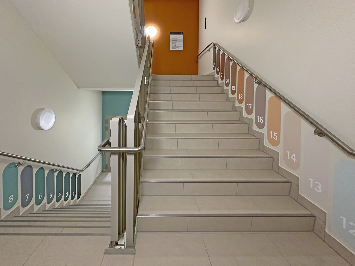
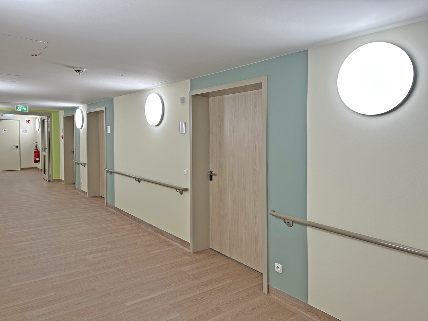
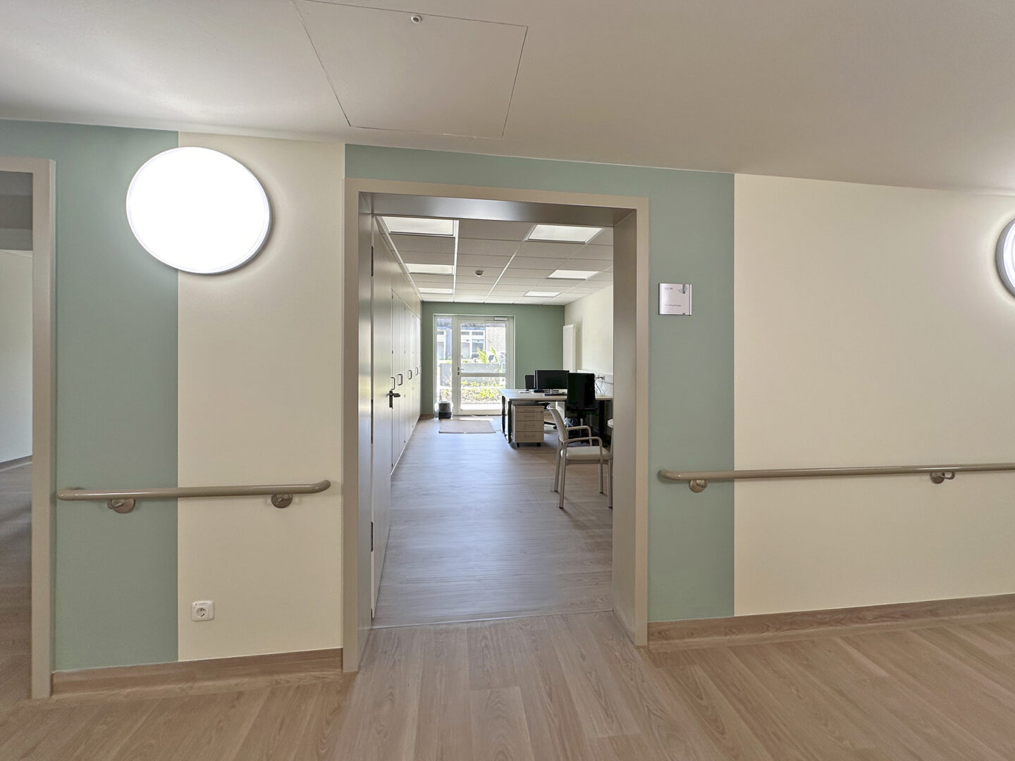
Through a participatory process, the Institute for Evidence-Based Color Psychology, in collaboration with staff from all professional groups, developed a needs-based color concept tailored to the specific requirements of palliative and geriatric care. The goal was to create an environment that conveys a sense of appreciation, security, and renewed confidence in life in equal measure.
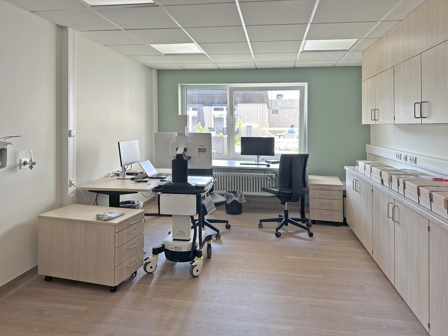
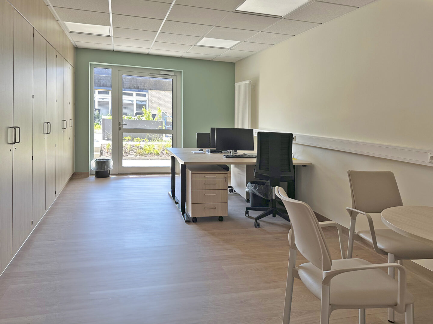
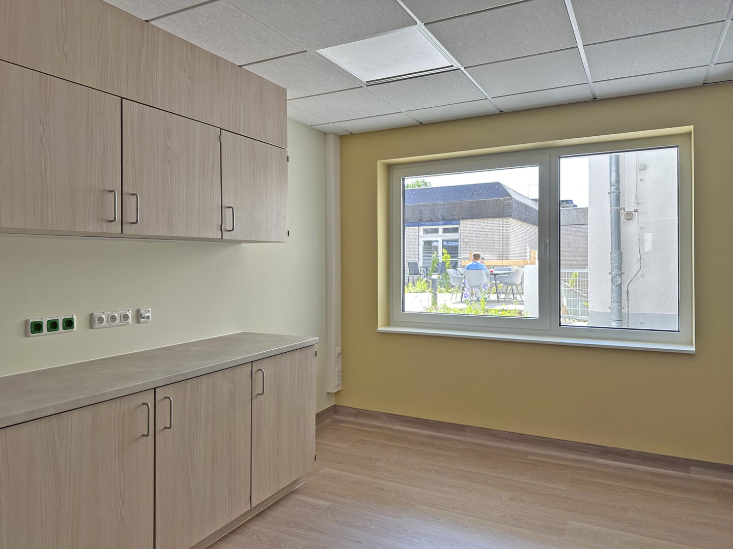
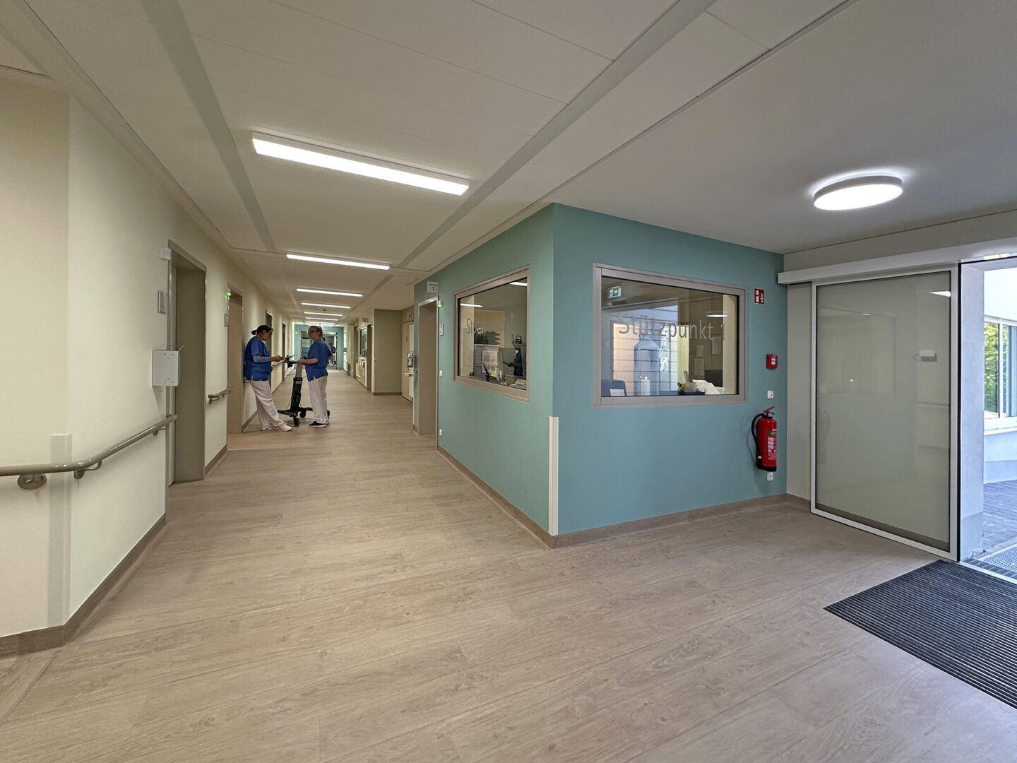
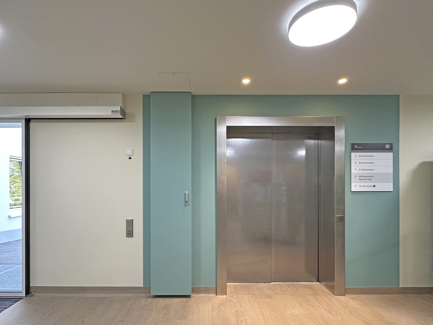
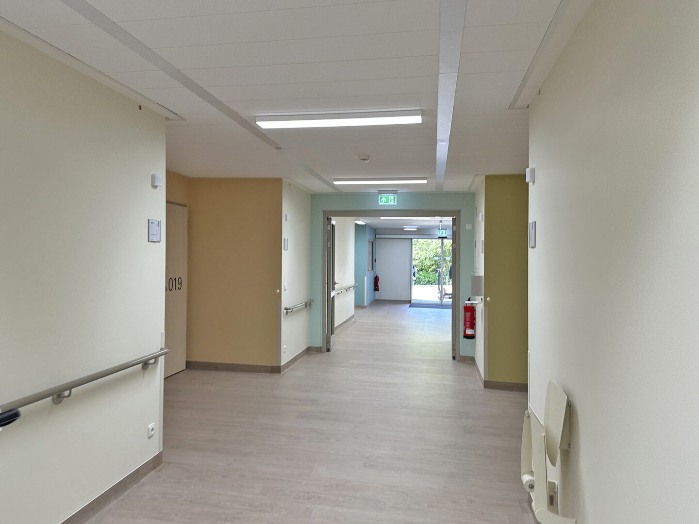
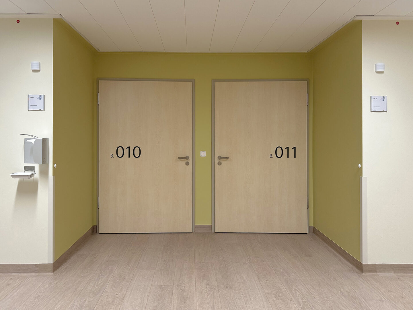
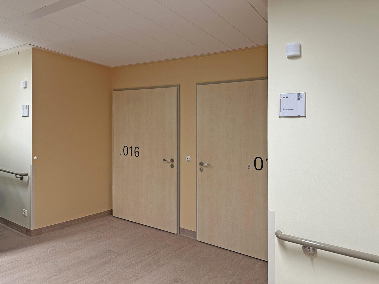
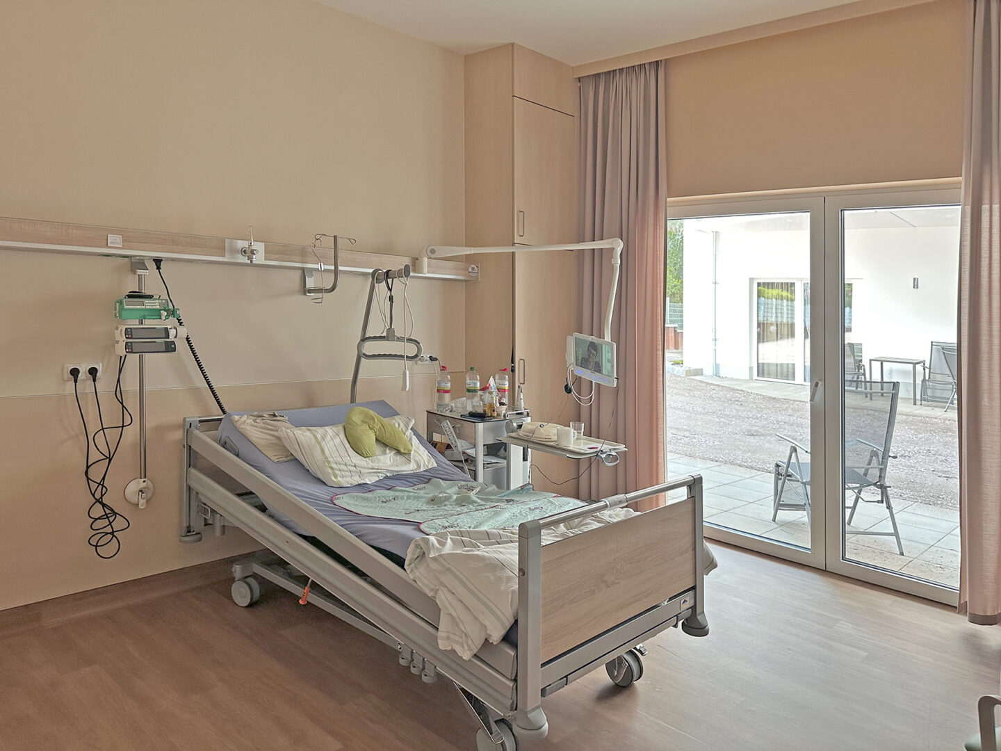
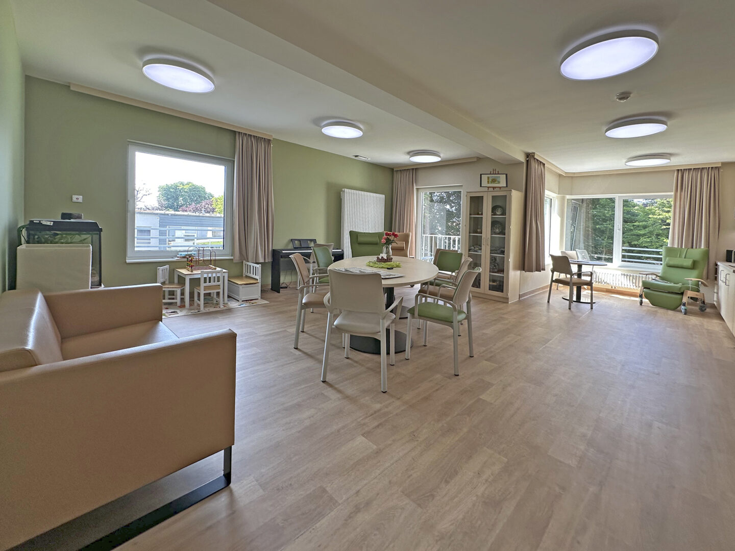
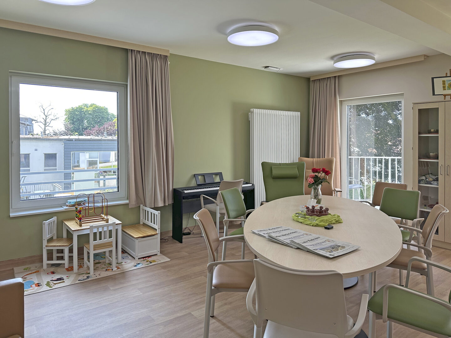
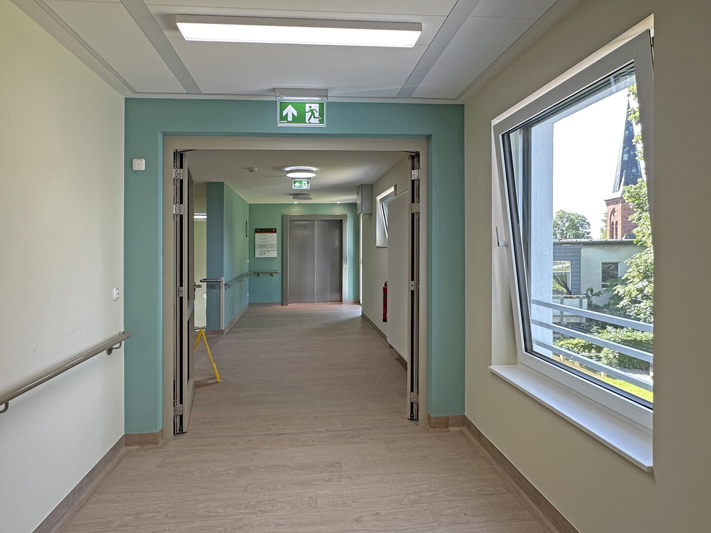
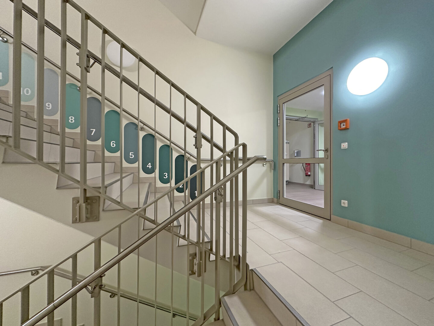
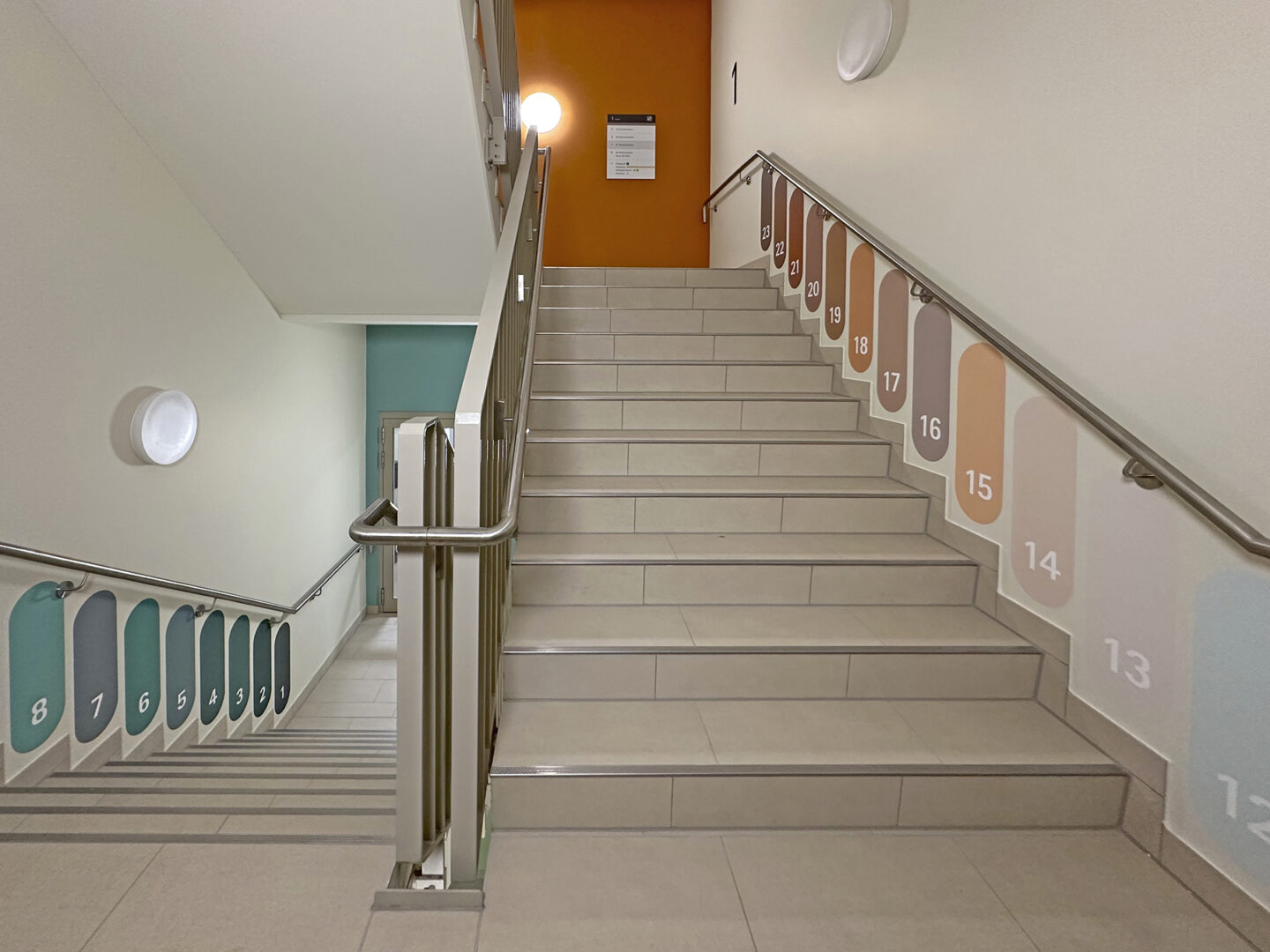
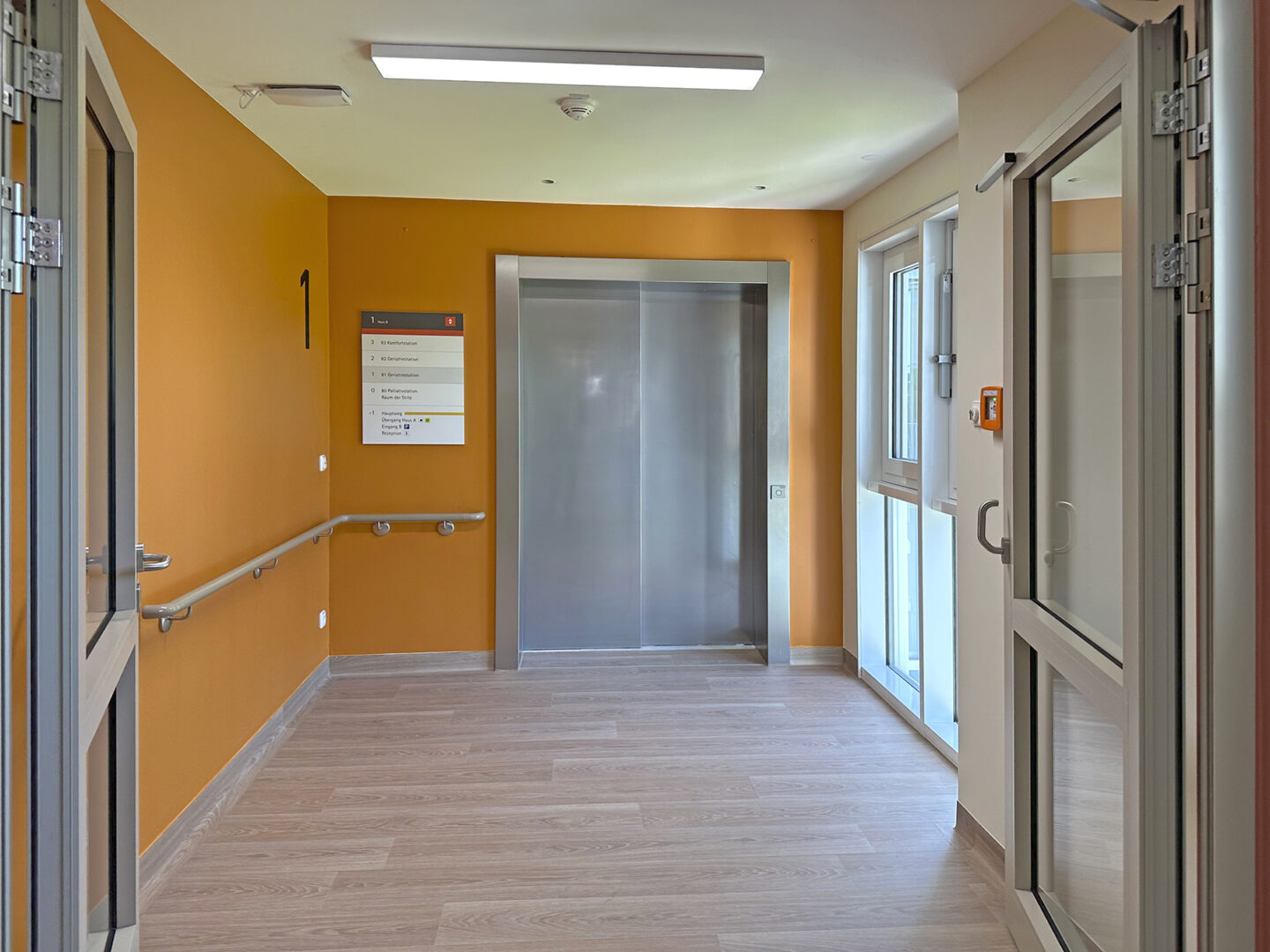
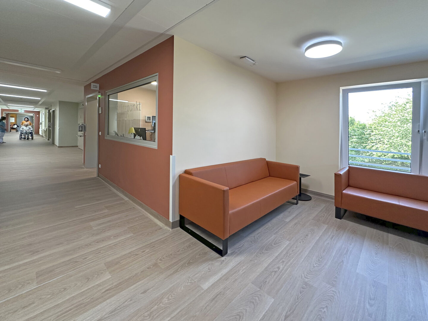
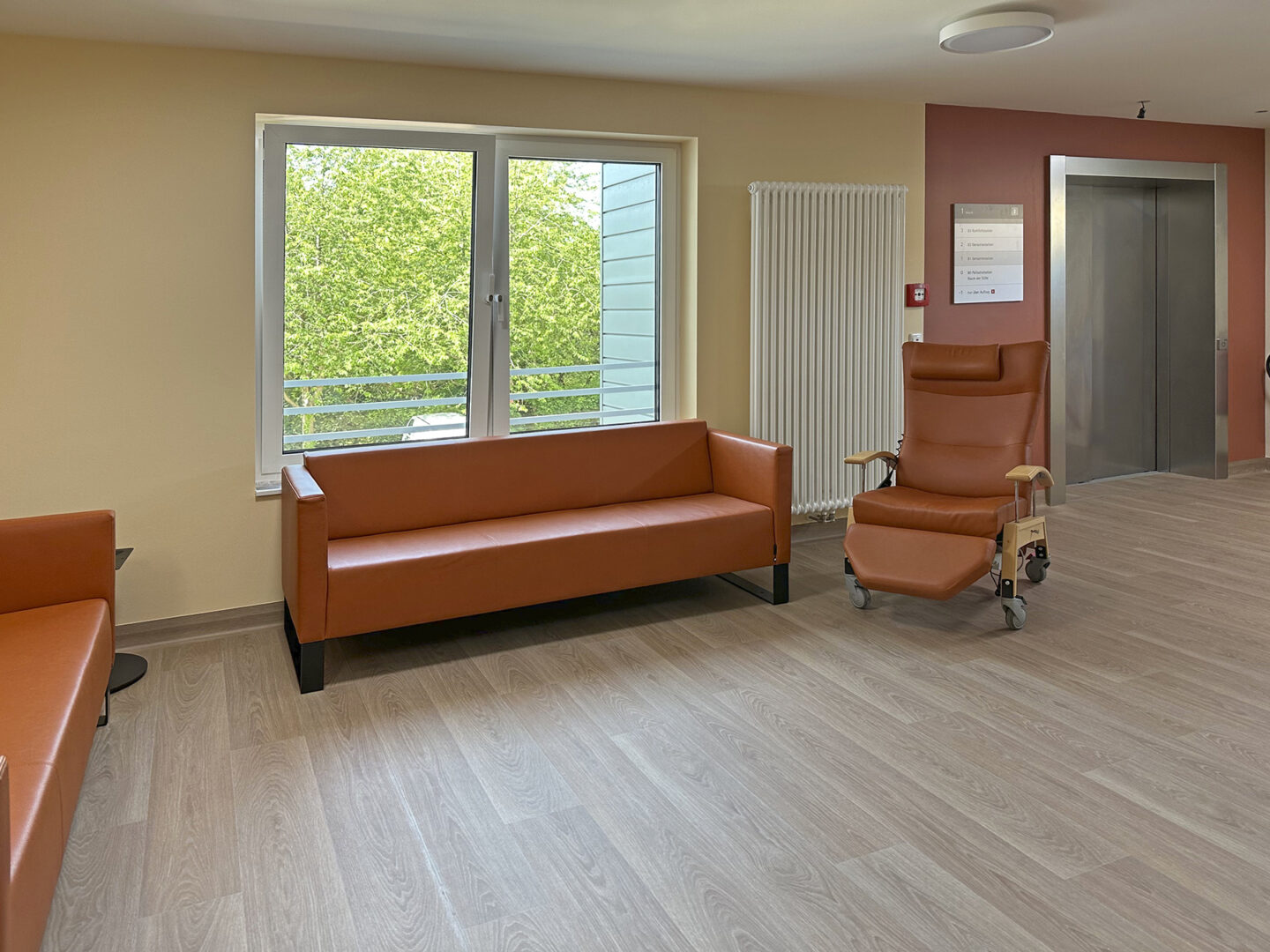
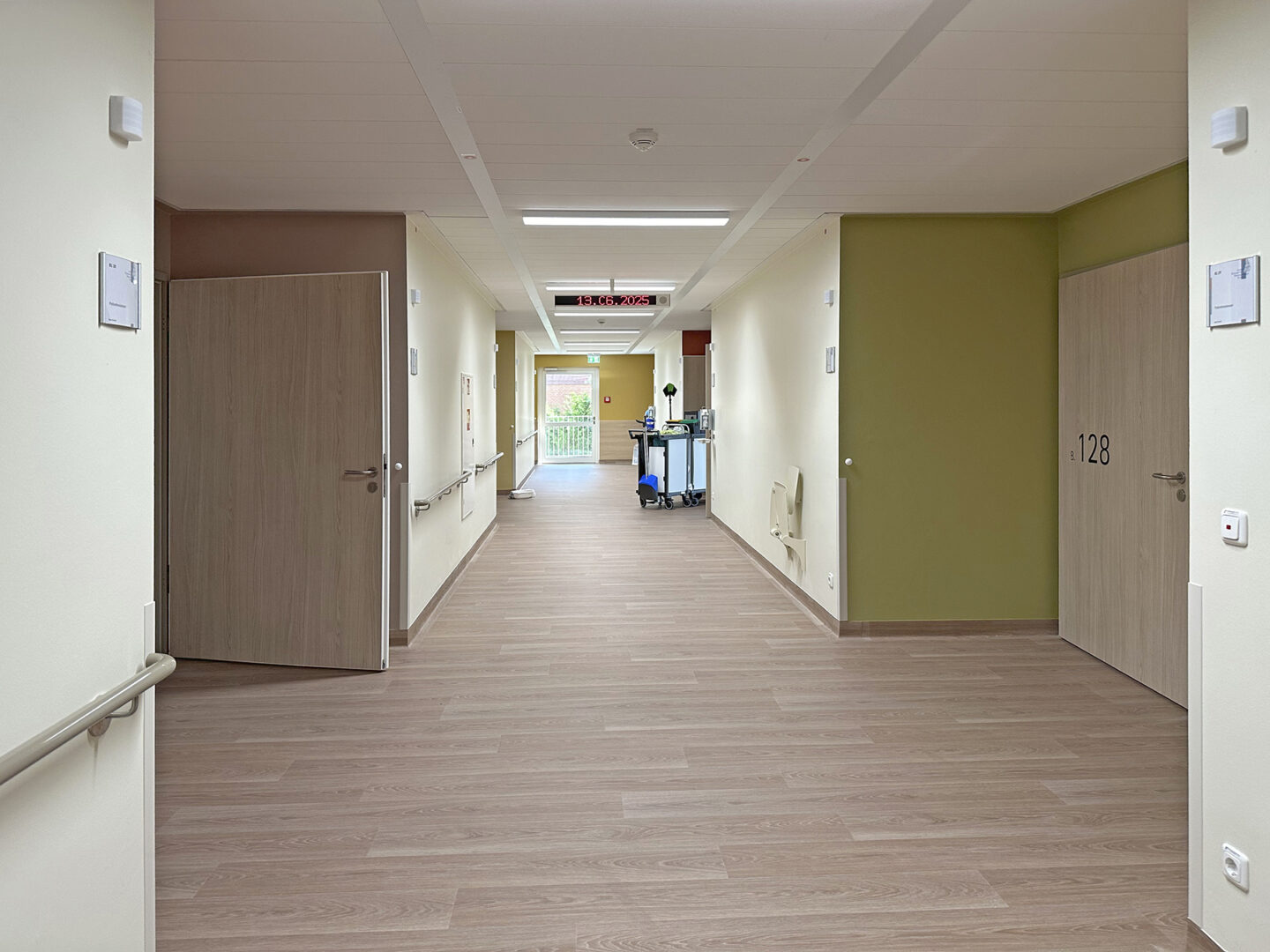
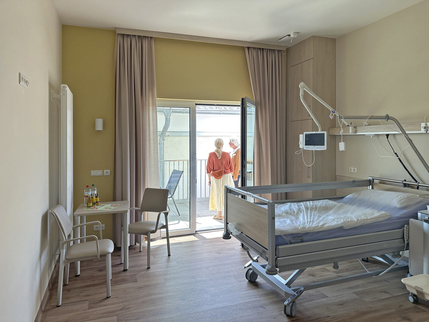
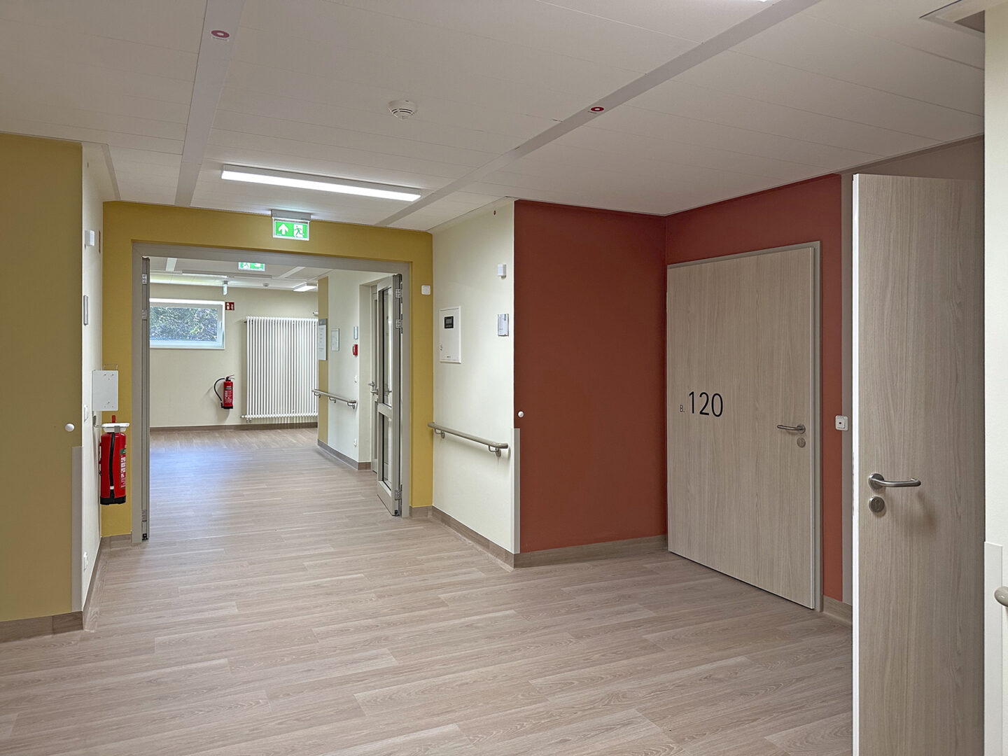
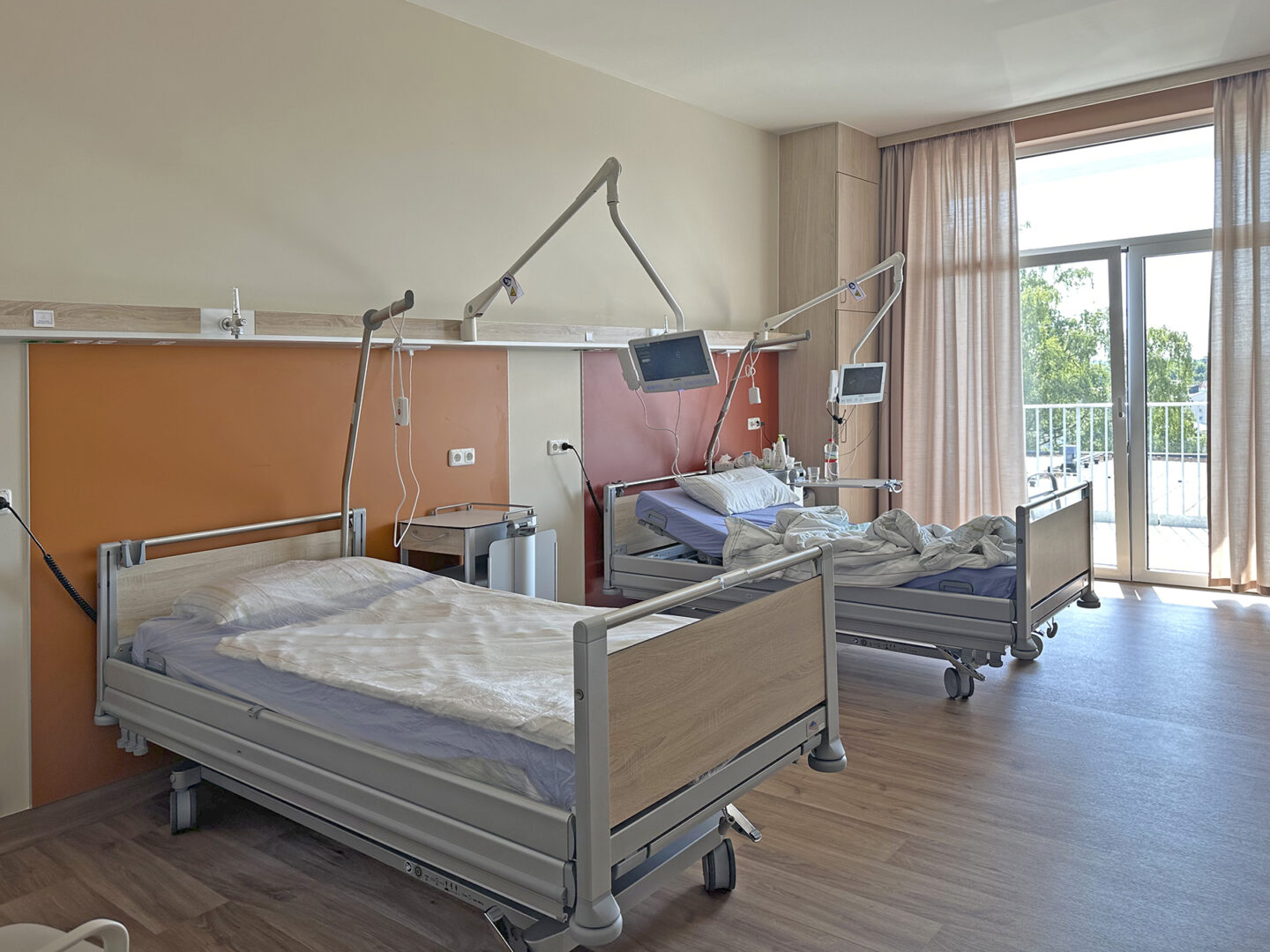
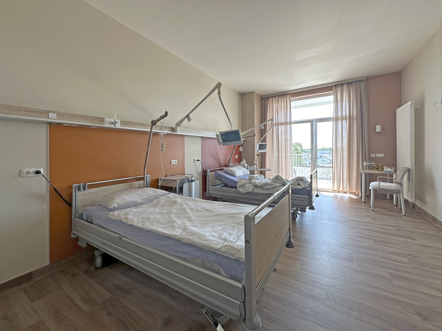
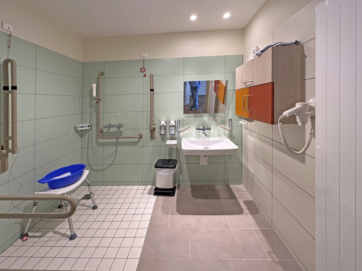
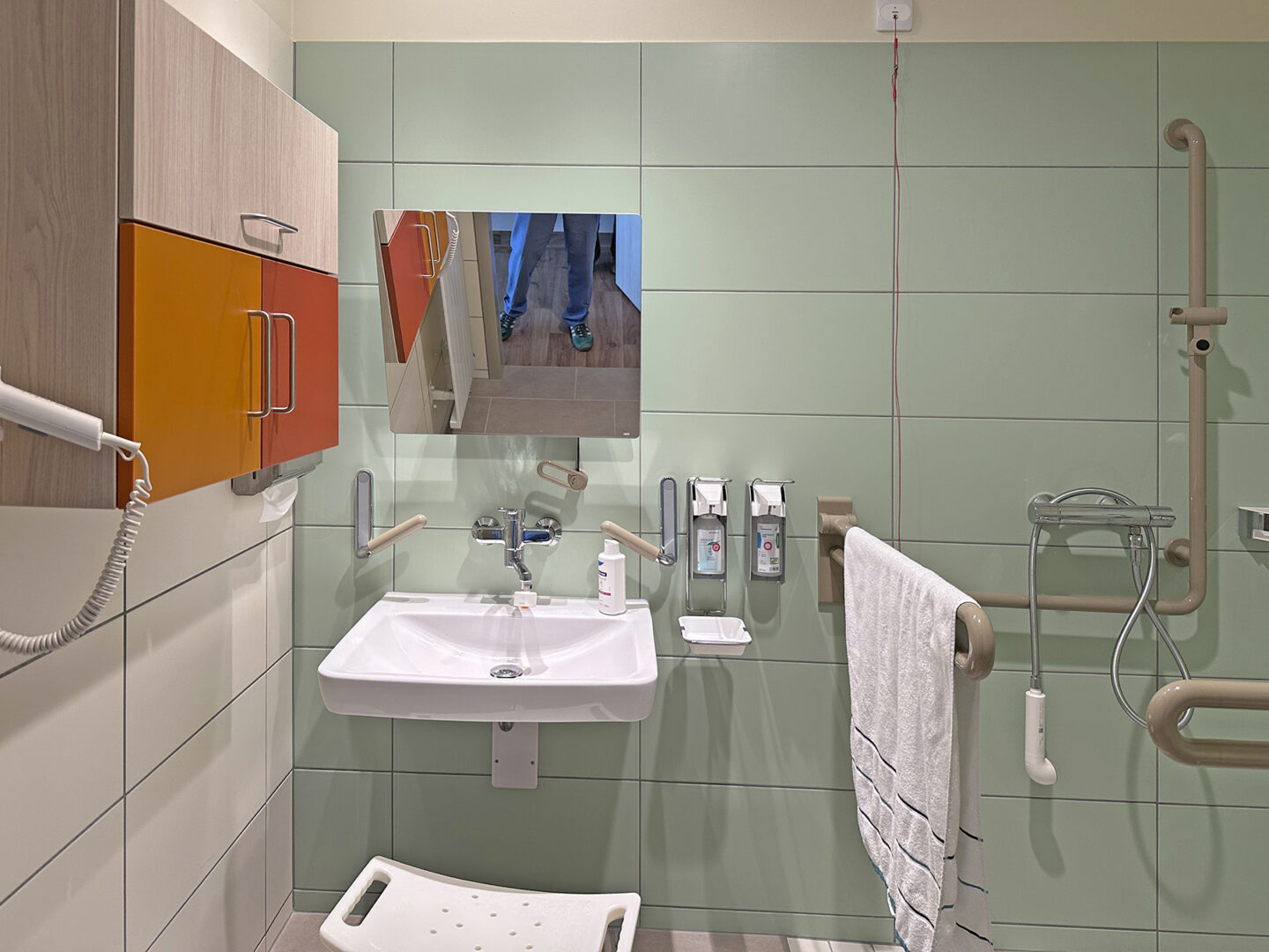
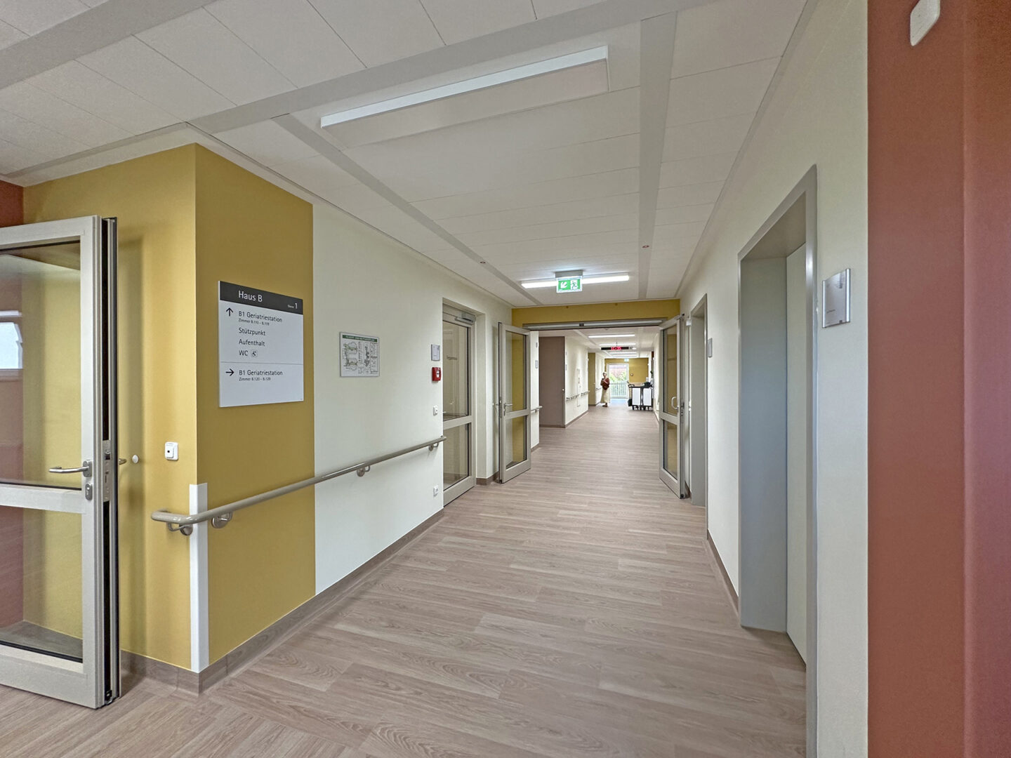
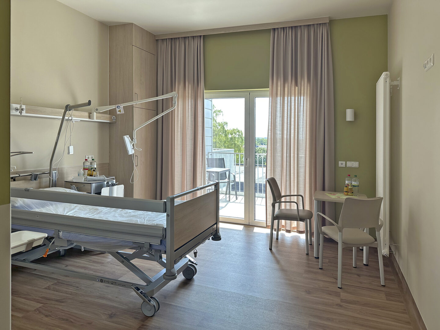
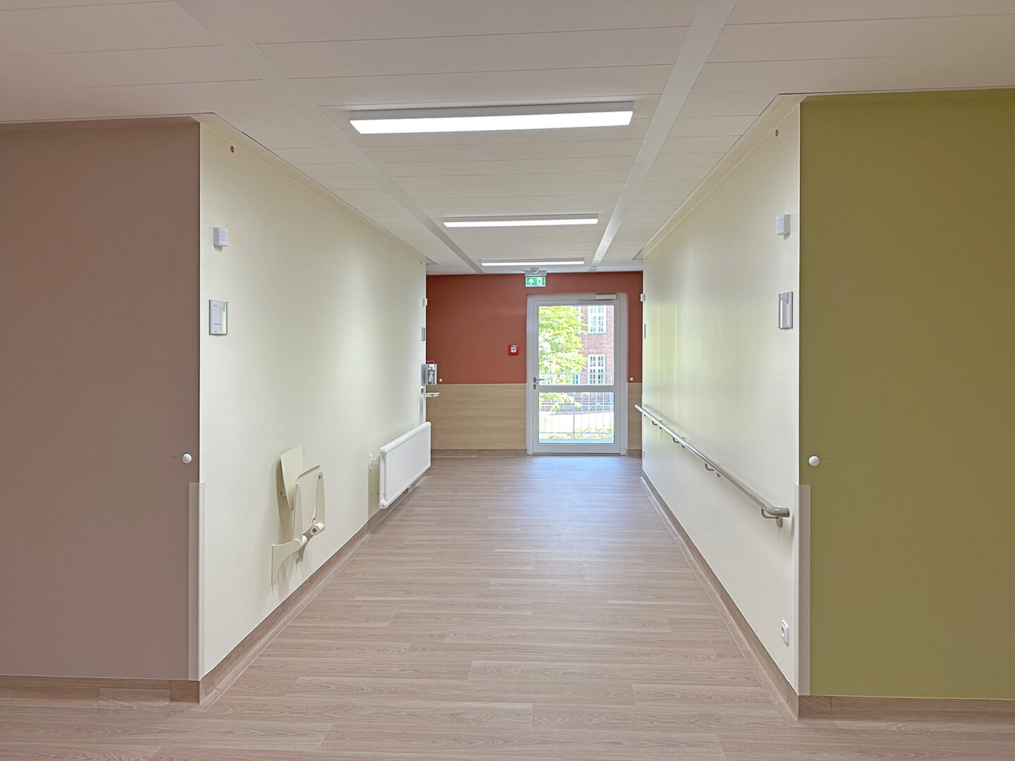
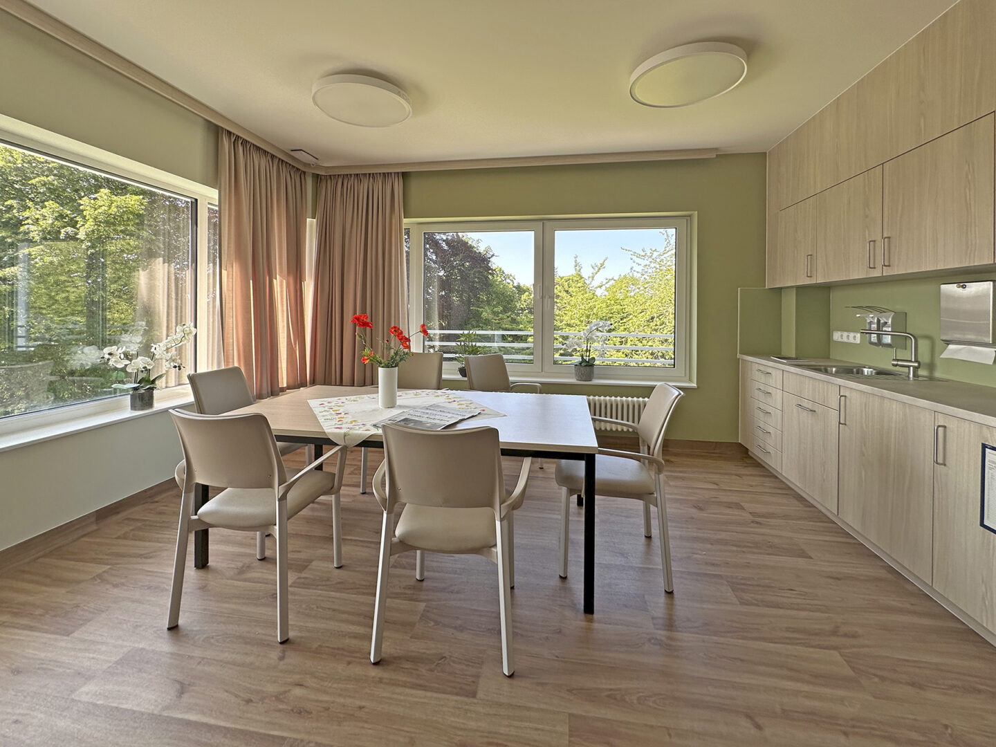
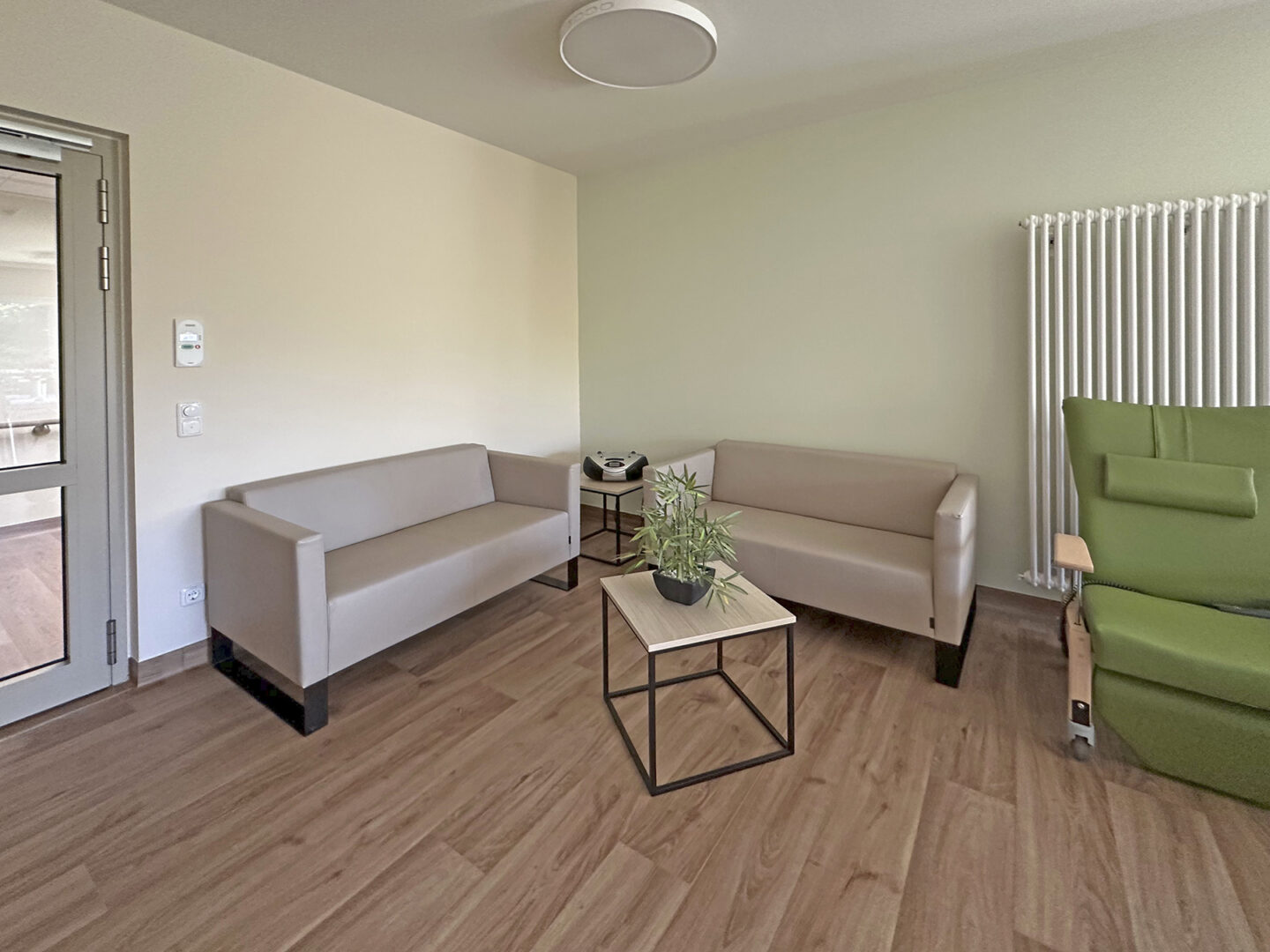
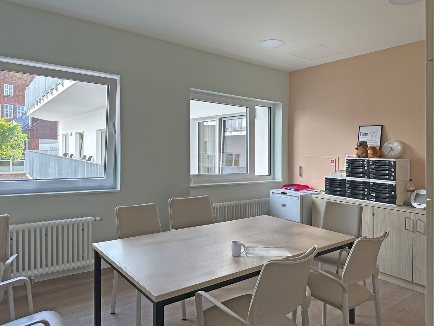
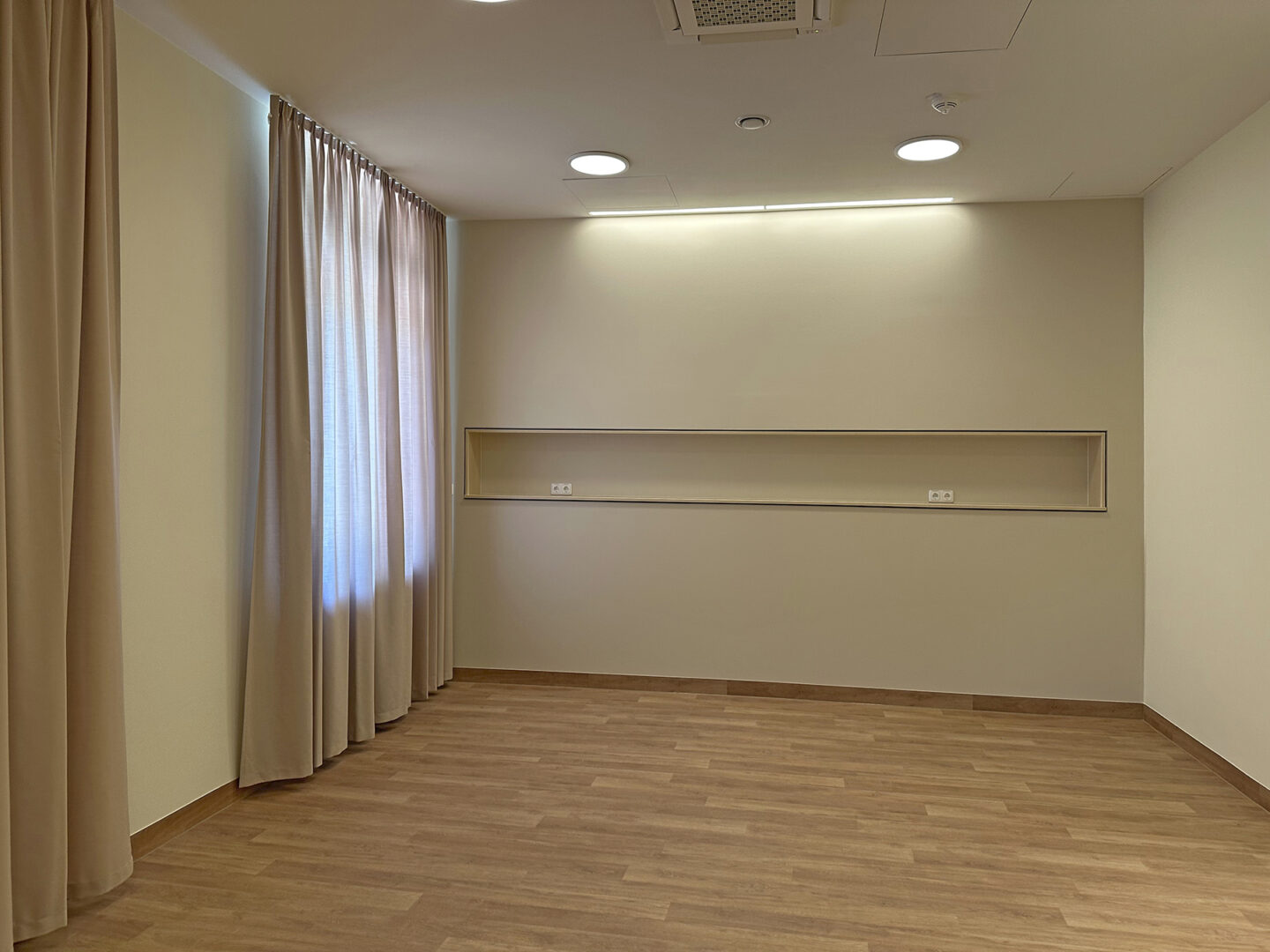
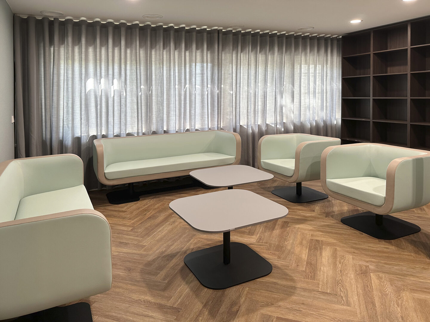
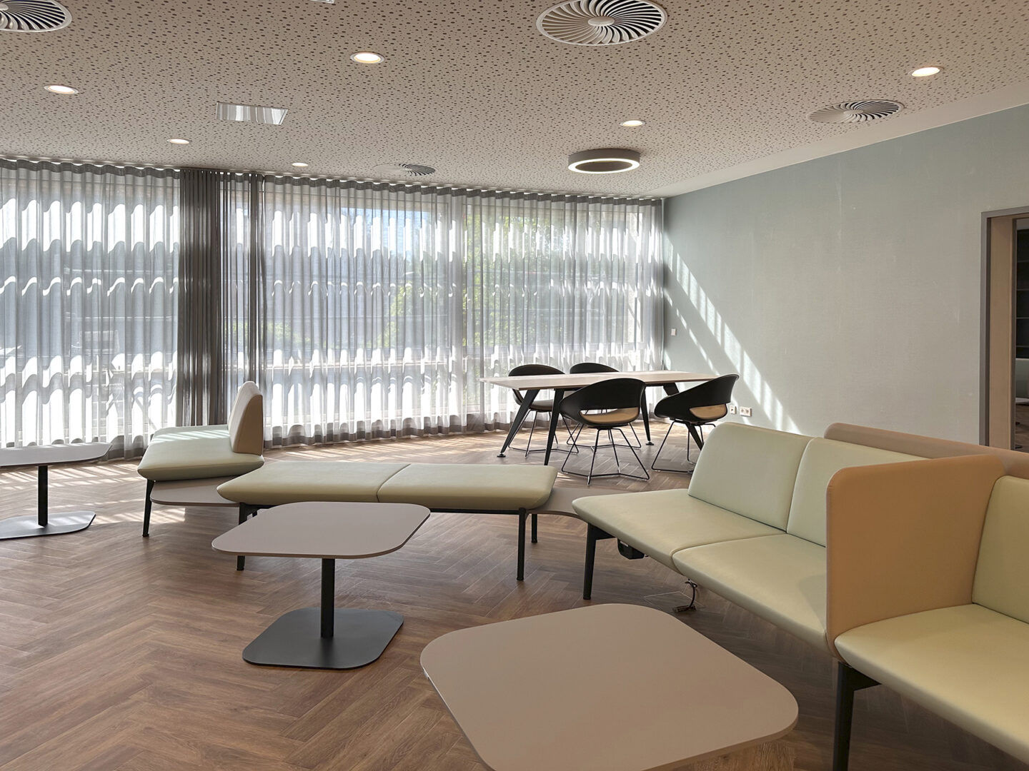
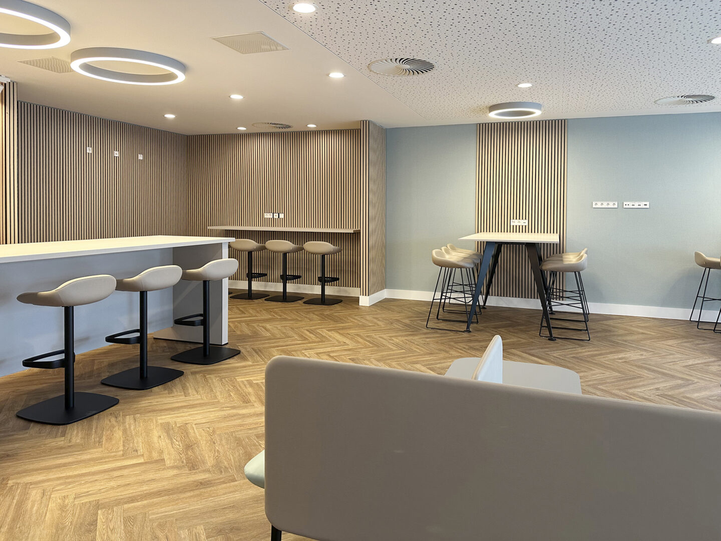
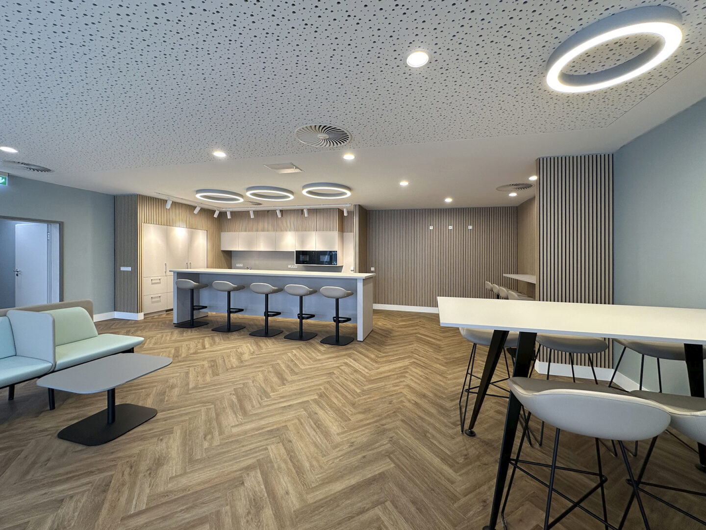
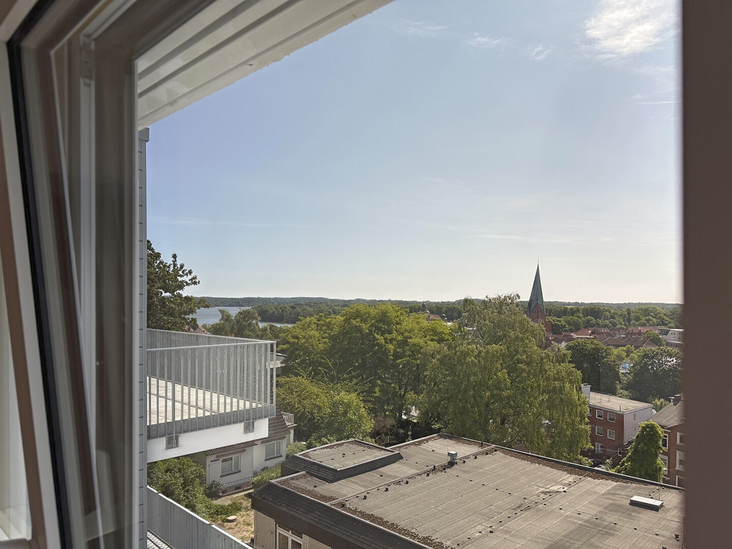
Yet the new building is far more than just an architectural project—it follows a holistic concept that closely integrates interior design with therapeutic interventions. Balconies offer patients the opportunity to retreat into the fresh air. Therapeutic gardens with multisensory elements —such as fragrant plants, tactile surfaces, and acoustically designed areas—enable healing experiences in nature that engage all the senses. This is complemented by targeted treatments such as aromatherapy or other non-pharmacological forms of therapy based on the latest research.
The color scheme provides a sensory framework into which all elements of the therapeutic concept fit harmoniously. It not only creates a pleasant atmosphere but also activates resources—for example, by specifically stimulating orientation, memory, a sense of calm, or an uplifted mood.
Initial feedback from everyday clinical practice confirms its effectiveness: In geriatrics, older, frail patients are now being discharged home more often than to long-term care facilities—a possible sign that the sensorially stimulating, color-rich environment is providing new strength and hope. The team is also providing initial feedback on the new work environment, ranging from positive to enthusiastic. However, reliable data on this will be provided by the ongoing scientific research at the earliest nine months after the move-in.
Looking back, our institute was commissioned to develop the color concept five years ago—in response to challenges that existed at the time regarding staff well-being and satisfaction, as well as recruitment. These experiences were openly reflected upon and translated into a consistent shift in thinking—resulting today in an environment that is not only beautiful to look at but also has a positive impact on the people who live and work there.
The new building, designed in the “white modernism” style and connected to the existing structure, surprises visitors inside with a warm color palette inspired by North German architecture. Light, earthy, and natural tones—inspired, for example, by the City Palace in Eutin—combine with functional requirements to create an atmosphere that evokes a sense of home rather than a hospital hallway.
This project thus builds a bridge—between tradition and the future, between functional efficiency and a human scale. St. Elisabeth Hospital is sending a powerful message: that architecture, color design, and an interdisciplinary therapeutic concept can achieve more than meets the eye.
Color Design Collaboration: Heike Krauss
Link to the Sankt Elisabeth Hospital Eutin website