By Jennifer Evans / It is wasted potential not to pay attention to the color effect when furnishing a pharmacy. In an interview with PZ, color psychologist Professor Dr. Axel Buether explains how nuances can be used for targeted communication.
PZ: Which colors are suitable for pharmacy furnishings?
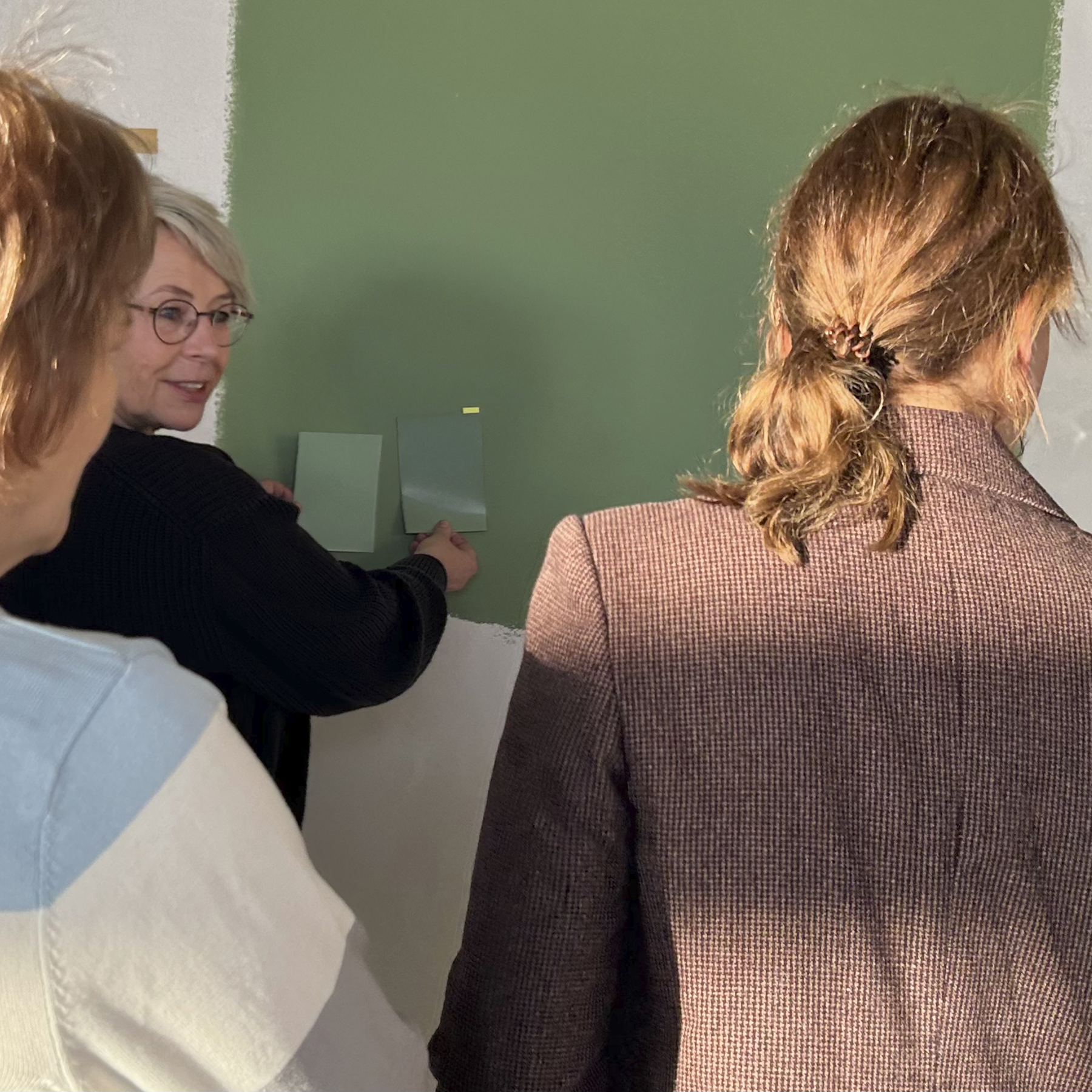
Buether: I always start with an analysis of the people and their needs – never with a nice shade of color. So I take a close look at the location, the customers, the employees and the work processes – almost like an anamnesis. Only when it is clear which atmosphere and which behavior the room should support do I create an impact matrix: Which color nuances promote orientation? Which ones reduce stress? Which ones facilitate consultations or strengthen trust?
An effect is never created by a single color tone, but by the combination, dosage and quality of light.
PZ: What requirements must on-site pharmacies fulfill?
Buether: You have special psychological tasks. Pharmacies must radiate health, trust and freedom from fear and at the same time offer clarity, professionalism and orientation. Added to this is the challenge that their product world itself is extremely colorful and visually loud. To prevent this variety from becoming overwhelming, pharmacies need a calm, neutralizing colour foundation. In this way, they can become a place that not only sells medicines, but also provides security, closeness and trust.
Ideal choice of colors for a modern pharmacy
If you know the needs and requirements of your business, you can act accordingly.
Reduce anxiety, build trust: Customers come with uncertainties, complaints or time pressure. Soft, highly desaturated natural colors are well suited.
Conveying health competence: This is achieved with cool, structuring nuances in combination with warm accents.
Let products have an effect, don’t drown them out: calm, harmonious background colors are ideal for shelves and presentations.
Reflecting brand and identity: A pharmacy is always also a business card for an understanding of health. To communicate this, the corporate design, website and real space should match. People expect the brand’s visual message to be confirmed in real space.
Make orientation easier: Discreetly color-coded functional zones help you find your way.
You can find the entire interview on the Pharmazeutische Zeitung (PZ) website