Hardly any other color touches people as directly as blue. On a summer day, we look up at the sky and feel a sense of vastness. We stand by the sea and feel freedom, freshness, or a sense of longing. We wear dark blue when we want to appear trustworthy, choose turquoise for spaces designed to promote relaxation, or ultramarine for products and works of art that radiate depth and uniqueness.
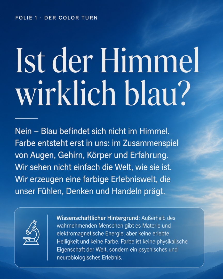
But is the sky really blue? Does the sea have a color that exists in the world independently of us?
No. Color is not a physical property of the sky, the sea, or an object. It arises only in our perception—through the interaction of our eyes, brain, body, memory, and experience.
This insight forms the starting point for a fundamental shift in perspective, which I call the “Color Turn ”: We no longer explain color primarily in terms of the physical conditions of the environment, but rather in terms of human experience.
Where is color if it isn’t in things?
Outside the perceiving human being, there is matter and electromagnetic energy. It is only our visual system that uses these to create brightness, contrast, spatial depth, and color. Sky blue, aquamarine, cobalt, and ultramarine do not arise outside of us, but rather in our minds.
The same is true of music. Outside the listener, there are vibrations and changes in pressure. They only become a melody within our experience. Language, too, does not exist in the air as a finished meaning. It arises in the conscious mind that understands it.
If the sensory organs or brain functions necessary for this are damaged, the corresponding experience disappears. Then, for that person, there is no longer any color, sound, or intelligible language.
However, that does not mean that color is merely imaginary or unreal. On the contrary: the perceived world is the primary reality of our lives.
When a person feels afraid of a dark basement room, that fear is physically and psychologically real—even if the basement is objectively harmless. Just as real is the sense of openness, confidence, and drive that a blue summer sky can evoke in us.
We do not first perceive the world neutrally and then evaluate it. From the very beginning, perception is linked to physical states, feelings, memories, and our readiness to act.
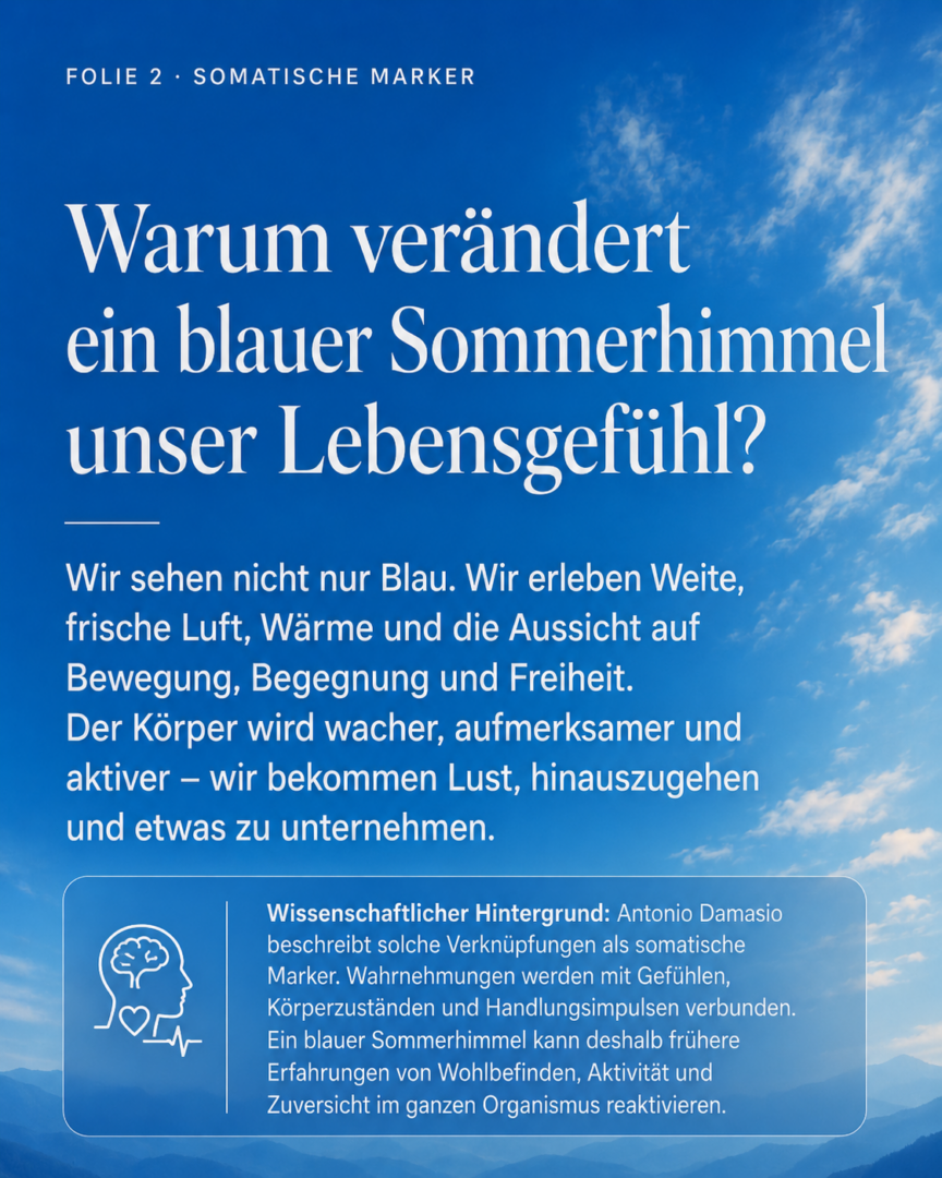
How does a blue summer sky affect our bodies?
A blue sky is much more than just a colored expanse. It evokes a sense of vastness, warmth, fresh air, good weather, and the prospect of activity, encounters, and adventures.
Our bodies adjust to activity and the outside world. We become more alert and attentive. We perk up and want to go out, travel, swim, meet friends, or start something new.
This also alters vegetative and hormonal processes. Serotonergic systems are involved in mood, well-being, and confidence, while dopaminergic systems are involved in motivation, anticipation, and drive. Circulation, respiration, muscle tone, metabolism, and readiness for movement adapt to the current state of mind.
However, it would be too simplistic to attribute these reactions solely to the abstract color blue. The blue summer sky is a multisensory experience. It encompasses temperature, air, sounds, smells, physical activity, and social experiences. The color, however, is its most powerful visual symbol. It encapsulates summer, freedom, vacation, water, movement, and well-being into a sense of life that can be experienced directly.
Why don’t we just see blue—why do we feel it throughout our whole body?
In his theory of somatic markers, neuroscientist and neurologist Antonio Damasio describes how experiences are linked to emotions, physical states, and tendencies to act.
We don’t just store a summer day as abstract information. We don’t merely remember that the sky was blue and the air was warm. Physical sensations are also tied to the experience: the warmth on our skin, the feeling of breathing freely, movement, lightness, encounters, or the joy of anticipation.
If we encounter a similar shade of sky blue later on, this entire pattern of experience can be triggered again. We don’t just see a color then. To some extent, we slip back into the state we associate with it.
This explains why a particular shade of blue can change our mood, our attitude toward a situation, and our willingness to act within a matter of moments.
Color, then, does not simply represent the world. It plays a role in how this world takes shape within us.
Why do the sky and the sea appear blue, even though air and water are transparent?
Up close, air and water usually appear transparent to us. But when viewed as a whole, the sky, streams, rivers, lakes, and oceans become the most expansive blue spaces in our environment.
We perceive the sky as a colorful experience due to the interaction of electromagnetic energy with the Earth’s atmosphere and our sensory system. In the case of water, depth, the substrate, suspended particles, reflections, and spectral absorption all affect the perceived color.
The blue we experience is never the same. It changes depending on the time of day, the season, the weather, the geographical location, the direction of view, the depth of the water, and atmospheric conditions.
A clear morning sky appears a different shade of blue than the dense atmosphere before a thunderstorm. A shallow tropical sea appears turquoise or aquamarine, while a northern ocean appears steel blue, gray-blue, or deep navy blue. In the distance, landscapes appear bluer and less contrasted due to the atmosphere.
That is why blue is not just a color category. It is a whole world of environmental and life experiences.
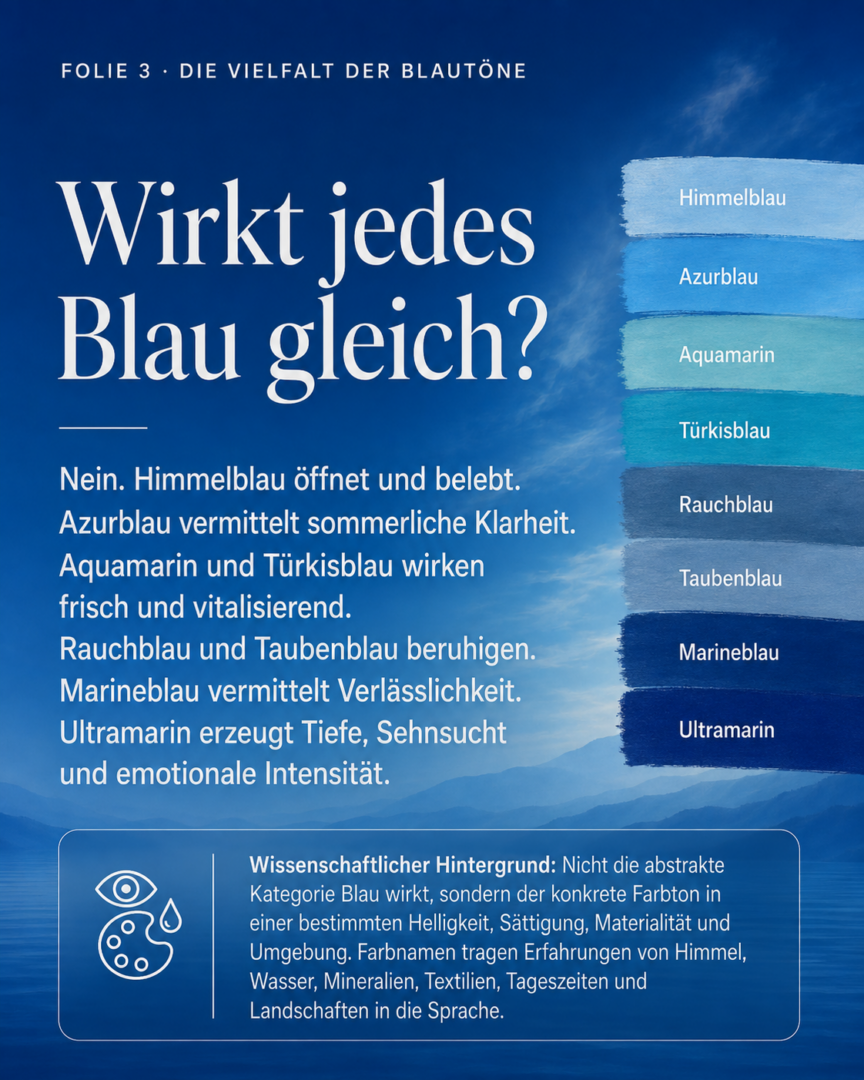
Does every shade of blue have the same effect?
No. The blanket statement “Blue calms” is just as inaccurate as the claim that “Red energizes.”
It is not the abstract category of color that has an effect, but rather the specific shade of blue with its particular brightness, saturation, materiality, surface area, lighting, and surroundings.
Sky blue can convey openness, lightness, and a sense of new beginnings.
Azure blue symbolizes summery clarity and optimism.
We associate aquamarine and turquoise blue with freshness, movement, and renewal.
Smoky blue and dove blue reduce the intensity of visual stimulation and can convey a sense of calm, security, and gentleness.
Cobalt blue has a striking, energetic, and mentally stimulating effect.
Navy blue symbolizes order, competence, and reliability.
Ultramarine evokes depth, longing, and emotional intensity.
Midnight blue evokes a sense of retreat, concentration, and mystery.
A light shade of cyan can have a fresh and invigorating effect. A muted gray-blue can be calming. A deep ultramarine can appear at once focused, solemn, and overwhelming.
Color names, too, are more than just linguistic labels. They evoke experiences of the sky, water, minerals, plants, textiles, times of day, and landscapes. A term like “aquamarine” conjures up a different mental image than “steel blue,” “ice blue,” or “night blue.”
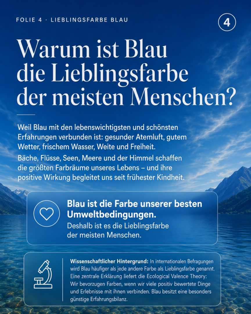
Why is blue most people’s favorite color?
In international surveys, blue is cited as a favorite color more often than any other color. For this to be true, no more than fifty percent of all people need to choose blue. What matters is that, compared to any other single color, blue has the largest group of people who prefer it.
Why is that?
The Ecological Valence Theory offers an important explanation. According to this theory, we often prefer colors to the extent that we view the things and experiences associated with them positively.
Blue has an exceptionally positive connotation. It evokes clean air, good weather, fresh water, clear views, vastness, and safety. Many of these associations are formed as early as childhood and are later reinforced through experiences in nature, travel, images, clothing, spaces, and the media.
Blue is therefore the color that represents our best environmental conditions.
Of course, some people may associate blue with cold, loneliness, storms, drowning, or loss. Yet, when we consider our collective cultural and personal experiences, the positive associations outweigh the negative ones. That is precisely why blue is so widely accepted.
Why do banks, insurance companies, and technology firms use blue so often?
Because color originates in our psyche, it can be used as a means of communication. Brands work not only with surfaces, but also with perceptions, memories, expectations, and physical states.
Banks, insurance companies, technology firms, social media platforms, and political parties often use shades of blue because these colors are associated with competence, reliability, order, and trust.
However, this effect is not based on any fixed, inherent meaning of the color blue. It is reinforced by experience, repetition, and industry conventions. Because we have come to associate reputable institutions with dark and medium shades of blue over the years, we learn to associate this color palette with reliability and professionalism.
This also presents a problem: Blue can come across as familiar, but also as interchangeable. While using the same color as all your competitors reduces risk, it may also cause you to lose your distinctiveness.
Strategic color design, therefore, does not begin with the question of which color generally has a positive effect. What matters most is which specific shade suits a brand’s personality, its offerings, the market, and its target audience—and how it is consistently applied across all touchpoints.
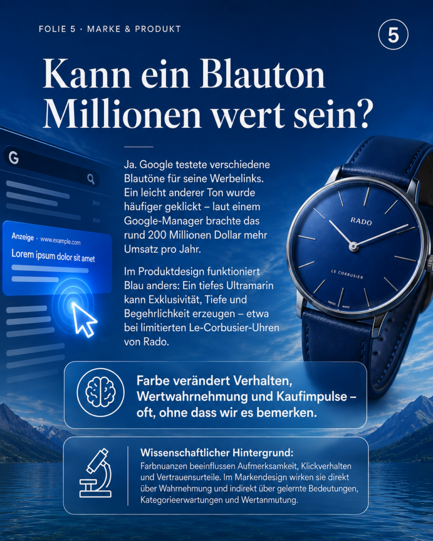
Can a slight change in the shade of blue be worth millions?
A well-known example from the field of digital design illustrates just how significant even the slightest color differences can be from a business perspective.
Google tested various shades of blue for its ad links. A slightly different shade was clicked on more often. A Google manager later estimated the resulting additional annual revenue at around $200 million.
Regardless of how accurately this figure can be verified in retrospect, the example illustrates a crucial connection: subtle differences in color influence attention and behavior without users having to consciously identify these differences.
In product design, blue can take on a completely different role. A deep ultramarine can convey exclusivity, material depth, and desirability. The Swiss watchmaker Rado, for example, incorporated an ultramarine shade from Le Corbusier’s *Polychromie Architecturale* into a limited-edition watch.
Here, blue is not meant to subtly guide the user to click. Instead, it becomes the central feature of the product itself, evoking a sense of quality, emotional depth, and appeal to collectors.
Color can draw attention, build trust, influence how we perceive value, and trigger impulse purchases—often long before we consciously think about it.
Can color make people healthier at work?
Spaces aren’t just seen. They are experienced with the whole body.
Color can create a sense of closeness or distance, increase or decrease the intensity of a stimulus, aid in orientation, provide a sense of retreat, and fundamentally change the atmosphere of a place.
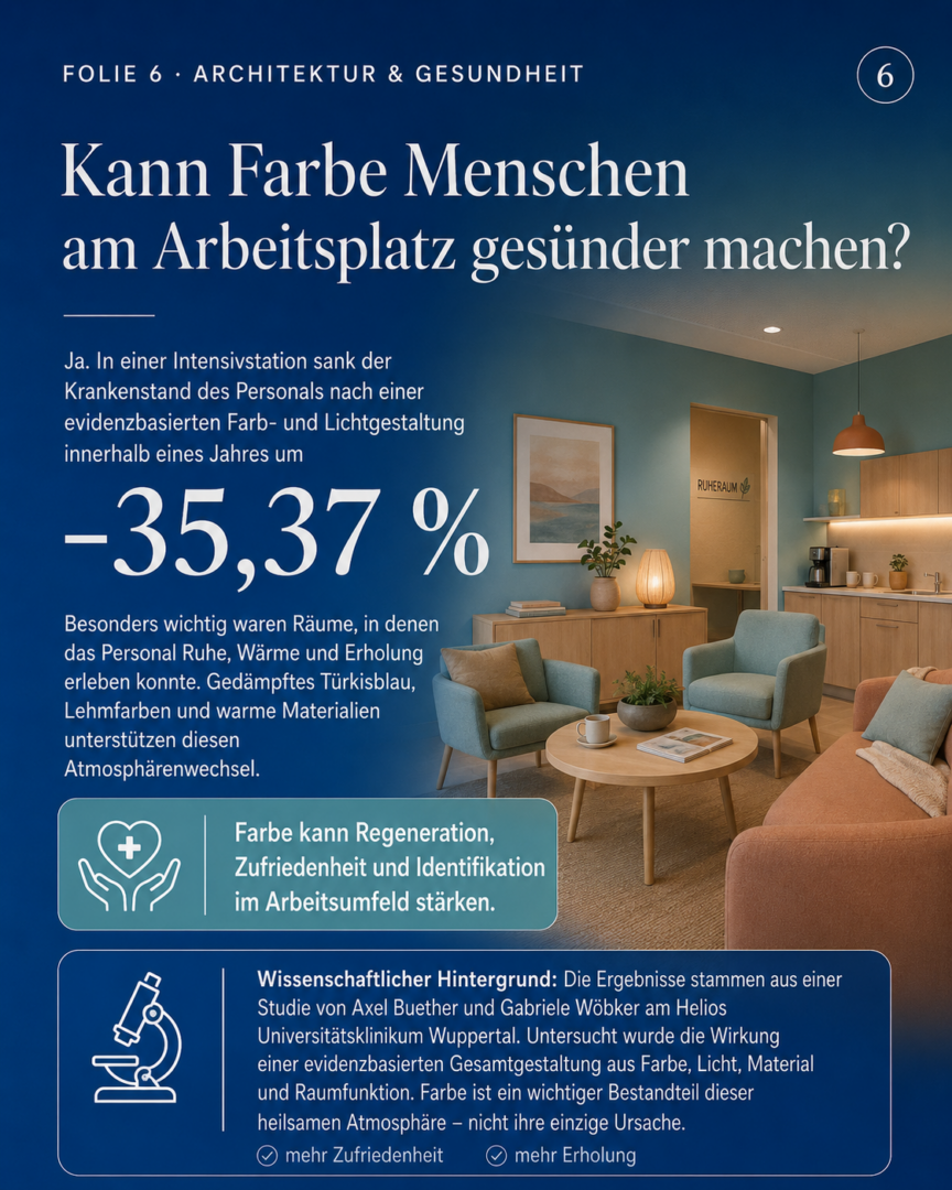
Subdued shades of turquoise and blue can convey a sense of freshness, calm, and distance from the hustle and bustle of work in break and relaxation rooms. When combined with warm earth tones, wood, textile surfaces, and a cozy atmosphere, a deliberate shift takes place: from clinical tension to a sense of safety, relaxation, and renewed energy.
In an intensive care unit at Helios University Hospital in Wuppertal that Gabriele Wöbker and I studied, staff absenteeism due to illness decreased significantly within a year following an evidence-based redesign that incorporated color, lighting, materials, and spatial function. At the same time, satisfaction with the break room, perceived relaxation, job satisfaction, and identification with the work environment all improved.
Color alone was not the cause of these changes. The overall atmosphere was the decisive factor. However, color played a central role because it links perception, memory, physical state, and spatial meaning.
Spectra, reflectance, and material properties can be measured. However, what really matters in people’s everyday lives is whether a space conveys a sense of safety, tranquility, belonging, spaciousness, or activity.
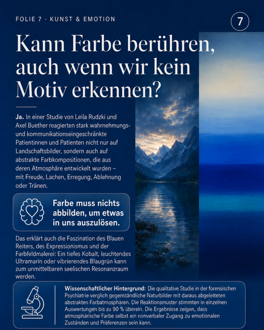
Can color evoke a response even when we don’t recognize a subject?
Art discovered the psychological autonomy of color long before modern neuroscience did.
The Blue Rider, Expressionism, and later Color Field painting increasingly detached color from the subject. Blue no longer had to represent the sky or the sea. It could become an emotional experience in its own right.
Kandinsky described blue as a color that draws people into its depths. With his intense ultramarine, Yves Klein sought to liberate color from the boundaries of the object. In color-field painting, large swaths of color become resonant spaces in which viewers experience a state of being rather than recognizing a specific motif.
Just how immediate this approach can be was demonstrated in a qualitative study that Leila Rudzki and I conducted in forensic psychiatry. Patients with severe impairments in perception and communication responded not only to representational landscape paintings but also to abstract color compositions developed from the atmospheric hues found in those landscapes.
Joy, laughter, excitement, rejection, or tears were evident even where no objects or landscapes were any longer recognizable.
The color didn’t have to represent anything to trigger a reaction.
Atmospheric color can thus provide a nonverbal window into feelings, preferences, and inner states. Often, the body reacts even before the mind has found an explanation.
So what is the true power of the color blue?
Blue fascinates us not because it has a single, universal effect. Its power lies in the extraordinary variety of experiences we associate with it.
Blue can open up and draw people in, energize and soothe, build trust, and stir a sense of longing. It can convey technical precision, social closeness, natural freshness, intellectual depth, or luxurious exclusivity.
Its effect changes with every shade, every material, every space, every culture, and every personal story.
The most important shift in perspective is therefore:
Color is not a property of the world, but rather a way in which we experience the world.
Because color arises in perception, imagination, memory, and design, it can alter our psychological and physical reality. That is precisely why it is one of humanity’s most powerful tools for communication and design.
Color does not simply represent the world. It plays a decisive role in shaping how we experience it.
You can find more of my coverage on this topic in the following media outlets:
Tagesspiegel: “Color Psychology: Sky and Sea: Why the Color Blue Makes Us Happy,”
WELT: “Psychology: Why the Color Blue Has a Special Effect on Our Brains“
Deutschlandfunk: “Psychology: People with anxiety disorders are more likely to have gray as their favorite color“
ntv: “Panorama: Sky and Sea—Why the Color Blue Makes Us Happy“
FOKUS online: “Peace, freedom, trust. A shade of blue explains why we long for the sea “
Ruhr Nachrichten, Dortmunder Zeitung Süd (DE) + Radio Ennepe Ruhr: “Sky and Sea: Why the Color Blue Makes Us Happy“
Radio Wuppertal: “Sky and Sea: Why the Color Blue Makes Us Happy“