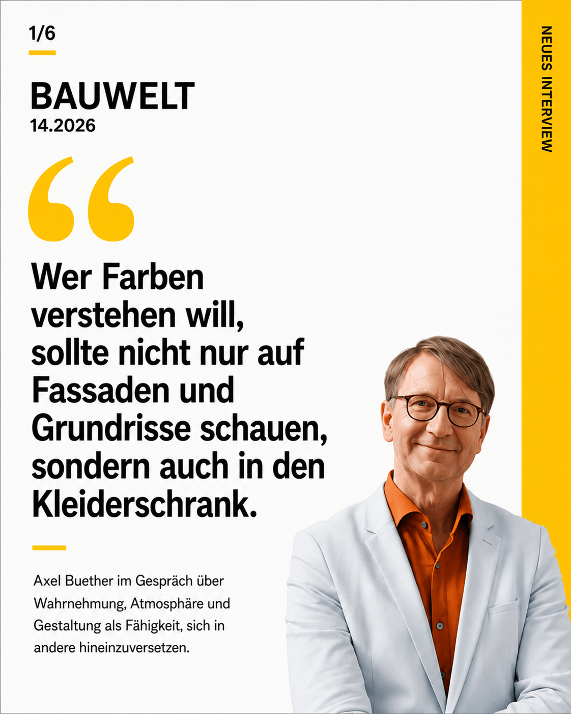
My new article in *Betriebliche Prävention – Arbeit, Gesundheit, Unfallversicherung* (Occupational Prevention – Work, Health, Workers’ Compensation Insurance ) is the first to consistently classify color and lighting design as an integral part of occupational safety and health. This gives the needs-based design of spaces and workplaces new professional, social, and possibly even legal significance.
In architecture, colors are still often viewed as a matter of taste, aesthetics, or cosmetic enhancement. Light, too, is often planned primarily on the basis of technical specifications. The effect that the overall visual atmosphere of a workspace has on perception, the nervous system, behavior, and health, however, is often overlooked.
This is exactly where my article “Color Design Is Occupational Safety” comes in. It explains why light and the colors of walls, ceilings, floors, surfaces, and furnishings are not merely decorative details. They constitute constant environmental stimuli to which the human body reacts continuously—long before we consciously assess a room.
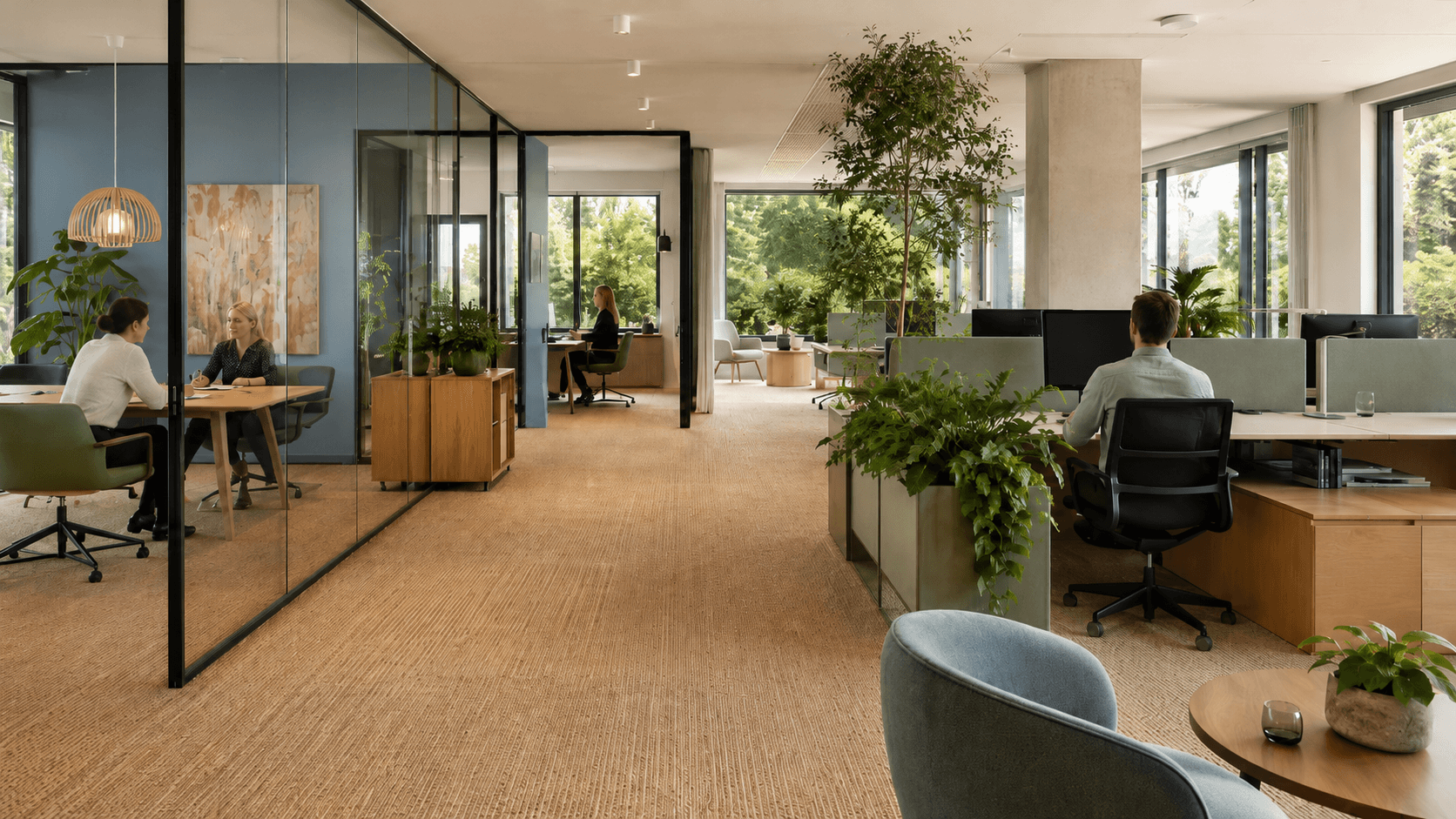
Work environments can make it easier or harder to find one’s bearings, instill a sense of security or create uncertainty, support concentration or cause additional stress. They can have a calming, energizing, or motivating effect and facilitate recovery. However, they can also intensify visual distraction, sensory overload, monotony, stress, and mental fatigue.
A supposedly “neutral” design featuring white walls, gray floors, and uniform artificial lighting is therefore by no means ineffective. Design monotony, too, influences perception and well-being. The crucial question is not whether spaces have an effect on people, but how they affect them.
From Aesthetics to Preventive Health Care
The particular significance of this publication lies in its professional context. The article does not appear in an architecture or design magazine, but rather in the professional journal *Betriebliche Prävention – Arbeit, Gesundheit, Unfallversicherung* (Occupational Prevention – Work, Health, Workers’ Compensation).
This fundamentally changes the perspective: color and lighting design are no longer discussed solely as a design element, but as a potential component of prevention.
If visual environmental conditions have been shown to influence stress regulation, the ability to concentrate, orientation, emotional stability, motivation, and social interaction, they must also be taken into account in occupational safety and health. A needs-based color scheme therefore affects not only the quality of architecture but also the conditions under which people work every day.
This reassessment could have far-reaching consequences. It opens up the discussion of whether visual and atmospheric impacts must be incorporated more systematically into planning processes, risk assessments, and occupational prevention strategies in the future.
Workplaces affect the nervous system
People spend a significant portion of their lives indoors. There, they are constantly exposed to colors, lighting conditions, contrasts, reflections, and visual stimuli. These influences are not only consciously perceived but are also processed largely subconsciously.
The autonomic nervous system reacts immediately to the quality of the environment. Light influences activity levels, alertness, and biological rhythms. Colors shape perception, direct attention, provide orientation, and influence the emotional assessment of a space.
This is particularly relevant in work environments that are already associated with high levels of mental, physical, or emotional stress—such as hospitals, nursing facilities, schools, government buildings, manufacturing facilities, control centers, or open-plan offices.
In this area in particular, design must not be considered only after all functional and technical decisions have already been made. It must be understood from the outset as part of an overall plan that promotes health.
Evidence-Based Design Instead of Personal Color Preferences
A prevention-oriented color scheme does not mean making rooms as colorful as possible or applying general color guidelines. It must be tailored to the activities, stressors, and psychological needs of the respective users.
Various atmospheric qualities are required:
- Focus and precision,
- Orientation and safety,
- Communication and Collaboration,
- Rest and Recovery,
- Engagement and motivation,
- Identity and Social Belonging.
The appropriate lighting and color qualities depend on the context of use. An intensive care unit has different requirements than a classroom, an administrative office, a production hall, or a break room.
Evidence-based color design therefore does not begin with the selection of individual shades, but rather with an analysis of the usage context. Only then are lighting, room colors, materials, surfaces, and furnishings combined to create an effective overall atmosphere.
Prevention begins with shaping the environment
Drawing on scientific findings and completed research projects, this article demonstrates that needs-based design can promote well-being, orientation, concentration, motivation, and job satisfaction. At the same time, it becomes clear that good design does not necessarily entail higher construction costs.
Often, the key difference lies not in the price of the materials, but in the quality of the design. Once colors and finishes have been determined, they can either be chosen based on personal taste or systematically tailored to their intended effect and function.
This holds significant potential that has hardly been tapped so far: color and lighting design can become a relatively cost-effective tool for workplace prevention.
The workplace of the past century was optimized primarily in technical, functional, and organizational terms. The workplace of the 21st century must also be understood as a biopsychosocial environment.
After all, people don’t just work with their minds and bodies. They always work with their nervous systems as well.
Read the full article “Color Design Is Occupational Safety” in *Betriebliche Prävention*