Corporate and product philosophy
The color collection represents the values of the Villeroy & Boch brand
- Continuation of the V&B success story, brand tradition
- Workmanship, durability and quality
- The most modern, attractive and reliable color system on the market
- Consistent customer orientation
- Typology and creative tool for sophisticated color selection
- Large selection of classic and modern colors and formats
- Large selection of modern gray tones and graduated white tones
- All tiles can be combined harmoniously and accentuated
- Wall and floor tiles in one system
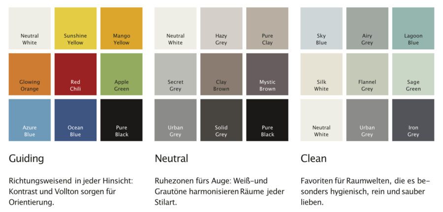
Color shades and material groups
The PRO ARCHITECTURA 3.0 color system consists of 45 individual shades, which are available in various material groups and surface qualities.
All shades are selected to be extremely durable, environmentally friendly and of timeless beauty, just like the ceramic material. Tiles from Villeroy & Boch have been around for almost 200 years.

Tiles for generations – sustainable, environmentally friendly, timeless
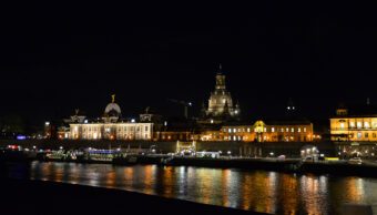
Tiles from Villeroy & Boch are not only used in many famous places such as Cologne Cathedral or the Elbphilharmonie concert hall, but also in countless Wilhelminian-style buildings. So everyone has encountered them before. Villeroy & Boch tiles can also be found in my home, which has been standing in the Brillerviertel district of Wuppertal-Elberfeldt for more than 130 years, where they are sure to last for many generations to come.

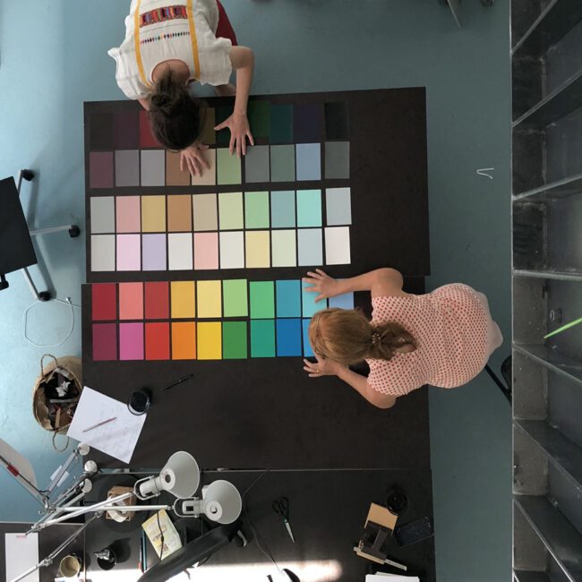
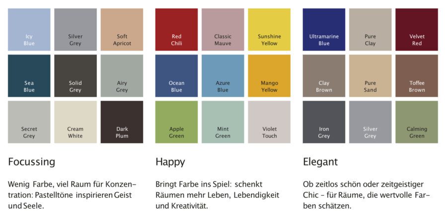
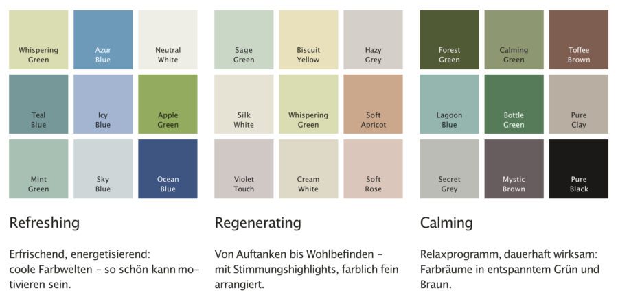
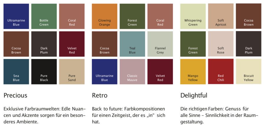
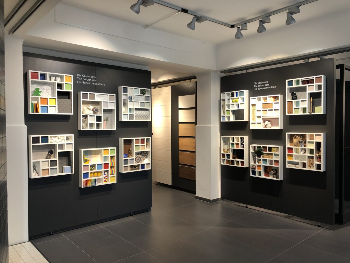
Colorsets as a modular system
12 color sets, each consisting of 9 individual shades, provide optimum orientation and offer a thematic preselection for every application.
The combination of the 45 individual shades into color sets such as “Guiding”, “Calming” or “Delightful” is based on criteria derived from the emotional moods and situational needs of the people for whom they are made.
Typology – functional assignment of color modules
The color tones and possible color combinations of a color system must work exactly where they are most frequently used. This allows the costs for production, warehousing and distribution to be optimized. Quality and price are in the best possible relationship.
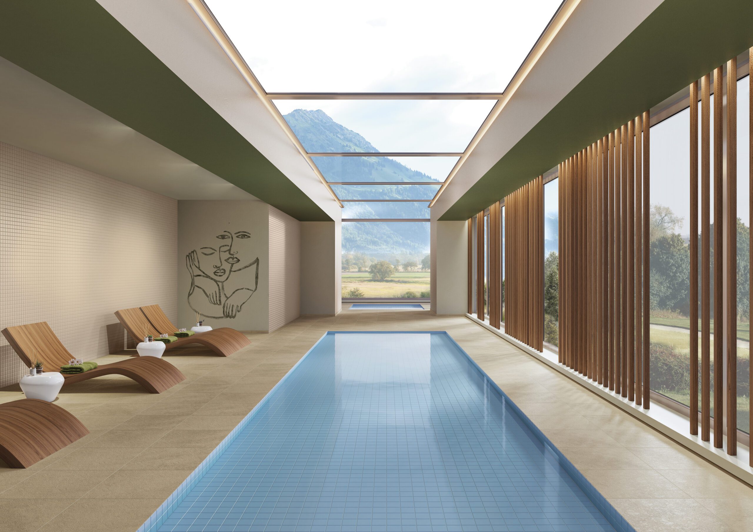
- Swimming pool
- Wellness
- Education
- Kindergarten
- Healthcare
- Hotel
- Gastronomy
- Shopping
- Transit
- Industry
- Function rooms
- Residential construction
Collaboration in the color design process: Heike Krauss and Matilde Frank
To the Villeroy & Boch homepage

The new PRO ARCHITECTURA 3.0 color concept convinced the international jury at the Red Dot Award: Product Design 2021 and was named “Winner” for its outstanding design quality.