When Spaces Help People Find Their Way Back to Life
A pilot project in evidence-based color psychology: How the new AUVA Rehabilitation Center in Vienna is creating an architectural environment that prioritizes health, well-being, and human needs.
A serious accident can change our lives from one second to the next. Things we once took for granted—getting up, walking, working, living independently—may have to be painstakingly regained. For those affected, a long journey begins—one that requires not only physical strength, but also courage, patience, and optimism.
The best possible medical care is essential for this. But what role does the environment play—the place where people spend weeks or months of their lives? Can it help alleviate fears, instill a sense of security, and restore a zest for life and motivation?
And what does that mean for the people who work there every day, supporting others on their journey back to life?
These questions are at the heart of an extraordinary construction project in Vienna.
With the new rehabilitation center of the General Accident Insurance Institution (AUVA), a health campus is being created at the Meidling site that brings together the treatment of seriously injured people—from the moment of the accident through rehabilitation—under one roof. The new building will be directly connected to the existing trauma center.
Our Institute for Evidence-Based Color Psychology at the University of Wuppertal was responsible for the color design of this new building. From the facade to all interior spaces and the furnishings, we were able to coordinate all key surface colors and also influence the quality of the lighting.
In this context, that is extremely rare. For us, therefore, this project represents a milestone in evidence-based color design and serves as a model for how scientific findings can be translated into people-centered architecture.
The visible world affects us—whether we want it to or not
We’ve all had this experience. We walk into a room and, within seconds, sense whether we feel comfortable there. Even before we consciously think about it, our perception has already assessed the environment. We feel safe or uneasy, welcome or out of place, energized or exhausted.
Color and light play a significant role in this. They influence how we perceive spaces, how we navigate them, how we feel, and how we behave.
However, no single color has the same effect everywhere and at all times. What matters most are the people, their needs, and the specific situation. A patient seeking peace and comfort after a serious accident needs different conditions than a therapist who is working with intense concentration, or a group of people gathering in a common room.
This is precisely where the evidence-based color psychology I founded comes into play. It does not start by asking which colors are beautiful or currently in style. Instead, it examines which color conditions can fulfill human needs, support desired experiences, and reduce avoidable stress.
In the new rehabilitation center, we were able to address these questions for the first time within such a comprehensive design context. Wall and ceiling colors, flooring, doors, built-in fixtures, furniture, and materials are not decisions made independently of one another, but rather form a carefully coordinated visual environment.
Lighting is also an important factor. After all, the effect of a color can never be assessed independently of lighting conditions. Recommendations regarding color rendering and color temperature have therefore been incorporated into the design and are being implemented.
A facade that belongs to the neighborhood as well
The responsibility for people-centered color design begins even outside the building.
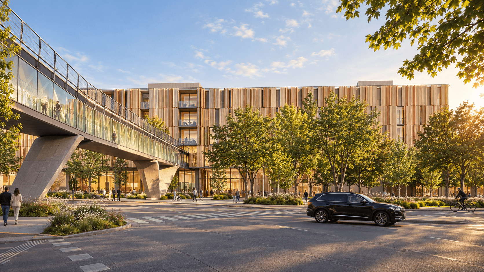
A large hospital is a defining feature of its surroundings. Its facade is noticed not only by patients, visitors, and staff, but also by the people who live in the surrounding residential buildings, work there, or pass by every day.
For these people, the building becomes a permanent part of their everyday lives.
Imagine a large, largely white hospital complex standing in an established neighborhood with no apparent connection to the existing buildings or green spaces. Even if its architecture is functionally sound, it can be perceived as alien, cold, and unwelcoming. The visual quality of its surroundings thus affects far more people than just those for whom it was built.
When designing the color scheme for this new building in Vienna, it was therefore important to us to give the building a distinct, respectful identity while at the same time integrating it harmoniously into its surroundings.
The facade is intended to blend in with the existing buildings and harmonize with the preserved trees and surrounding green spaces. The planned landscaped courtyard will also allow this connection between architecture and nature to be experienced from within the building.
The point is not to make architecture invisible through color. A public building should make its presence felt and foster a sense of identity. What matters is that it enriches its surroundings rather than setting itself apart from them.
After all, whoever designs a building’s colors is always shaping a part of its neighbors’ living environment as well.
Respect for Patients and Staff
This same approach continues inside the building.
Patient rooms should convey a sense of safety, calm, and security. Therapy areas require conditions that support focus, activity, and motivation. Common areas should facilitate social interaction, while quiet spaces allow for rest and recovery.
Not every room needs the same atmosphere. And not everyone reacts to the same colors in the same way. That is precisely why a needs-based color scheme requires more differentiation than a uniform design scheme.
The employees also deserve special attention. Nurses, therapists, doctors, and all other staff members spend a significant portion of their lives in these facilities. They perform physically and emotionally demanding work and bear responsibility for people facing difficult life situations.
From our research projects, we know how important the visual work environment can be for well-being, work motivation, and social interaction. Effective color design can help reduce stress, promote relaxation, and strengthen employees’ sense of belonging to the workplace.
The fact that AUVA places such a high priority on the needs of patients and employees makes this collaboration particularly valuable to us.
Here, health is understood not merely as a medical task, but as a requirement for the entire environment in which people recover and support others in doing so.
People and the environment belong together
This commitment also includes responsibility for our natural resources.
The new building features energy-efficient building systems, renewable energy, and spacious green areas. According to AUVA, the project meets the stringent criteria of the Austrian “klimaaktiv Gold” certification.
Our color scheme also had to meet these requirements. This is because, in architecture, choosing a color is almost always also a decision about a material—and thus about a specific product.
Surfaces must not only support the desired psychological effects; they must also meet hygienic, functional, technical, and environmental requirements.
A construction project of this scale in particular demonstrates that responsible design goes far beyond aesthetic decisions.
A Milestone for Evidence-Based Color Design
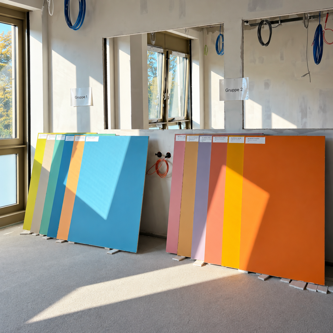
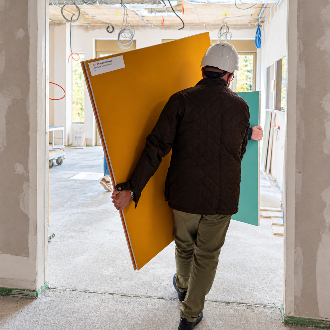
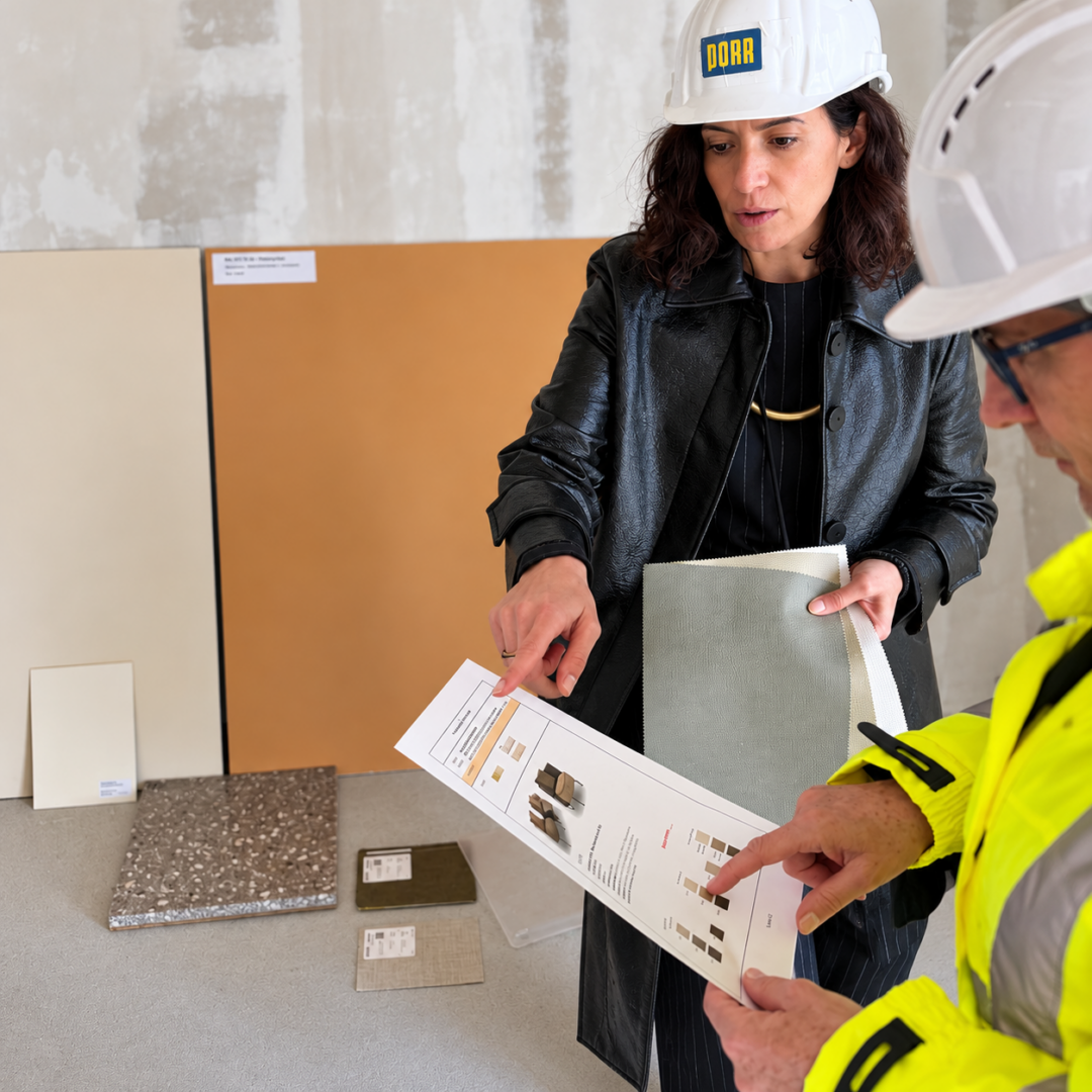
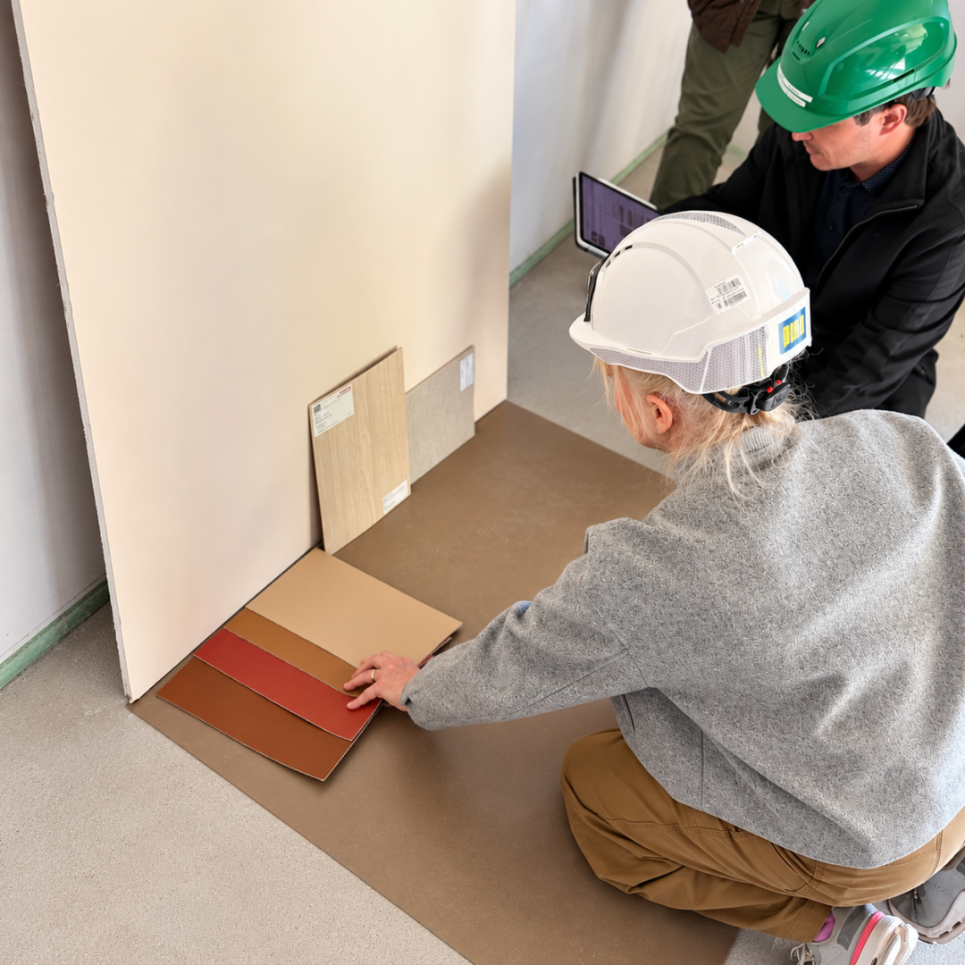
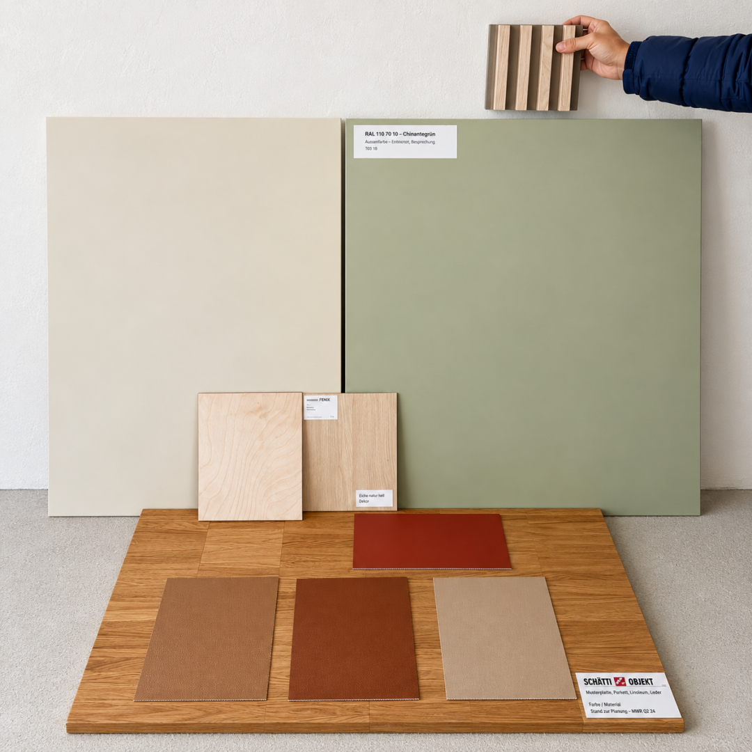
During the most recent sampling session in Vienna, we reviewed the developed color and material concepts with the project participants using concrete samples and coordinated their implementation.
The facade already gives a hint of how the new building will blend into its surroundings in the future. Inside, too, the color scheme is taking on a more concrete form. What was previously the subject of intensive research, planning, and coordination processes is now becoming part of a built environment.
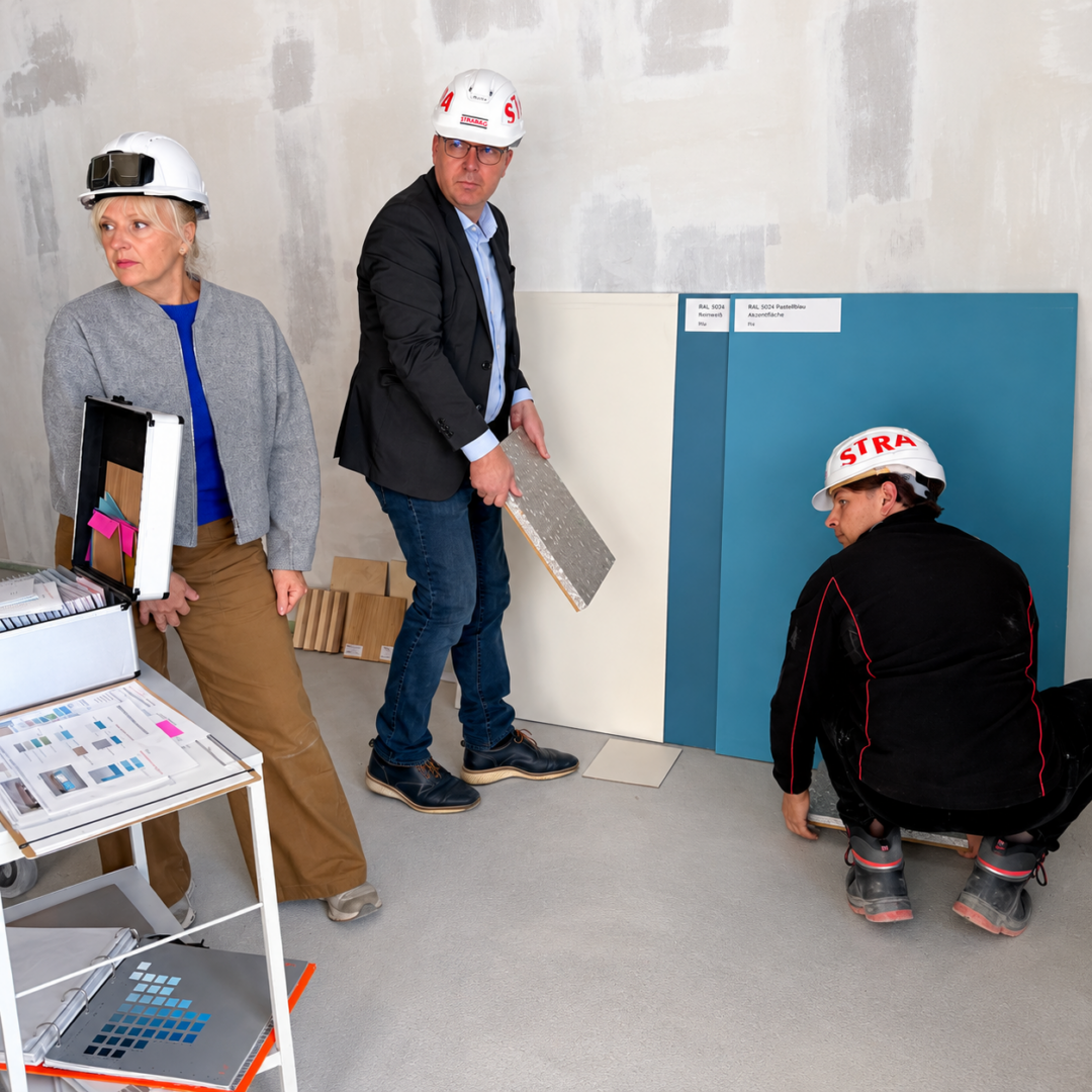


This project is of particular importance to our institute. We rarely have the opportunity to develop a building’s color scheme with such comprehensiveness and consistency. Our collaboration with AUVA demonstrates the potential that arises when a client not only invests in cutting-edge medical and technical excellence but also makes the well-being and health of all people a central criterion of the architecture.
The actual effects on patients and staff will only be assessable once the facility is in operation. But the groundwork for this is being laid now.
Perhaps that is the most important idea behind this project: The quality of a building is not measured solely by its architecture, its technical features, or its energy efficiency.
It is reflected above all in the impact it has on the people who live, work, and recover there—and who call the surrounding neighborhood home.
A building cannot undo a serious accident. But we can create spaces where people feel safe, accepted, and valued—spaces that help them regain their strength, restore their confidence, and find their way back to life.
That is exactly why we design color.