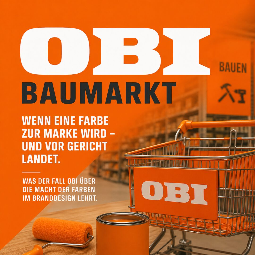
Today, the Federal Court of Justice is hearing a seemingly banal question:
Does Orange belong to a DIY store?
This refers to the case of the DIY chain OBI and its characteristic color tone (RAL 2008). What at first glance appears to be a special topic of trademark law is in fact a highly precise lesson on the strategic power of color in brand design.
Because when companies start fighting over colors, it’s no longer about design.
It’s about sovereignty of perception.
The starting point: decades of consistent color branding
For many years, OBI has consistently relied on a visual dominant:
- Facades
- Guidance systems
- Price and campaign communication
- Advertising and POS
The result is clear from a marketing perspective:
- High brand recognition
- Strong visual coherence
- Clear activation in the retail context
And yet the color trademark was canceled – by the Federal Patent Court.
Why?
The central question: brand or industry aesthetics?
The court argues in essence:
- Orange is functionally plausible in the DIY store segment
- and is therefore not clearly understood as an indication of origin
Empirical data from the process shows:
- Depending on the expert opinion, only around 30 % to just under 50 % clear allocation
- At the same time, 6 out of 7 leading DIY chains used comparable color spaces
The consequence:
The color looks strong – but not exclusive.
The mistake many companies make
Many organizations confuse two things:
- Color Usage (use one color)
- Color Ownership (owning a color)
These are two completely different strategic states.
The OBI case shows:
- High visibility ≠ Clear assignment
- Consistency ≠ Differentiation
- Presence ≠ Ownership
Why it has worked for others
There are counter-examples – and they are revealing.
Deutsche Telekom – Magenta
- Decades of radical consistency
- Complete integration into all touchpoints
- Aggressive defense of the color domain
Result: Magenta is not just design, but mental property
Savings Banks Finance Group – Red
- Comprehensive presence in everyday life
- Extremely high recognition
- Clear assignment in the context of use
Result: Red acts as a cognitive shortcut to the brand
The decisive difference
The difference between these cases and OBI is subtle – but strategically fundamental:
- Telekom and Sparkasse use colors that are not functionally necessary for their industry
- OBI uses a color that fits the industry perfectly
This is precisely the problem.
The more “right” a color is, the less it belongs to you.
The real power of color
From the point of view of evidence-based color psychology, the effect is clearly explainable:
1. preattentive processing
- Color is perceived faster than shape or text
- it controls attention in the millisecond range
2. activation control
- Orange has been proven to produce:
- Increased alertness
- Impulses for action
- visual dominance
3. contextual meaning
- Orange is not interpreted in the DIY market – it is expected
- it is part of a culturally stabilized perception scheme
The strategic consequence for decision-makers
Color branding is not an aesthetic issue.
It is a management tool.
It influences:
- Brand Positioning
- Category Differentiation
- Customer Journey
- Conversion Behavior
- Retail Performance
And it decides whether your brand:
- is seen
- is remembered
- or is confused
Invitation to the next step
In my seminar for decision-makers on evidence-based color psychology and strategic color branding I teach:
- How colors actually work (beyond myths)
- how to empirically substantiate color decisions
- how to systematically build up visual differentiation
- and how you can avoid your brand being “lost” in the industry
The question is not whether color works. It’s whether you use its effect strategically.
Interview 1 with link: “Obi-Orange” and “Telekom-Magenta” – why are colors important for brands? Deutschlandfunk Kultur 7.05.2026
Interview 2 with link: “Who owns “Orange”: Dispute of the DIY stores before the BGH WDR aktuelle Stunde 7.05.2026