
Column in Colore Magazine
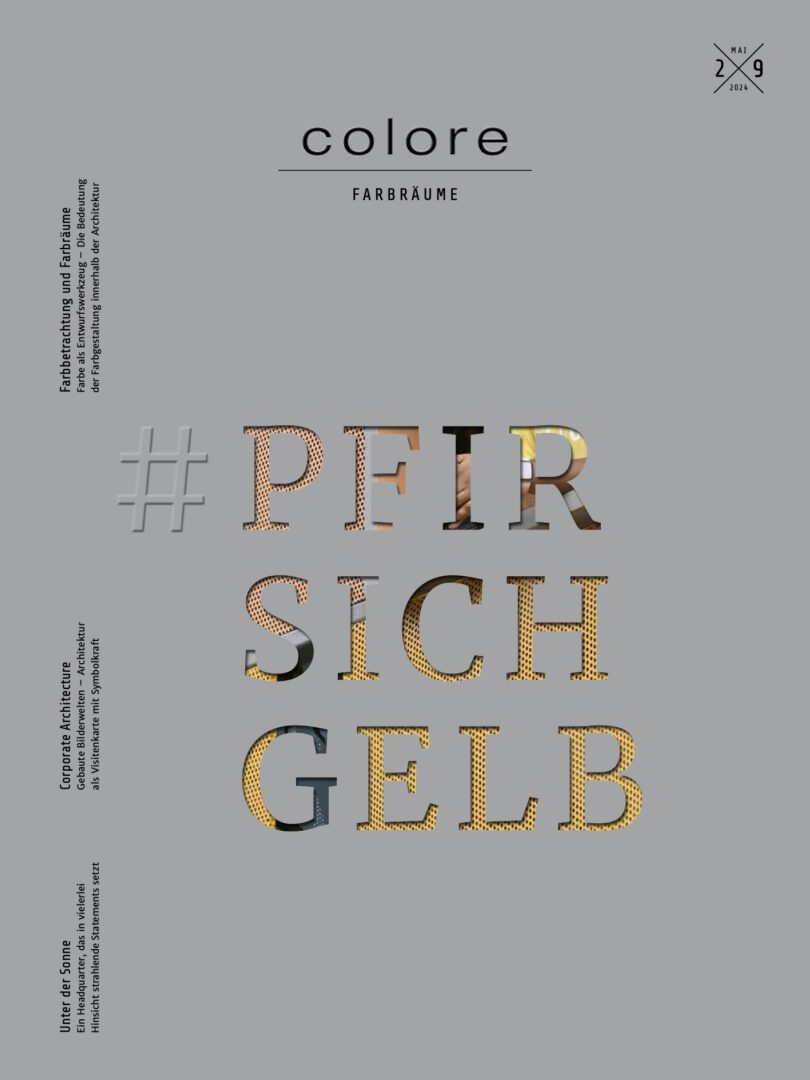
Starting in 2023, I will be contributing a column titled “Color Reflections” to each new issue of the Brillux architecture magazine *colore*, covering various topics in color psychology. The new issue, “PEACH YELLOW,” is now available for free download on the COLORE magazine website.
Color as a design tool
The Significance of Color in Architecture Over Time
Until just a few decades ago, color was one of the
three primary design tools in architecture.
Le Corbusier, arguably the most influential architect of the modern era, said the following in his *Polychromie Architecturale* regarding the importance of color in the design process: “In architecture, color is just as powerful a tool as the floor plan and the section. Or rather: polychromy is an integral part of the floor plan and the section themselves.”
This statement seems downright paradoxical today. On the one hand, because modernism—through the absence of a locally, functionally, and contextually differentiated color schemes, and on the other hand, because contemporary design theories lack an examination of the diverse effects of light and body colors on the perception of architecture, as well as on the experiences and behaviors of its users. Consequently, it took me a great deal of research time for my own work to find current practical examples in Europe where color is not merely superficial colorfulness but an essential design tool. To this day, there is no contemporary, scientifically grounded theory on the application of color as a design tool. I would like to counteract this and, in a sense, take the first step in this direction.
A functional component of the architecture
Color becomes a problem for the design process and for architecture itself when it is reduced to mere appearance. For this reduces color to ornament, embellishment, and decoration. Such a use of color does not fit the essence of a contemporary building culture and rightly contradicts the self-image of modern architects. Thus, the topic “People and Color”—in the world’s most successful design manual for architects, written by Bauhaus student Ernst Neufert, translated into 19 languages, continuously updated, and now with over 500,000 copies sold—is covered on just a single page. But where does this misjudgment of such reductionism stem from, which reduces the sensory medium of color to its outward appearance?
On the Ideology of a White Modernity
During the Renaissance, which was marked by a return to the culture of antiquity, white became the symbolic color of the Enlightenment and science, as well as of a form of progress that had freed itself from traditional conventions and narrow-minded thinking. However, “white modernity” only became an ideology through the misjudgment of the famous German archaeologist Johann Joachim Winckelmann, who, in the 18th century, declared the purist white color of ancient marble temples and sculptures to be the eternal ideal of beauty. Yet the buildings and sculptures of ancient Greece were just as colorfully painted and decorated as the temples of Mesopotamia, Egypt, India, and the Americas, or the caves, pagodas, mosques, synagogues, churches, and secular buildings throughout the world. When this news spread in 1817 following a publication by Johann Martin von Wagner, art agent to the Bavarian King Ludwig I, the practice—which had until then been declared barbaric—came as a shock to many people. The artist Auguste Rodin is said to have beaten his chest vehemently and exclaimed:“I can feel it here—these buildings were never colorful!” The fact that experts still struggle to acknowledge such a widely known fact stems from the powerful symbolic significance of the color white.
White as a Model for Industrial Construction
The white of early Modernism was a revolutionary symbol of renewal that stood out clearly against the polychromatic backdrop of the existing built environment. Good examples of this are the villas designed by Adolf Loos, which are white on the outside but, like all buildings of classical Modernism, feature polychromatic interiors. No architect of classical modernism at that time was willing to prioritize his ideology over human well-being. During this phase, color was still used quite naturally as a design tool. But it was not to remain that way. With the spread of new building materials such as concrete, steel, and glass—which were initially clad but, as their use became more widespread, were increasingly allowed to be displayed in their raw form—the appearance of modern architecture underwent a transformation. Compared to the appearance of North American metropolises shaped by technological change—which served as models for the European avant-garde—the small-scale, polychromatic cities and villages of Europe seemed backward, like relics of a bygone era.
From Individual Craftsmanship to Anonymous Mass Architecture
With the reconstruction of cities destroyed in the war, however, polychromy increasingly disappeared from the appearance of European architecture. Historical building materials such as brick, natural stone, wood, clay plaster, and earth pigments, as well as handcrafted cladding and paintwork, hindered the process of modernization and were therefore largely banished from cityscapes and interiors. The modern architectural language of the “New World” became a symbol of progress and, at the same time, offered the opportunity to break away from and distance oneself from a past perceived as reactionary and a failure. Consequently, many remnants of the bombed-out old towns were not rebuilt but cleared away and replaced by largely monochromatic urban neighborhoods. While white was initially the symbolic color of modernism, it gradually became the standard color throughout architecture. In the shadow of white, the triumph of another achromatic color also unfolded almost unnoticed. To this day, building materials such as asphalt, concrete, and steel ensure that the proportion of gray in the urban and landscape scenery is steadily growing, while the polychromatic richness of the natural world and the old towns is shrinking at the same rate.
On the Alienation of Humans from Their Architecture
The end of polychromy thus reflects a new approach in architecture that no longer takes the individual needs of the person as its point of reference, but rather the predefined requirements of an anonymous mass. How users actually experience the built environment—and what impact architecture has on their well-being, health, and behavior—remains unrecognized in the design process. The negative societal consequences of such design practices have long been the subject of criticism, yet they scarcely prompt any behavioral changes. To illustrate the consequences of a failure to address the effects of color, I quote here from the personal experience of someone affected: “ … I’m currently working in the neonatal intensive care unit at X Hospital. Next summer, we’ll be moving into a new building. Caring for premature babies and their parents involves so much more than “just” intensive care. Unfortunately, we have no say whatsoever when it comes to the color scheme. White walls, LED spotlights… it’s a dreary experience. In terms of equipment, everything will be there, but what makes our specialized care unique will be completely lost. The patients and their parents often stay on our unit for months. It practically makes our hair stand on end. This kind of environment simply cannot foster a sense of well-being. Can you help us create a positive work environment and ensure that these premature babies have a smooth transition into the world? “
Colorless, joyless, loveless
The disappearance of color in cities and rural areas increases people’s alienation from their living environment, since humans are evolutionarily at home in the diversity of a polychromatic environment. The philosopher Karl Popper describes the connection between the genetically inherited disposition of mind and body, on the one hand, and the living environment, on the other, as “expectation.” We move, learn to dance, speak, and sing; we perceive our world as multicolored and shape it accordingly—partly because we have the genetic predisposition to do so, and partly because this is the only way we can fully develop, experience the richness of the world intended for us, and be completely ourselves. The colorfulness of the environment isn’t simply there; it is genetically determined for us and serves an evolutionary purpose in our lives. Only for this reason can we perceive it and feel at home. White and gray living and working environments cause a general sense of unease—not for everyone, but for the vast majority of people. On this point, I’d like to quote another nurse who put her personal experience from another project into words, succinctly capturing the connection between color and its effect:“Right now, the reality is that there’s no color here; it’s actually very colorless and also designed in a very uninviting way.”
On the Resonance Function of Architecture
This woman therefore feels that the design of her workspaces lacks the mindfulness, care, and appreciation that are a given in her work with the people entrusted to her care. Architecture appears to be lovingly designed to the extent that it takes into account people’s fundamental and specific needs and creates a “resonance space,” as the sociologist Hartmut Rosa puts it. General needs such as the pursuit of beauty, well-being, health, happiness, and appreciation are fundamental to good work and a fulfilling life. Specific needs, on the other hand, arise from the context of the experiential and practical situation, the genius loci, and the concrete wishes of the users on site. Thoughtfully designed architecture creates a relational space in which people can feel “at home” in the best sense of the word. Incorporating color into the design process is therefore not about superficial colorfulness, but solely about resonance. It is about shaping the effects that color is intended to evoke in the people involved within the context of their respective living and working situations.
Color follows function – Color follows function
The phrase “Form follows function,” coined by Louis Henry Sullivan and made famous by its adoption into Bauhaus teaching in postwar design schools, applies just as much to color as it does to floor plans and sections. Color is a category of sensory perception that encompasses far more than the mere specification of hues, light values, and material designations. In developing a color concept, the needs of the users are primary, while the personal views and color preferences of the designers are secondary. The phrase“The medium is the message”was coined by Marshall McLuhan. According to his theory, media not only convey content to us but also determine the message by structuring that content. For the application of color in the design process, this implies:
- The color scheme shapes our perception of the built environment.
- The color scheme determines what is visible and what becomes invisible.
- The color scheme determines who specifically feels drawn to the content.
- Color schemes influence how a situation is perceived.
- Color schemes influence how people react to their surroundings.
Why We Design Not Colors, but Needs, Wishes, and Desires
Color is not merely a beautiful illusion, but a sensory medium that connects us to the world. Our perception of color determines how we orient ourselves in the world and how we relate to people, objects, and spaces. Colors possess this power because we associate them with meanings that remain 99% unconscious to us at the moment of experience. Colors are all the more powerful because these meanings trigger both psychological and physical reactions in our bodies, which to a very large extent determine our expectations regarding the things and events we encounter in the outside world. The philosopher Karl Popper articulates this concept in his evolutionary theory of knowledge as follows:“Expectations are forms of knowledge, feelers that we extend into the environment.”Formally, we define color through physiological parameters such as chromaticity, brightness, saturation, depth, brilliance, and contrast. In terms of content, color defines us; it determines what we feel, what we do, and how we see the world. So when I select and compose colors for built spaces today, I do not rely on my personal preferences or intuition, but rather on the expectations of the people affected by my decisions. I shape the needs, desires, and longings of the people whose well-being I am responsible for. For me, color design is neither a service nor fine art, but rather a way of serving people themselves.
List of Sources
1 Le Corbusier: Polychromie Architecturale – Le Corbusier’s Color Palettes from 1931 and 1959, ed. Arthur Rüegg, Birkhäuser Verlag 2015
2 Axel Buether: Color: Design Principles, Planning Strategies, Visual Communication. DETAIL Praxis Institute for International Architectural Documentation, Munich 2014
3 Johannes Kister (ed.), Ernst Neufert: Architectural Design Theory. Fundamentals, Standards, Regulations, Springer Vieweg, Wiesbaden 2018
4 Vinzenz Brinkmann, Ulrike Koch-Brinkmann (eds.): Colorful Gods – Golden Edition: The Colors of Antiquity. Prestel, Munich 2020
5 Victoria Finlay: The Brilliant History of Colors in Art. Yale University Press, New Haven 2014, p. 21
6 Gottfried Semper: Preliminary Remarks on Painted Architecture and Sculpture in Antiquity, Altona 1834; ibid.: The Use of Colors in Architecture and Sculpture, Issue 1, Rome 1836
7 Anders V. Munch: The Style Without Style: Adolf Loos. Brill, Leiden 2005
8 Alexander Mitscherlich: The Inhospitability of Our Cities. Suhrkamp, Frankfurt am Main 1965. Jan Gehl: Cities for People. Jovis Verlag, Berlin 2015
9 Note: I received this subjective statement in a personal email and verified it as a general problem among the workforce through a representative employee survey. 10 Karl R. Popper: All Life Is Problem-Solving. Pieper, Munich 1994
11 Interview regarding the Helios study “Color in Healthcare Architecture,” https://www.youtube.com/watch?v=43Dp9zB9o6M
12 Hartmut Rosa: Resonance: A Sociology of World Relations. Suhrkamp, Berlin 2016
13 Marshall McLuhan: The Magic Channels. Understanding Media. Verlag der Kunst 1994 [1964]