
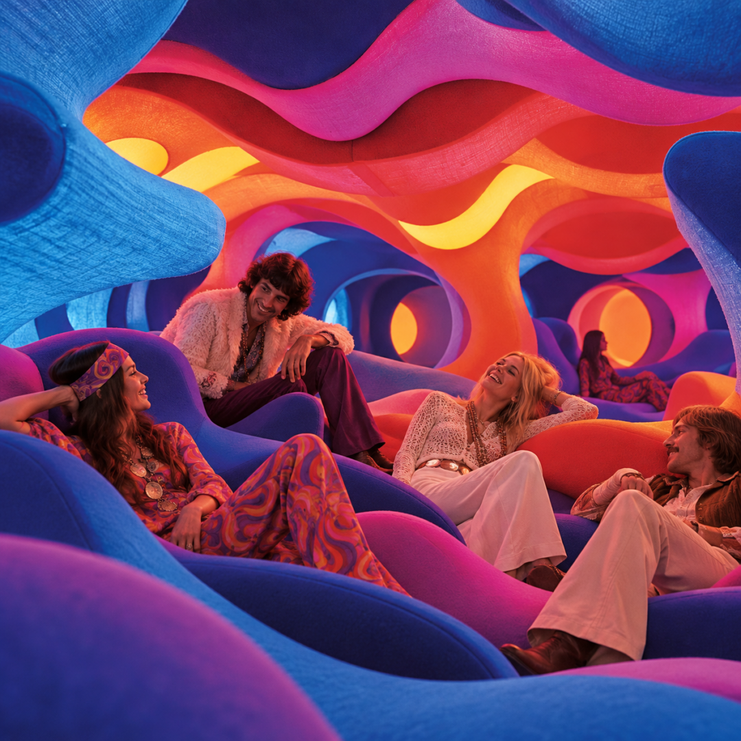
How much of Verner Panton’s radical world of color and space still resonates today? And what can we learn from his designs about how color influences our perception, our experience, and our behavior?
On October 7, 2026, I have been invited to TALKING SPACES #1 in Stuttgart—the kickoff of a new series of talks organized by AW Architektur & Wohnen and smow. Together with architect and interior designer Peter Ippolito and design historian Mathias Remmele, I will discuss the work of Verner Panton and, in particular, his legendary design of the SPIEGEL publishing house in Hamburg. The evening will be moderated by Karen Hartwig, editor-in-chief of AW Architektur & Wohnen.
For Panton, color was not merely decoration
Verner Panton (1926–1998) was one of the designers of the 20th century who consistently viewed color as a fundamental component of spatial perception. For him, color was not something added at the end of a design process, but rather an integral part of the concept from the very beginning. Light, color, materials, patterns, furnishings, and architecture were all meant to work together to create an atmosphere.
Noteworthy is Panton’s keen interest in the psychological and physiological conditions of color vision. His wife, Marianne Panton, later reported that as a student he had even considered studying color psychology. In his own writings, he explored perception, light, reflection, and how colors change under different lighting conditions. His central tenet was that color choices should not be left to chance: colors have “meaning and function.”
From today’s perspective, this is particularly interesting. For much of what Panton developed intuitively, experimentally, and through intensive observation touches on questions that are now the focus of perceptual psychology, environmental psychology, and evidence-based color design: How do visual stimuli influence arousal and attention? How does a colorful environment alter our emotional assessment of a space? What role do saturation, brightness, contrast, light, and materiality play? And how do individual sensory stimuli come together to create an atmosphere experienced as a whole?
Panton rarely thought of color in isolation. The Vitra Design Museum describes how he deliberately used graduated color scales, light, and patterns to modulate the character and mood of his interiors. His spaces were not neutral containers for colorful furniture—the entire room became a sensory experience.
A Designer at the Dawn of the 1960s
However, Panton’s color worlds can hardly be understood if separated from the era in which they were created. The late 1950s, 1960s, and early 1970s were marked by profound social and cultural change. A young generation challenged traditional ways of life; pop culture, the youth movement, new gender roles, and sexual liberation transformed everyday life. At the same time, space exploration, technological progress, and new plastics gave rise to a vision—at times downright euphoric—of what the future might look like.
Visual culture also underwent a transformation. Pop Art and Op Art, fashion photography, advertising, television, album covers, and the emerging youth and music culture introduced intense, sometimes fluorescent colors and visually striking contrasts to a media landscape that had never seen anything like them before. The Museum of Modern Art describes 1967 as a veritable explosion of print media and a close connection between Pop Art, television, and the music industry; newly available DayGlo colors, reflective surfaces, and plastics further reinforced this development. The Städel Museum also highlights how quickly the visual principles of Op Art found their way into fashion, advertising, music, and interior design.
At the same time, a psychedelic aesthetic emerged that brought together music, graphic design, film, fashion, architecture, and interior design. It was part of a culture in which perception itself became the subject of experimentation: Light shows, intense color contrasts, fluid forms, music, and multisensory environments were no longer meant to be merely observed, but to be experienced. The Whitney Museum describes this interconnection of social change, music, film, graphic design, architecture, and psychedelic art as a defining phenomenon of the era.
Panton was part of this cultural climate—though his work should not be reduced to it. He originally came from the tradition of Danish design and had worked with Arne Jacobsen. That is precisely why his evolution is so remarkable: Instead of the understated materials and rather subdued color palette of Scandinavian modernism, he developed increasingly radical spatial concepts beginning in the late 1950s, in which plastics, textiles, artificial light, and intense colors became key design elements.
From Furniture to Immersive Space
The famous Panton Chair, which went into mass production in 1967, exemplifies this transformation: New plastics made possible a fluid, one-piece molded construction that broke with the conventional notion of a chair. Technological advancements and the newfound freedom of form went hand in hand with a newfound freedom of color.
This approach became even more radical when Panton was able to design entire rooms.
In 1969, for the new SPIEGEL publishing house in Hamburg, he designed not only the well-known cafeteria, but also, among other things, the entrance, lobby, bar, conference areas, a staff swimming pool, and color schemes for the hallways. Color became a central means of connecting the individual spatial dimensions. The cafeteria, which has been largely preserved, is today considered one of the most significant examples of his interior design work.
Almost at the same time, in 1970, Visiona II —created for Bayer—emerged as one of the most radical spatial experiments in design history. On an exhibition ship at the Cologne Furniture Fair, Panton virtually eliminated the familiar distinction between floor, wall, ceiling, and furniture. The famous “Fantasy Landscape” became a walk-in, softly upholstered landscape in shades of red, orange, violet, and blue. These colored spaces were not intended to be viewed from a distance. People were meant to lie down, sit, move around, communicate with one another, and physically experience the space. Light, color, textiles, and even sound became integral parts of a multisensory overall concept.
For me, this is precisely where a particularly fascinating starting point for the discussion lies: What happens when color is no longer understood as a surface, but as an environment?
Then the question changes fundamentally. It is no longer about whether a red, orange, or violet is “beautiful.” Rather, what becomes decisive is the effect that a specific interplay of color, light, material, form, and spatial organization has on the people who inhabit that space.
What can we learn from Panton today?
More than fifty years later, our living conditions have changed fundamentally. From today’s perspective, some aspects of the euphoria about the future back then seem ambivalent—not least the almost boundless enthusiasm for plastics, which was increasingly called into question as early as after the 1973 oil crisis and with growing environmental awareness.
Other questions, however, have remained surprisingly relevant.
How much sensory intensity can a space tolerate? When does color have a stimulating effect, when a soothing one, and when does it become overwhelming? Do different activities require different atmospheres? Why do we feel immediately at ease in some spaces and restless or out of place in others? And why, despite our current knowledge of perception and human behavior, does the notion persist that architecture can consist largely of neutral white, gray, or beige spaces?
Perhaps Panton’s relevance lies precisely in the fact that he forces us to take color seriously as an effective component of our environment.
Not every one of his solutions needs to be repeated today. But his ambition to place people not just as observers, but as feeling and perceiving beings, at the heart of design opens a discussion that is more relevant than ever.
This is what I want to talk about at TALKING SPACES – from the perspective of perception and color psychology, in dialogue with architecture and design history, and above all, together with the audience.
TALKING SPACES #1 – the first installment of the series.
Wednesday, October 7, 2026 · 7 p.m.
smow Store Stuttgart
Breitscheidstraße 10 · 70174 Stuttgart
What makes this format special is that we aren’t sitting in front of a traditional podium. The evening takes place surrounded by Verner Panton’s furniture. After a brief introduction, an open conversation ensues with audience participation; afterward, there will be an opportunity for further discussion during a get-together.
For information and registration, contact AW Architektur & Wohnen