Why OBI Is Losing the Legal Battle Over Its Brand Color—and What Companies Can Learn From This About the Psychological Impact and Strategic Importance of Color.
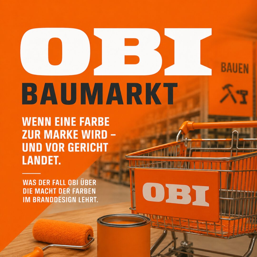
On September 17, 2026, the Federal Court of Justice issued a ruling that extends far beyond trademark law: The home improvement chain OBI has lost exclusive trademark protection for its corporate color, orange (RAL 2008).
The ruling brings an end to a legal dispute with competitors Hornbach and Globus that has lasted for years. At the same time, it raises a fundamental question that is of strategic importance to all companies:
When does a color become a brand’s distinctive hallmark—and when does it remain merely part of the visual language of an entire industry?
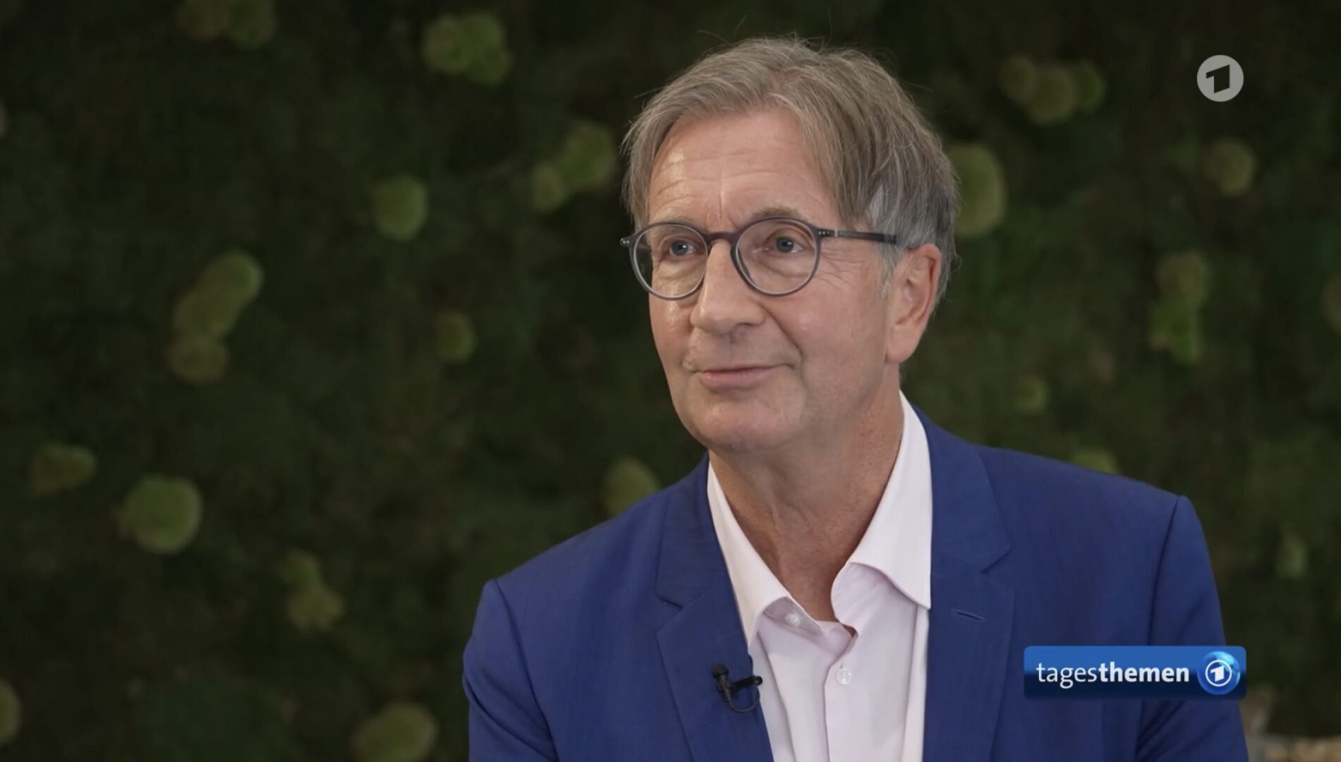
The decision has attracted widespread media attention nationwide. As a professor of visual communication and director of the Institute for Evidence-Based Color Psychology at the University of Wuppertal, I have explained the scientific and strategic background in numerous interviews, including for ARD’s “Tagesschau,” “Tagesthemen,” WDR, and Deutschlandfunk Kultur.
After all, the OBI case clearly demonstrates that color is much more than just an aesthetic choice. It influences how we perceive brands, what expectations we associate with them, and whom we trust.
Why OBI Is Losing Its Orange Color
For decades, OBI has consistently relied on the color orange. Facades, advertising campaigns, retail spaces, wayfinding systems, and promotional communications all contribute to a visually cohesive brand image.
As a result, the color is closely linked to the company’s identity. However, high brand recognition alone does not justify exclusive trademark protection.
In its ruling of September 17, 2026 (Case No. I ZB 58/25), the Federal Court of Justice upheld the decision of the Federal Patent Court. According to the court’s assessment, it had not been sufficiently proven that consumers would unambiguously interpret the claimed orange tone, taken on its own, as an indication of origin pointing to OBI.
Of particular significance were the results of various consumer surveys, as well as the widespread use of orange and related shades by other home improvement chains.
The key insight: A color can trigger strong brand associations without necessarily being clearly associated with any single brand.
The Psychological Dimension: Why Orange Works So Well at the Home Improvement Store
From the perspective of evidence-based color psychology, there is a particularly interesting connection here.
Colors are not merely surface properties. They form a fundamental system of order in our perception, through which we structure our environment, recognize meanings, and prepare to make decisions.
Because of its high visual impact and its culturally acquired meanings, orange has special communicative potential. In a retail context, it can draw attention to offers, convey a sense of dynamism, and signal a willingness to take action.
Furthermore, the long-standing use of similar color schemes in the home improvement market has led to the development of industry-specific perceptual patterns.
The color thus becomes not only a symbol of a single company, but also part of a collective visual heritage.
The paradox: Precisely because Orange is so effective in its communications within the industry, it is difficult to claim this impact exclusively for a single brand.
It is important to distinguish between the general psychological effect of a color and its specific, empirically verifiable brand association. Both arise under different conditions and must be examined accordingly.
Perception is not the same as recognition
Color is one of the first features of our visual environment that we process. It enables us to quickly recognize differences, direct our attention, and locate objects or situations.
This is an extraordinary advantage for brand communication.
Even before a company name is read or a logo is consciously recognized, a distinctive color can already trigger memories, expectations, and emotional responses.
These processes are learned through repeated experiences and can largely take place unconsciously.
However, a distinction must be made between three dimensions of impact:
- Attention: Is the brand even being noticed?
- Recognition: Does the color remind you of a well-known brand or industry?
- Differentiation: Is the color clearly associated with a specific company?
It is only the interplay of these dimensions that makes a brand color a strategically robust identity element.
High visibility does not necessarily mean distinctiveness.
What Telekom’s Magenta and Sparkasse’s Red Do Differently
Deutsche Telekom, with its magenta, and the Sparkassen-Finanzgruppe, with its red, demonstrate that colors can evolve into distinctive brand symbols over the course of decades.
It is not just a matter of how consistently a company uses a color. Equally important are the color’s distinctiveness in the competitive landscape, its repetition across as many touchpoints as possible, and its long-term association with specific brand experiences.
A color can thus become a visual cue that triggers memories of a company even before its name becomes visible.
However, this does not mean that only unusual colors or those not typically associated with the industry can be successful. Rather, the decisive factor is whether the chosen color develops a distinct and sufficiently unique brand identity in the relevant market.
What Companies Can Learn from the OBI Ruling
The OBI case raises a fundamental question about strategic color design:
Should a brand color primarily meet the expectations of the target audience—or should it stand out as clearly as possible from the colors used by competitors?
Both can be worthwhile. However, these two goals are not automatically compatible with one another.
Companies that consistently base their color schemes on their industry may benefit from familiar patterns of perception. At the same time, they risk blending in with their competitors due to visual similarities.
Those who consciously set themselves apart, however, can develop a distinctive brand identity, but must ensure that this new color language is understood and perceived positively.
In my view, that’s why the color strategy should come at the beginning of brand development, not at the end.
The selection of a corporate color should be based on empirical findings regarding perception, emotional impact, target audiences, cultural meanings, and competitive environments.
This is because color influences key factors in business communication:
- Awareness and Brand Recognition
- Emotional brand loyalty and trust
- Recognition and Differentiation
- Orientation and Decision-Making Behavior
- Brand Identity and Long-Term Competitive Positioning
However, color alone does not determine economic success. Its impact is realized through the interplay of product quality, brand experience, communication, and the specific context of use.
The real lesson: Color is a strategic asset
The Federal Court of Justice’s ruling does not prevent OBI from continuing to use orange as its corporate color. It denies the company the exclusive protection it sought for this abstract shade of color in connection with the retail services in question.
This distinction is crucial for brand strategy.
The economic significance of a color does not stem from legal ownership of it, but from its impact on people’s consciousness.
Whether this effect also justifies exclusive trademark protection in a specific case is a separate question that must be answered from both an empirical and a legal perspective.
The OBI ruling makes it clear just how closely the fields of perception psychology, brand strategy, and business law are now intertwined.
Companies that continue to view color solely as an aesthetic design element are underestimating one of the most powerful tools of visual communication.
The key question isn’t which color suits your brand. It’s what perceptions, feelings, and expectations your brand should evoke in people—and how color can help achieve that.
Interviews and Media Reports
September 17, 2026 – Decision of the Federal Court of Justice
- ARD “Tagesthemen”: Federal Court of Justice Ruling—OBI Home Improvement Chain Cannot Claim Trademark Protection for the Color Orange
- ARD Tagesschau: OBI Is Not the Sole Owner of Orange
- WDR Aktuelle Stunde: Federal Court of Justice Rules on OBI – Who Owns Orange?
- WDR: OBI Loses Color Dispute – Orange for Everyone
May 7, 2026 – Report on the oral hearing
- Deutschlandfunk Kultur: “OBI Orange” and “Telekom Magenta”—why are colors important for brands?
- WDR: Who Owns Orange? Dispute Among Home Improvement Stores Before the Federal Court of Justice
Legal basis: Federal Court of Justice, decision of September 17, 2026, I ZB 58/25 – “OBI-Orange.”
Interview 1 with link: “Obi-Orange” and “Telekom-Magenta” – why are colors important for brands? Deutschlandfunk Kultur 7.05.2026
Interview 2 with link: “Who owns “Orange”: Dispute of the DIY stores before the BGH WDR aktuelle Stunde 7.05.2026