Call for help from the intensive care team for premature babies
“Next summer, we will be moving into a new building. Caring for premature babies and their parents involves so much more than “just” intensive care. Unfortunately, we have no lobby whatsoever when it comes to the color scheme. White walls, LED spotlights,…. a dreary experience. Everything will be there in terms of equipment, but what makes up our special care is totally lost. Patients and their parents often stay on our ward for months. Our nursing staff’s hair stands on end……. It’s impossible to create a feel-good atmosphere. Can you give us a helping hand? Can you help us to create a good working atmosphere and give the premature babies a good start in this world?“
Abstract
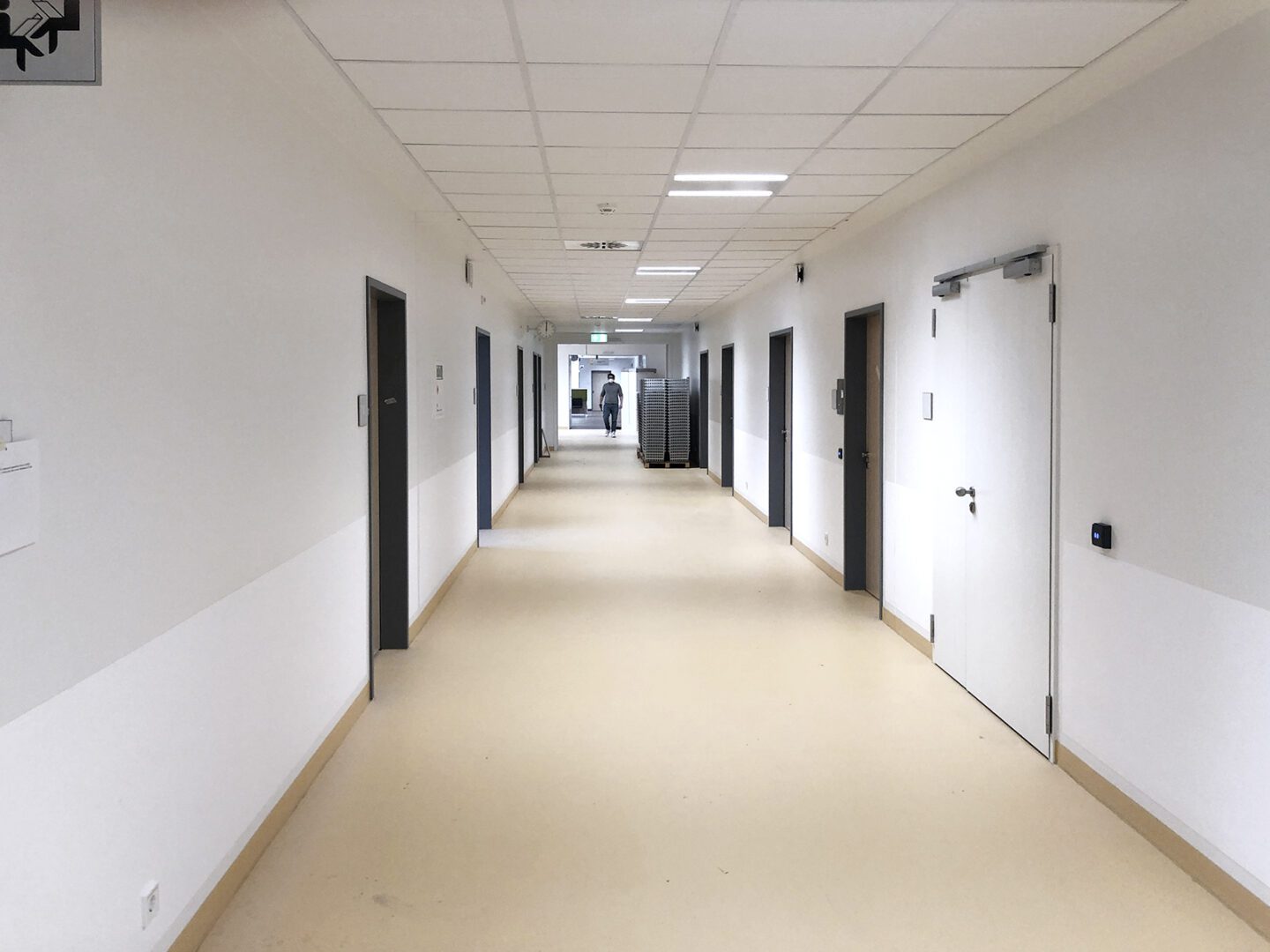
This study examines the influence of color design on the well-being and satisfaction of patients, relatives and staff using the practical example of the neonatology department in the Clinic for Pediatric and Adolescent Medicine at the Klinikum Bremen Mitte. In continuation of our previous studies[i], this was the first time that a new building was available for a study. The color redesign of the neonatology ward in the new clinic building became necessary because the largely monochrome color scheme of the ward (white walls and ceilings and yellow floors throughout) met with vehement disapproval from the medical, therapeutic and nursing staff, which was expressed both verbally and in writing.[ii] The color redesign was carried out in a participatory process according to an evidence-based methodology.
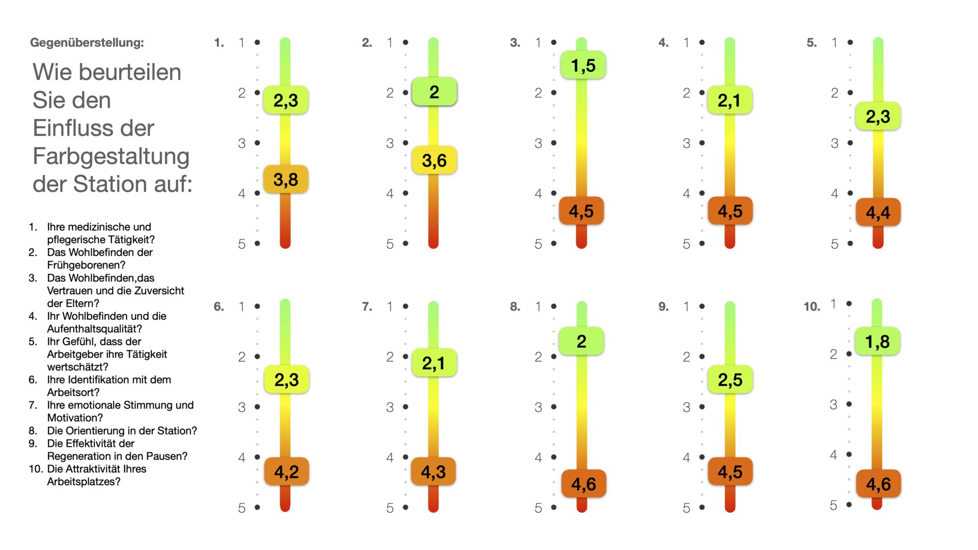
The results of the representative survey of medical, nursing and therapeutic staff before and after the color redesign, as well as the interviews and observations, show significant changes in the experience and behavior of the people affected. The assessment of well-being, quality of stay, emotional mood, orientation and motivation improved on average by 207% from 4.3 (negative) to 2.1 (positive).
[i] Buether, Axel and Wöbker, Gabriele (03/2020). Study “Color and Health” “Assessment of the psychological and medical effects of the environmental factors color and light on patients and staff in the field of intensive care medicine” DOI: 10.13140/RG.2.2.28780.10884
Buether, Axel and Wöbker, Gabriele (03/2020). Helios University Hospital St. B2-2 “Assessment of the psychological and health effects of the environmental factors color and light on patients and staff in intensive care medicine” DOI: 10.13140/RG.2.2.31296.69127
[ii] The rejection of the existing color scheme of the new clinic building was clearly expressed by the staff’s call for help (see attachment), the interview with the medical director (see attachment). The reasons for rejecting the existing atmosphere were stated in the questionnaire and validated by the results of the survey (see table of results).

Results of the study:[i]
- The color scheme is a significant factor for well-being. (Overall result of the survey before the color change from 4.2 rather negative to 2.1 rather positive afterwards)
- White walls do not have a neutral effect, but significantly counteract the well-being of patients, relatives and staff.(The overall result of the survey before the color change of 4.2 is significantly worse than the neutral result of 3)
- The distribution of answers proves that the effects of color in a room can be objectively assessed, planned and used in the structural context of the usage situation for the benefit of the user groups concerned. Deviations in the distribution of the answers prove that the effects of color in the room remain subjective within a range that is tolerable, as it does not significantly impair the success of the design (see graphic).
- The color scheme of the architecture has a positive effect on the medical and nursing activities of the staff if it is needs-oriented and evidence-based. (from 3.8 rather negative to 2.3 rather positive)
- The color scheme of the architecture promotes the well-being of patients if it is needs-oriented and evidence-based. (from 3.8 rather negative to 2.3 rather positive)[ii]
- The color scheme of the architecture promotes the well-being, trust and confidence of parents if it is needs-oriented and evidence-based. (from 4.4 rather negative to 1.5 very positive)[iii]
- The color design of the architecture promotes the well-being and quality of stay of the staff if it is needs-oriented and evidence-based. (from 4.4 rather negative to 2.1 rather positive).
- The color scheme of the architecture encourages staff to feel that their employer values their work if it is needs-oriented and evidence-based. (from 4.2 rather negative to 2.4 rather positive)
- The color scheme of the architecture promotes staff identification with the workplace if it is needs-oriented and evidence-based. (from 4.2 rather negative to 2.3 rather positive)
- The color scheme of the architecture has a positive effect on the emotional mood and motivation of staff if it is needs-oriented and evidence-based. (from 4.2 rather negative to 2.1 rather positive)
- The color scheme of the architecture has a positive effect on orientation in the ward if it is needs-oriented and evidence-based. (from 4.6 negative to 2.0 rather positive)
- The color scheme of the architecture has a positive effect on the effectiveness of regeneration during breaks if it is needs-oriented and evidence-based. (from 4.6 negative to 2.5 rather positive)
- The color scheme of the architecture has a positive effect on the attractiveness of the workplace for staff if it is needs-oriented and evidence-based. (from 4.5 rather negative to 1.8 rather positive)[iv]
[i] A color scheme does not always have a positive effect on users. It can be counterproductive and dysfunctional if it is not geared to the needs of users and is not evidence-based. A study on this issue is currently being carried out. In 2021, Axel Buether was commissioned to redesign the Interdisciplinary Pediatric Intensive Care Unit at Johannes Gutenberg University Mainz, whose color concept had previously been conceived and implemented by an artist. A purely artistic color design can have positive effects for the user groups concerned, but at the same time also carries the risk of failure, which is a legitimate result in art, but is unacceptable in architecture, where the well-being of the users is of central importance in most cases.
[ii] The reasons why the nursing staff arrived at this assessment are explained in the transcribed interview A. The interview explicitly mentions that premature babies react to a pleasant atmosphere, which is determined by the perceptual quality of light and surface colors. The observations we have documented visually also show that colored cloths are used by nursing staff on incubators to regulate the incidence of light and the color quality of the light in the immediate vicinity of the child even more finely. Our previous studies listed under 1 and 2 show that adult patients also benefit from a color scheme if it is needs-oriented and evidence-based.
[iii] We saw the greatest improvement in this question, although we did not ask the parents directly. The reasons why the nursing staff came to this conclusion are explained in the transcribed interview B. It is stated here that parents often spend weeks to months in the ward with their premature babies and are under extreme stress. Here, the effect of a confidence-building feel-good atmosphere and the intuitive form of orientation using the color coding system from any location in the ward to your own child is particularly noticeable.
[iv] Here we were able to achieve the second greatest improvement, just behind the well-being of the parents. The assessment in the questionnaire is consistent with statements made in the interviews with staff.
Please indicate when citing: Prof. Dr. Axel Buether, Dr. Hans Thorsten Körner. Influence of color design on the functionality of new hospital buildings, in particular the well-being of patients, relatives and staff in the field of neonatology. 18.10.2022 DOI: 10.13140/RG.2.2.22488.16645
Conclusions and outlook
On the connection between well-being and health:
The WHO constitution defines health as follows: “… a state of complete physical, mental and social well-being and not merely the absence of disease or infirmity.”[i] Our study shows that the white wall design of the newly built ward counteracts the intended purpose, as it significantly impairs the well-being and, according to the WHO definition, also the health of patients, relatives and staff. A clinic whose atmosphere significantly impairs the well-being of the people in it is dysfunctional.[ii] The interplay of light and surface colors contributes significantly to the atmospheric effect of built spaces, whereby the interactions of all sensually perceptible environmental factors such as the smell of cleaning agents and the evaporation of building materials, the acoustics of the surfaces and the noise level of the rooms, the quality of the food and, above all, the degree of human attention and friendliness must be taken into account.
In summary, it can be said that not using a needs-oriented and evidence-based color scheme causes a number of problems for the people affected and for the hospital as a whole, which cannot be justified either ethically or economically. The costs for a needs-oriented and at the same time evidence-based color design are hardly calculable compared to the construction costs, and are negligible compared to the total costs of planning. This project was essentially made up of 2 factors: a) the development of the color concept and b) the repainting of the wall surfaces, which in this case only had to be done a second time because a needs-oriented and evidence-based color concept was dispensed with the first time.
In interviews and conversations, it was repeatedly mentioned that the built space itself has functional deficiencies, such as a lack of views from the interior corridors and the adjoining support points to the surrounding greenery or the sky. Studies show that such relationships have positive effects on people’s health.[iii] It follows from this that a needs-oriented and evidence-based color concept should accompany the design as far as possible, whereby important parameters must be worked out in advance, such as health-promoting views of the colorfulness of the surrounding nature, the sky, green space or water or the creation of an outdoor space design that enables the planning of such views. Color is an essential component of evidence-based healthcare construction, which also has many other important aspects, as demonstrated by recent publications from the field of architectural psychology.[iv]
[i] Preamble of the WHO Constitution of the WHO 1948 (quoted from WHO 2020, p. 1)
[ii] Abel, A. (2020) Architecture and health. Needs-oriented architecture using the example of a Maslow metamodel. Weimar, Germany: Faculty of Architecture and Urbanism Bauhaus University Weimar
[iii] Ulrich RS, Simons RF, Losito BD, Fiorito E, Miles MA, Zelson M. (1991) Stress Recovery During Exposure to Natural and Urban Environments. J Environ Psychol 1991; 11: 201 – 230
[iv] G. Koppen and T.C. Vollmer (2022) Architektur als zweiter Körper, Gebr. Mann publishing house