Longing for a beautiful, ideal world
The trend colors in 2020 are an expression of fundamental fears and longings that have gripped many people in the face of advancing climate change, the crippling coronavirus pandemic and the looming economic crisis. Such crises not only awaken massive fears about the future, but also the dream of an intact nature that gives us security and stability. Experiencing nature, natural products and natural colors are the megatrend today! This applies not only to sustainable, high-quality products, but also to the design of a crisis-proof environment in which we can live healthily, feel good and develop freely. In this age of advancing globalization and digitalization, the concept of nature is once again being used as romantically as it was at the beginning of industrialization, when natural philosophers such as Jean-Jacques Rousseau praised the simple rural way of life and many city dwellers were drawn back to the countryside. But are we really romantics when we dream of a world in which we coexist with nature in a mindful, peaceful and respectful way?
The end of white modernism
Nature is our home, our ancestral habitat. Who asks whether our ancestors were really so much better off there than we are here and now? We must therefore redefine our relationship with nature from the ground up, without completely questioning the achievements of modern societies. This also applies to the selection and use of colors in product and interior design as well as in urban planning and architecture. The sterile white of technological modernity and the lifeless gray of extensive infrastructure structures have become a symbol of alienation. There are plenty of examples of this, such as forbidding hospitals, precarious residential areas and desolate housing estates as well as omnipresent concrete and asphalt surfaces. Equally problematic are a large number of synthetic colored paints, which we now produce at low cost, replace at short intervals and dispose of. This not only consumes valuable resources, but also generates unimaginable amounts of waste. Even more dangerous for humans and the environment are the dyes that we cannot see with the naked eye, such as nano-dye particles, which can already be detected in every liter of seawater and cause considerable damage to the health of humans, animals and plants. We need colors that are good for us and do not harm the environment. This applies not only to the color material, but also to the perceptible color impression. Every effective color design is applied color psychology!
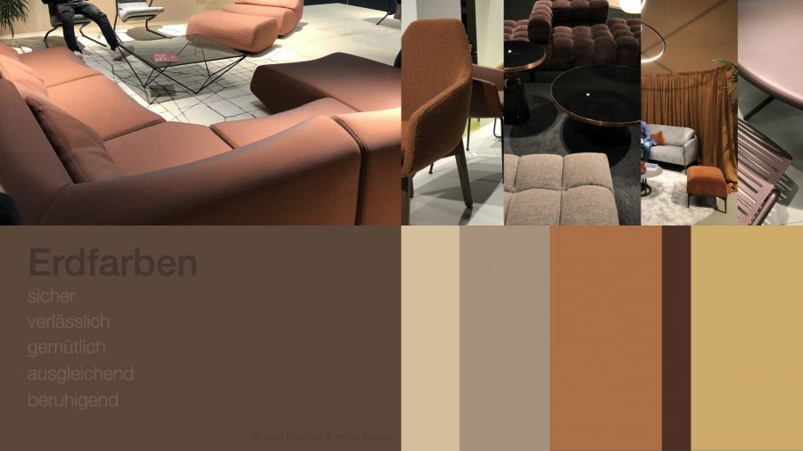
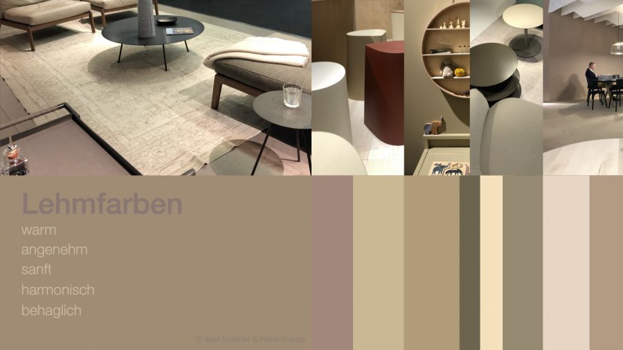
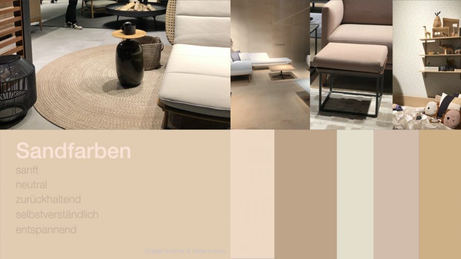
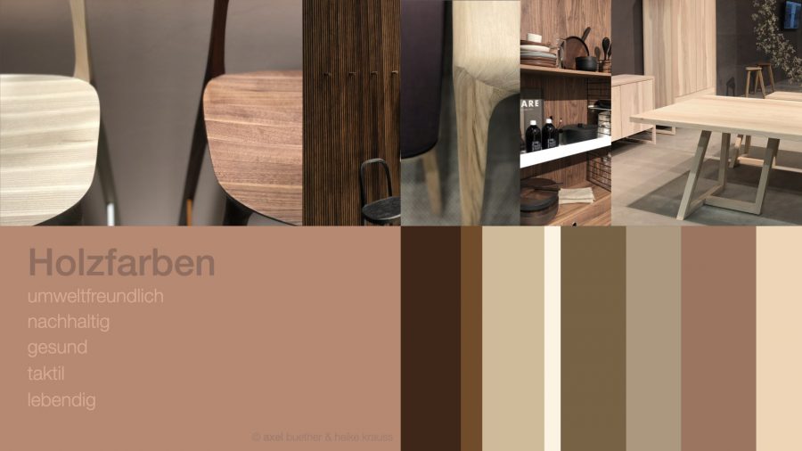
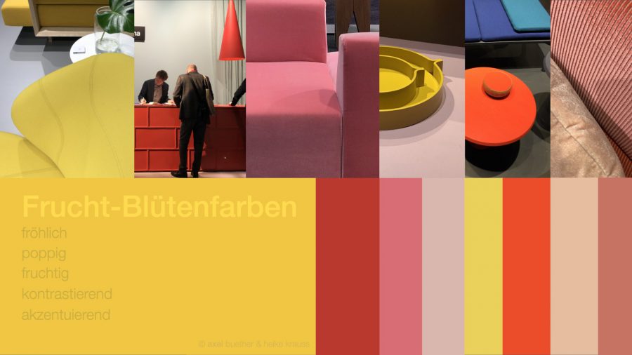
Back to natureColorfulness
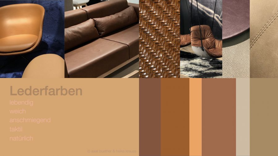
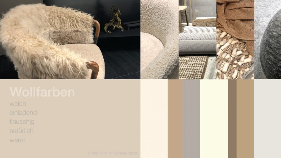
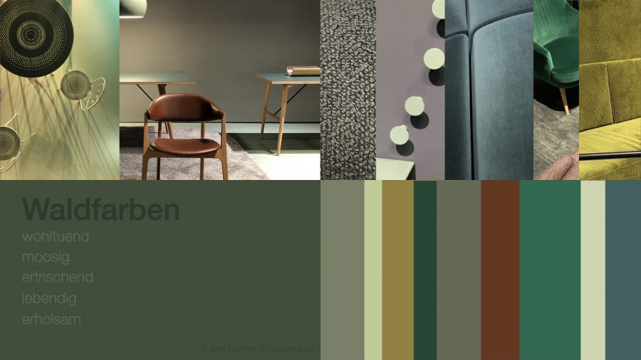
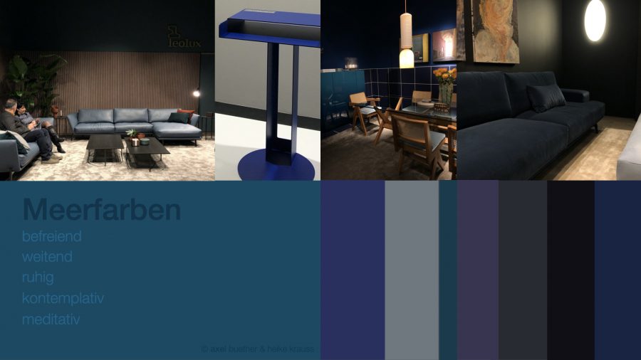
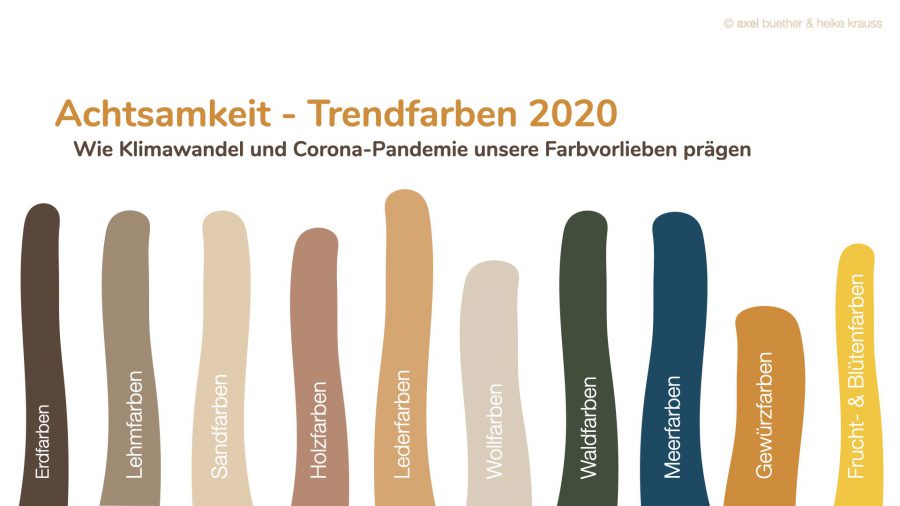
There have never been as many natural colors as there are today. Earth tones, clay tones, wood tones, sand tones, leather tones and wool tones promise pleasant touch experiences at the mere sight of them and stimulate feelings of safety and security. Natural brown tones create a cozy, homely atmosphere. However, where it is too “at home”, products and interiors quickly appear stuffy and old-fashioned. Shades of brown are classics in home and clothing colors. Stimulating natural colors effectively provide refreshment, accents and contrasts. The bright colors of flowers and fruits not only delight us in the garden, but are also ideal as accent colors for products and rooms. The aromatic palette of spice colors such as curry gives things and rooms an exotic touch. Dark natural colors such as deep sea blue and shady forest green, on the other hand, create an atmosphere of calm, relaxation and contemplation in the room. They absorb a lot of light and thus promote feelings such as tiredness and deceleration. Natural colors offer us a maximum of inner harmony, as they always fit together perfectly “by nature”. Our visual perception has developed in interaction with the colors of nature. Is it any wonder that we feel most at home in the face of these diverse hues, color tones and nuances?