If you take the effect of colors
on people, especially pregnant women and newborns, what color should a delivery room be?
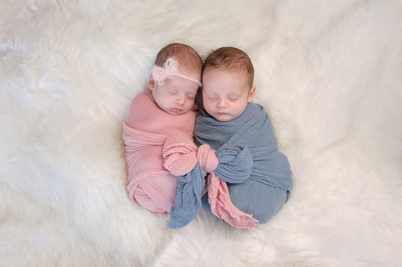
What does a baby see when it is born? It does not locate the first colors in space at all, but perceives them physically, more like a scent, like an impression that lies on the retina. A very bright light then acts like a blow to the baby. It comes out of the darkness. The delivery room with its bright light is not perceived as a room, but as if a bright flashlight is being shone in our eyes. A delivery room that is too bright is the worst possible room for a child to be born in.
Babies are confronted with light in utero and can perceive light in the womb. With our own child, the midwife used a flashlight to try to motivate a turn in the womb. However, the light arrives in the womb as warm, very subdued, it is more of an orange-violet, because the cold waves are filtered out. There’s no sign of yellow yet – the child only learns about the sun later.
Colors and light therefore always belong together in the view. If you talk about colorlessness, then that would be something transparent. As soon as something gets a body, it has color. We humans get it pretty quickly that we need colors – not transparent surfaces like glass plates.
So what gives a child a sense of security?
That would be a darkened orange-violet. But in the delivery room I have to ask myself the question: Am I creating a comfortable atmosphere for the baby or for the woman giving birth? For them, you would want to increase the activity level in certain phases so that the mother is more alert. You need a different color for this.
Basically, I have to think first: What do I need? What kind of people am I addressing? Who comes here? It’s also a question of the color home – which is different for someone from the south of Italy than for someone from northern Germany.
If you had to design the color scheme of a midwife’s practice, how would you go about it?
Let’s start in the entrance area: This is to some extent the business card for the practice. What message do I want to send out here? What are important characteristics that define me and that I want to communicate? You have to define whether you want to emphasize the safety factor or the softness.
At reception, it’s all about the question: How do I welcome a person? It is also important that I do not design everything in the entire practice – from the entrance area with the reception desk to the birthing room – in the same way. I need a change of atmosphere, it should become more secure. This means that the reception area can have a high level of activity and the birthing room a maximum of security.
The birthing room is the center of the practice. To create optimal conditions for the birth, I would paint this room orange-purple and tint it heavily. However, I would not advise painting the entire practice orange. Also not in pure colors, but always use a gray.
The wall colors should therefore always be tinted, which would correspond to nature. A natural green, which is good for us, always contains a little bit of red. If you want to use pure colors, you can do this better with curtains, but also with the furniture or objects in the room.
The floor should convey safety. A wooden floor would be ideal for this, but there is also the practical side to consider: the floor must be easy to keep clean. Ochre tones, earthy or sandy colors can be used to imitate the look of wood.
The ceiling, on the other hand, should be much lighter in color than the floor and walls. Not pure white, but a very light, sandy tone that looks almost white would be suitable. You could also warm it up with a hint of orange.
You can find the entire interview and more in the magazine LUCINA Magazin zur Traditionellen Lehre der Hebammen- und Entbindungskunst