On news sites, at the Robert Koch Institute, on the federal government’s overview page: one color currently dominates the presentation of corona incidence values. Red. This does not always help with understanding.
Excerpt from a contribution by Sarah Unterhitzenberger and Benedict Witzenberger
A recent example shows just how emotional the debate about colors in corona graphics is at the moment: The “Tagesschau” recently faced accusations of manipulating color scales to make the incidence values appear worse than they actually are.
The news program had published two maps of Germany with incidence values per district on its Instagram account. In March, the counties with an incidence of over 50 were colored orange on the map; in April, these counties suddenly turned red. According to the Tagesschau, this was due to two different playout channels: The lighter color scale was intended for television, the darker one for the website.
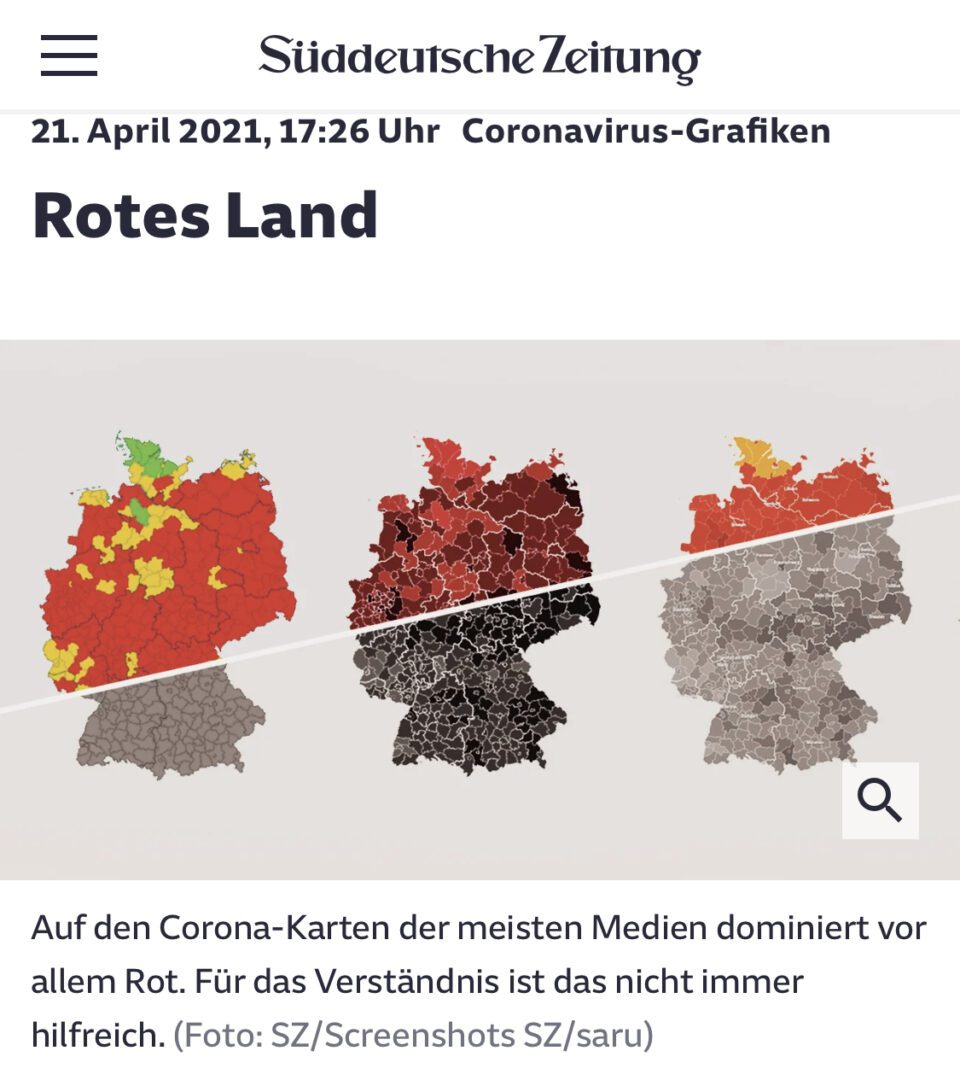
The corona cards are getting redder
The sequence of the traffic light colors green, yellow and red is clear worldwide. The logic of “good, medium, bad” is therefore also used in many coronavirus maps. However, the non-red areas in maps of Germany are currently becoming fewer and fewer. This is because the number of new infections is increasing and the threshold value with an incidence of 100, which should be particularly emphasized. Because many maps have already used all shades of red in the first wave, the numbers assigned to the colors have been moved further up since the fall. The cards are increasingly becoming a red spot. A situation that Axel Buether finds problematic: “You have to think about whether you can visually shout for help every day.” As a result, the red loses its effect on many people. They get used to it and the red cards no longer change their behavior. On the other hand, there are also people who are put into a state of panic by the large red cards, a kind of permanent alarm.
Link to the full article in the Süddeutsche Zeitung