Color is the medium of our reality. What (color) world do we want to live in?
With the growing flood of threatening reports that haunt us from the moment we wake up until we fall asleep in times of coronavirus, the desire for a healthy world is growing. Digitalization is changing the way we communicate, and therefore also the way we perceive the reality of our lives. The incessant stream of images that reaches us every day via smartphones, smart TVs, notebooks, tablets, desktop PCs and games consoles transforms our consciousness and our being. Nothing remains as it was and is. Everything is in flux. Colors are the material of our inner and outer images, our perceptions and ideas, which also give meaning to the words of our language. The era of digitalization has long since begun, but the effects of the social transformation have never been as visible and tangible as in times of the coronavirus pandemic. Topics such as “Smart Cities”, “Smart Homes”, “Artificial Intelligence”, “New Work” and “New Learning” are no longer just theory for more and more people, but part of everyday life. What kind of world do we want to live in, what kind of future do we want?
69 billion colors in the Smart TV. Waste or an expression of our longing for authenticity in the simulation?
Worldwide media consumption currently amounts to over 8 hours a day. Our lives appear as an endless succession of visual worlds, between which we switch at ever shorter intervals by “touch”. Images consist of colors, many colors, 16 million colors for conventional televisions and computer monitors (8bit SDR), 1 billion colors for modern 4K devices (10bit HDR), 69 billion for Dolby Vision (12bit HDR). Can you see that, you might ask? Nothing is as convincing as a self-experiment. It’s best to see the effect of the color explosion for yourself, because it’s probably only a matter of time before the new color standards for smart TVs become established anyway. HDR is already standard in new MacOs and Android photos.
The greater color depth not only makes images appear sharper, more detailed and more spatial, but also more real, more vivid and more emotional. This creates authenticity, and that’s what matters to us! This is why these technological standards will prevail, even if data volumes and energy consumption increase exponentially with every bit of color depth. Why do we strive for authenticity in the digital world? Quite simply, look at the sea through HDR-enabled 4K VR glasses and compare the impression with the original? Nothing touches, captures and moves us more than reality! This insight has never been as clear to us as it is today, when our lives are increasingly becoming a simulation. Today, colors must therefore be authentic above all, matching the character of people, the properties and intended use of products and the content of our statements.

With freedom comes the death of security, the basic trust in the values and stability of modern societies. Which colors fulfill our need for a beautiful, intact world?
We use far more colors than ever before in human history, not only in the digital world, but also in the analog world. Our color culture is not only becoming richer, but also more diverse. Global migration movements ensure that people from different cultures perceive and encounter each other. Even more exchange takes place on the Internet. Globalization is creating a constantly growing range of products and services that is also becoming increasingly diversified. Where there is unmanageable diversity, the need for recognizability, for an unmistakable identity, increases. Colors create identity and provide orientation in complex environmental situations, because that is precisely their evolutionary function. The corporate identity of companies, products and services is therefore increasingly becoming a color identity to which we relate other formal features such as design and typography.
The transformation of countless regional color cultures into a global color culture shows how strongly we are already networked with the world today. We perceive a greater complexity in our living environment, even if we are only traveling virtually. We no longer view our world in regional or national terms, but as a global phenomenon. Awareness of global climate change, threats from epidemics, wars and scarce resources is omnipresent. Children refuse to go to school in order to save a world whose vulnerability suddenly seems completely real to them. Colors are always an expression of the themes that most strongly move people and societies of a particular era. The coronavirus pandemic is not only causing fear and hardship, it is also making us more aware of the signs of globalization and digitalization than ever before.
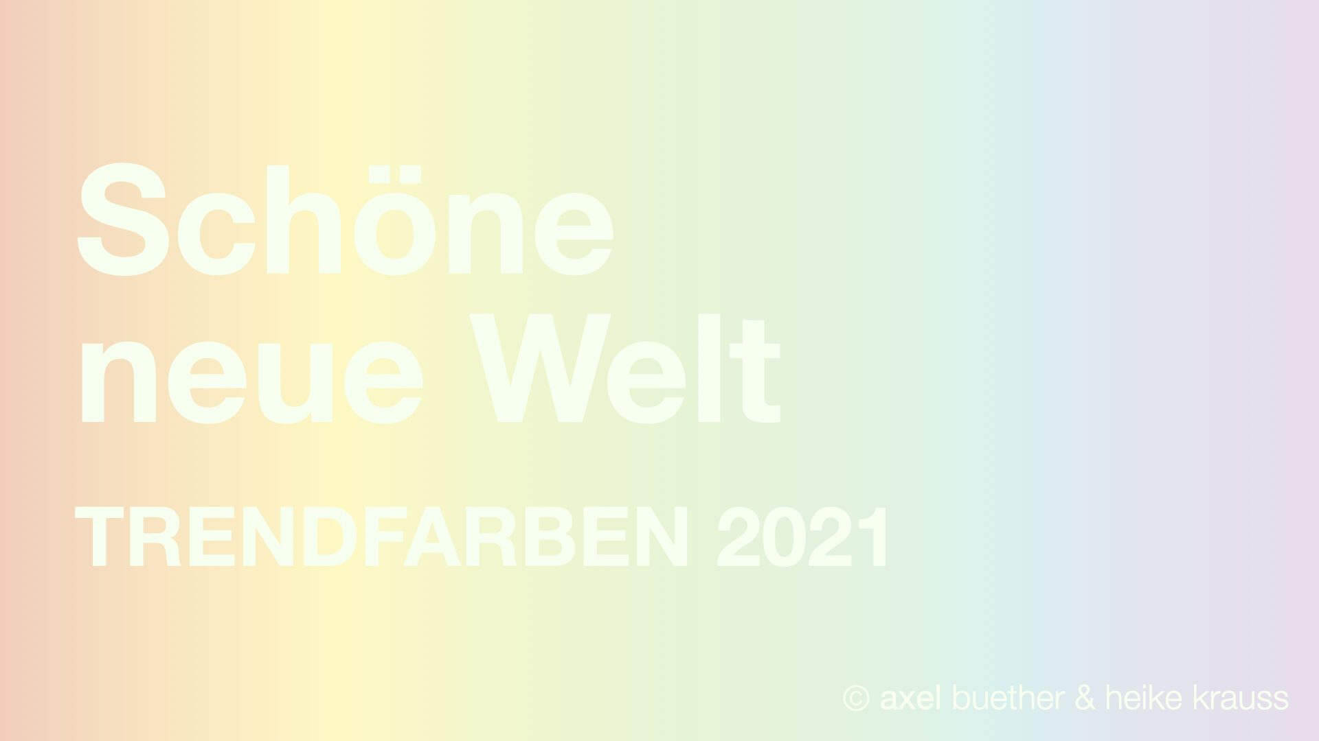
The trend colors of 2021:
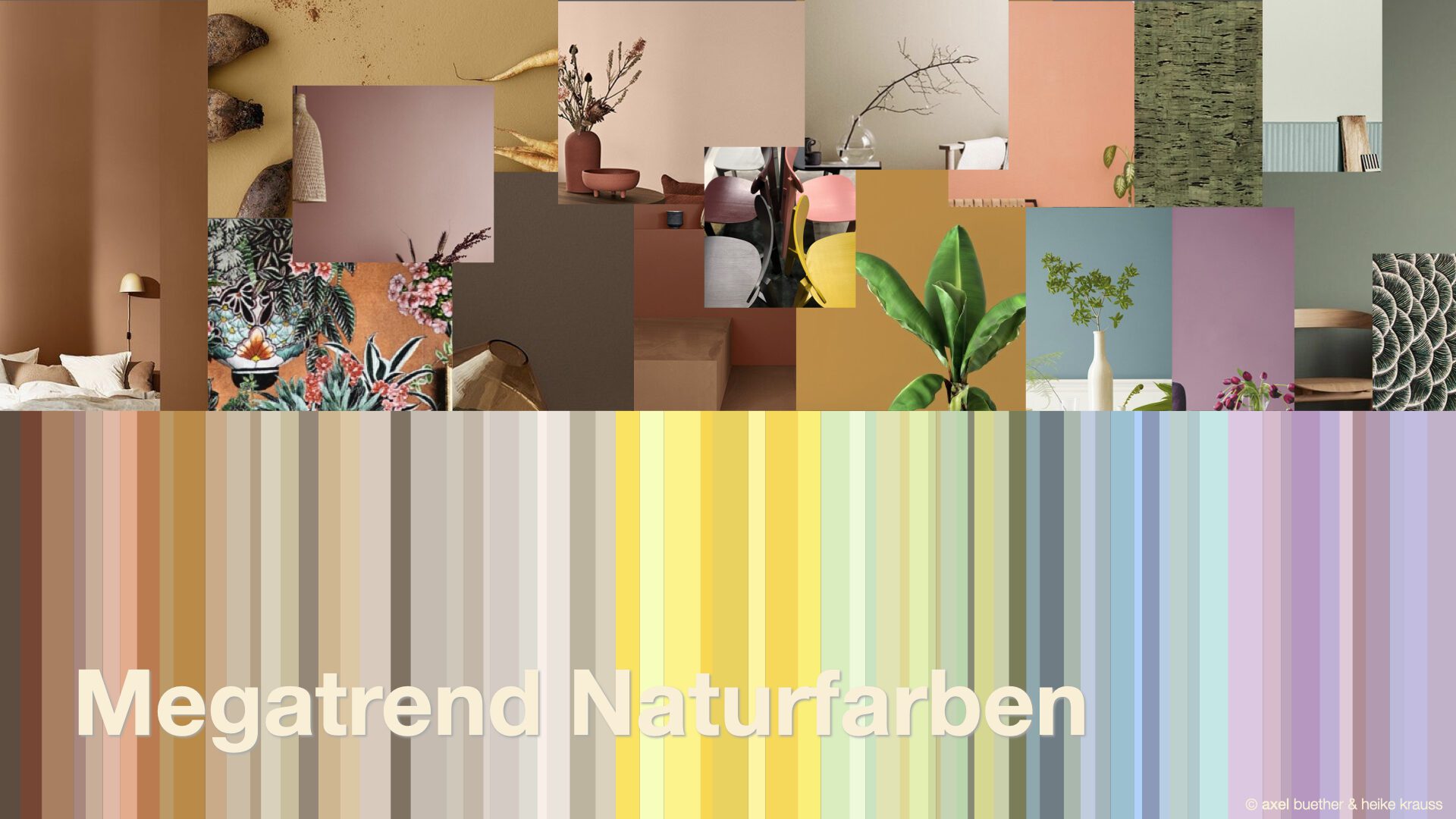
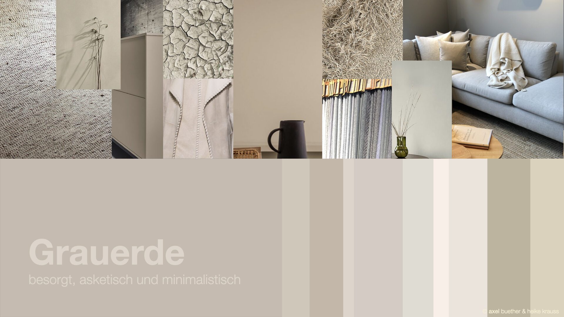
Greige – minimalist, ascetic and concerned
Warm shades of gray, mixtures between gray and beige, are becoming increasingly important in fashion, product design and interior design. Greige is a sustainable color that can be used independently of short-term fashion trends and flexibly combined. Greige enhances every color and is therefore also a wonderful base color for strong accents. In contrast, achromatic shades of gray such as ash gray, which lack any trace of life, appear dull and pale. Those who choose Greige are not turning their backs on life, but remain travel-loving, sociable, health-conscious and well-connected despite their attitude. Without a colorful accent, Greige seems like an act of self-restraint, of minimalism, which can serve as a warning to less environmentally conscious contemporaries, whether intentional or not.
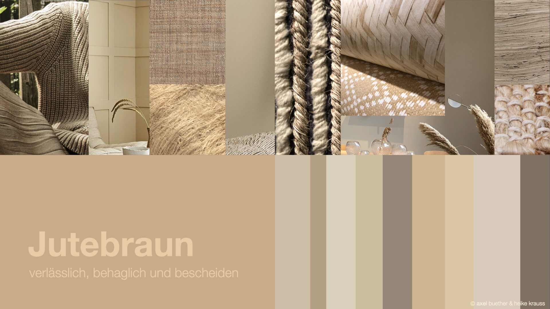
Jute brown – reliable, cozy and modest
Authentic brown tones from the spectrum of natural colors are particularly interesting for health-conscious people who are looking for an antidote to the stress and fast pace of everyday life, who appreciate relaxing physical activities such as yoga, a healthy, varied diet and long walks in the great outdoors. We perceive colors with all our senses. Brown is a sensually stimulating color. The brown tones of natural materials such as jute, hemp, wool, fur or leather evoke a pleasant tactile experience, as do brown sand, clay and earth tones. The spectrum of brown spice colors such as curry, saffron, cinnamon and cocoa, on the other hand, stimulates our taste buds. Colors are a matter of taste, and it’s all about the right associations. Colors from the rich spectrum of natural brown tones provide authenticity for themes such as well-being, health and environmental protection.
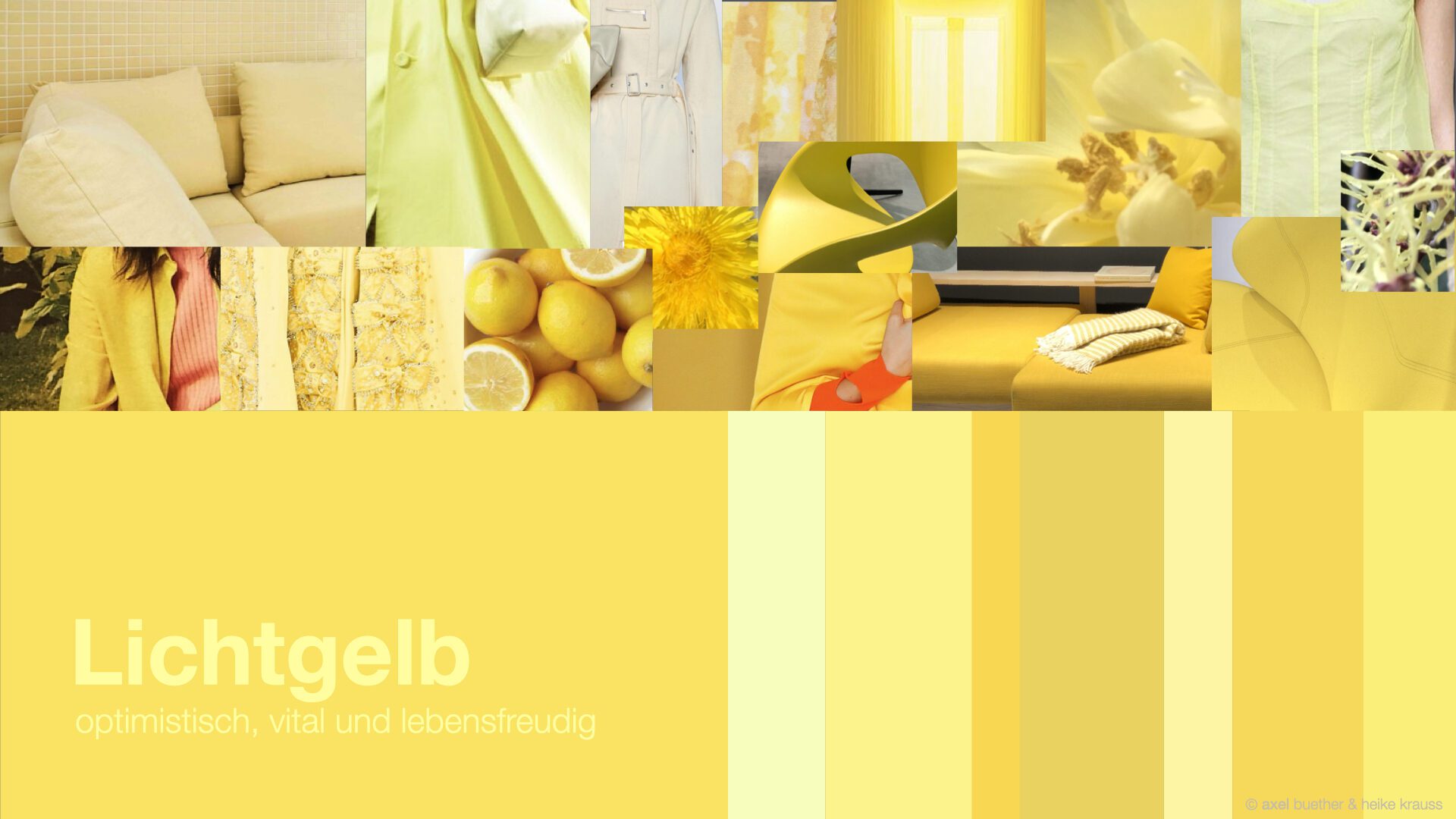
Light yellow – optimistic, vital and full of life
As the coronavirus pandemic loses its menace and restrictions fall, we want to enjoy life to the full again, now more intensely and consciously than ever before. Many people are hoping that the time will come as early as spring 2021, when the light and therefore the immune system will be stronger again. Corona worries or not, the annual color spectacle will reliably provide feelings of happiness again this year. The coronavirus pandemic has opened our eyes to the beauty of the world, the pleasures of the senses and the transience of our existence. Yellow is the symbolic color of joie de vivre, which gives us strength and radiates optimism. The purer, brighter and more radiant, the lighter, happier and more vital we feel.
Lime green – lively, relaxing and hopeful
Green is the middle ground, the color of balance and equilibrium, the global symbolic color for topics such as health and environmental protection. In times of the coronavirus pandemic, when people are worrying about their health on a daily basis and spending more and more time in nature, preserving the “green lung” is becoming a matter of survival. Green is our ancestral color home, whose unique beauty we only become painfully aware of when we lose it. Wherever we can, we bring this soothing atmosphere indoors, with views of “greenery” such as gardens, forests and parks. Where this is impossible, we make do with green home textiles, furniture, accessories and wall paints. Vegetable green tones are the classic room colors, but they should not be too bright, as this can have a toxic and off-putting effect. Mineral colors look the most natural, especially in shades of gray. Dark natural shades of green such as fir green or pine green have a calming effect on stressed nerves, while lighter shades such as lime green have a youthful, vital and activating effect.

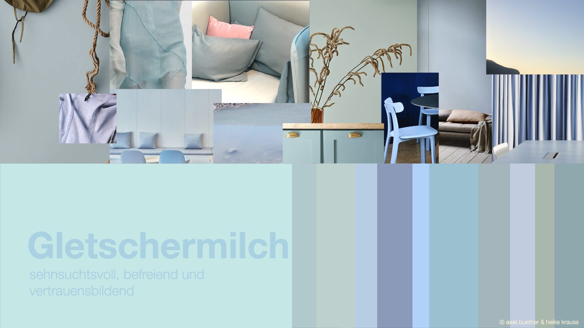
Glacier milk – longing, liberating and confidence-building
The fresh turquoise-blue color of large glaciers is increasingly becoming a symbolic color for climate change. Reports about the melting of large masses of ice spread fear and terror, which makes the color even more precious to us. Blue reflects our longing for vastness and the sea, our urge for boundless freedom, qualities that a bright blue sky signals to us. Pure, highly saturated, glossy blue tones create a cool and fresh atmosphere, an effect that can be further enhanced by combining them with white. The cloudy turquoise-colored runoff water from the glaciers is called “glacier milk”. If you are looking for an effective color tone for your home office that promotes alertness and alertness as well as mental concentration, and yet is friendly and homely, this grayish light turquoise tone is recommended. With a clear change of atmosphere to the living, cooking and sleeping areas of the home, overwork symptoms such as burn-outs can also be reduced in a natural way. Those who like it cooler, cleaner and fresher, whether on their clothes or in the room, can do without the gray component altogether, because as soon as the particles of “glacier milk” have settled, large bodies of water such as mountain lakes or the sea appear in a radiantly fresh and ice-cold turquoise blue.
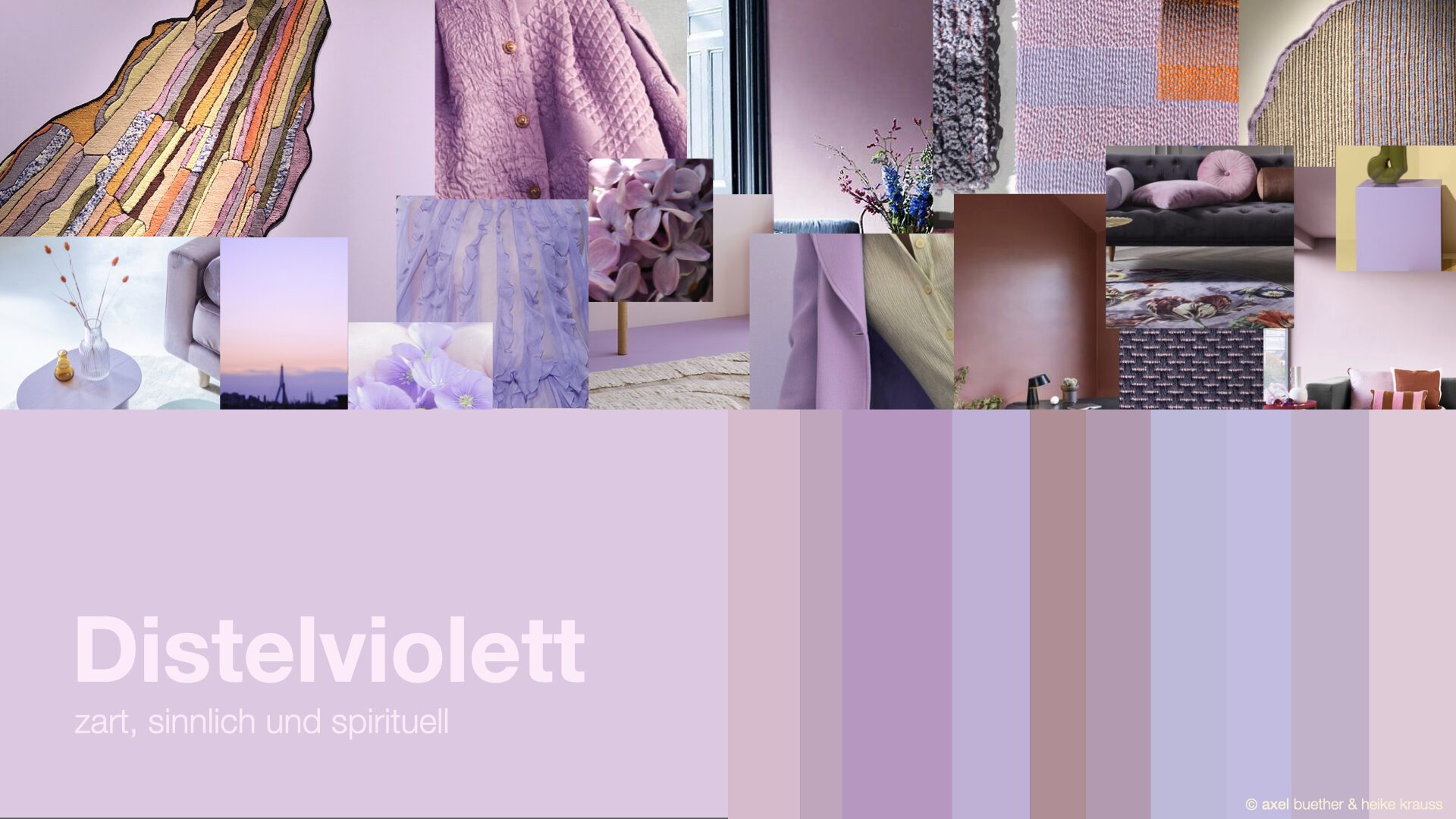
Thistle violet – delicate, sensual and spiritual
The rich spectrum of violet plant colors, which can appear delicate and pastel, but also powerful and magnificent, ensures vitality and joie de vivre. Think of the many tasty and healthy purple berries, fruits and vegetables that we benefit from every day! If you are looking for beautiful and inspiring shades of purple, then also take a look at the flowers of violets, lavender, amaryllis, anemone, tulips, bellflowers, cranesbill, lilies, deadly nightshade, aconites, thistles and orchids. The enchanting flowering plants use their magnificent color palette as a lure as well as their irresistible opulent fragrance. Not only insects, but also we are magically attracted to them. Pastel violet tones are ideal for interior design, while pure berry tones are ideal for accentuating individual surfaces, furniture and accessories. We can also benefit directly from the vitality, sensuality and joie de vivre of the violet spectrum through our clothing colors. Violet increases attractiveness. This applies not only to women, but also to men, who look much softer, more open and smarter in purple clothing.
The secret of exciting color effects lies in the color composition
If you are looking for exciting color combinations that still look authentic and natural, you can easily combine the minimalist greige or the modest jute brown with bright, pure colors such as light yellow, lime green or glacier blue. The overall impression, the color composition, is important. Greige and jute brown, which exemplify natural, stimulating brown tones, are very suitable as base colors that take up the largest proportion of the composition. Bright colors, on the other hand, are accent colors that should always be used sparingly, as this is the best way to make them stand out. There are many parallels to cooking in terms of color design. Every color concept needs a basic theme, a foundation, like a good meal. All other colors should be selected so that they reinforce the basic theme. Greige or jute brown are ideal as base colors for an outfit or living space. However, these colors only reveal their full beauty, simplicity and naturalness when they are combined with an accent color such as light yellow, lime green or glacier blue. You have a successful color composition when all colors enhance each other.