Over the past ten years, intensive care medicine in Germany has become much more modern, which has led to more and more patients surviving. The other side of the coin, however, is that a third of the survivors suffer from cognitive, physical and psychological disabilities, some of them for the rest of their lives. To prevent this from happening, Charité – Universitätsmedizin Berlin and Helios University Hospital Wuppertal have redesigned their room concepts for intensive care units in terms of lighting and color design and provided scientific support for the projects.
The results not only provide information about the effect of light and color on patients, they will also play an important role in the design of future intensive care units.
Four intensive care units in Wuppertal redesigned
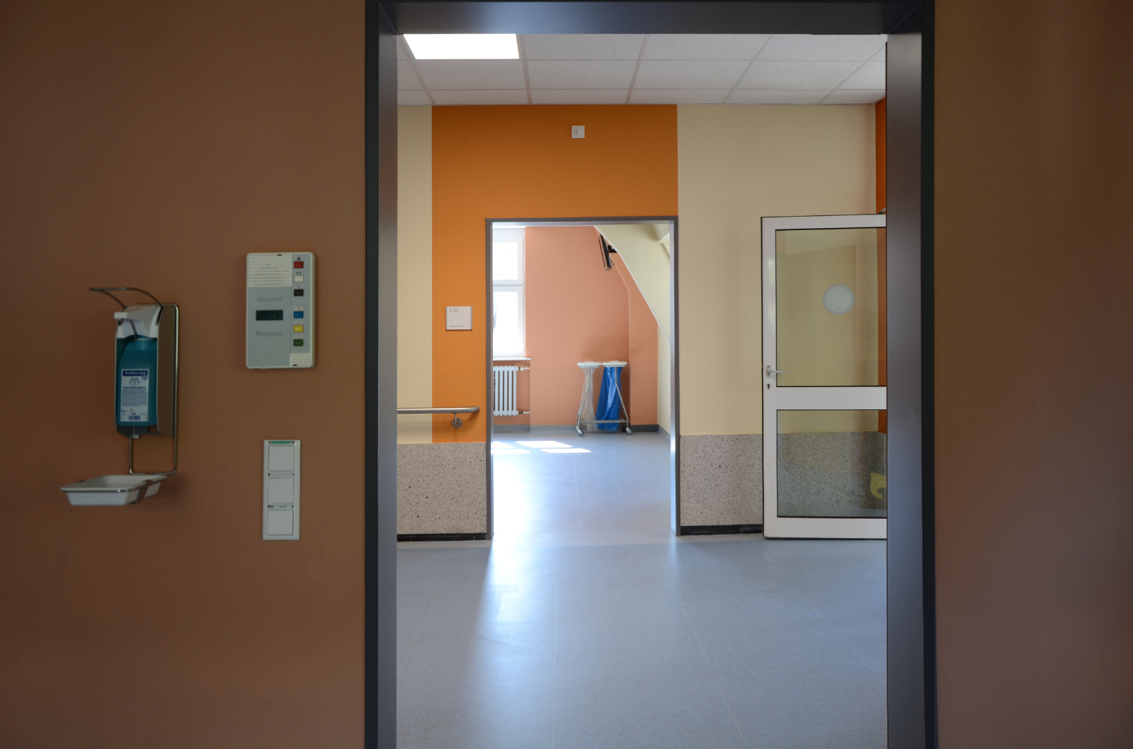
The Helios University Hospital in Wuppertal is already one step ahead in this respect: in 2016, employees began redesigning four entire intensive care units to prevent delirium wherever possible and increase the well-being of patients. To this end, the intensive care clinic headed by Dr. Gabriele Wöbker contacted the Central Institute for Color in Science and Design at the University of Wuppertal: “The intensive care units had to be painted as part of the usual renovation work, so it was a good time to think about new color concepts,” explains the head physician at the intensive care clinic. Prof. Dr. Axel Buether teaches “Didactics of Visual Communication” and was immediately enthusiastic about the idea: “I found it exciting to research the influence that space can have on the patient’s state of health.”
To do this, Wöbker and Buether first determined what effect each room should have on patients and staff. It was important to both of them that the employees also benefit from the redesign. Then it was time to choose the colors. Buether explains: “People need colors that create a boundary and give them stability. Yellow, white and light blue don’t achieve this, so you quickly feel lost in a room painted in these light colors. However, a color must also reflect light in order to counteract constriction. Sandy tones are body colors. They reflect enough light and still offer the eye enough support.” For this reason, one ward opted for earthy green, yellow, brown and red tones that convey a sense of security and safety to patients. It was important to the team that the corridors were given a much cooler and brighter color scheme and lighting to highlight the difference between a quiet patient room and the hustle and bustle in the corridors. “People automatically behave more quietly when the environment feels more personal and homely,” explains Buether. “For staff, on the other hand, it is important to experience a change of atmosphere after a highly stressful work situation in order to be able to switch off more quickly and extend the recovery phase.” That’s why cleaner, fresher colors such as apple green and light wood tones were used in the staff rooms to promote relaxation.”
Stimulating and calming color scheme
Each ward and each room is designed differently, adapted to the respective clinical pictures. “Depressed patients need uplifting and stimulating colors, while suicidal patients need to be soothed by colors,” says head physician Wöbker. To enhance the color effects, energy-saving lamps were replaced with LED lights with different color temperatures at all stations. “LEDs have a higher color rendering index and therefore reproduce room colors more naturally. Energy-saving lamps, on the other hand, make colors look unnatural, faces appear colder and make social communication more difficult. Replacing the lamps was therefore an important addition to the color scheme of the walls,” says Buether. Light sources were used in the corridors to imitate the light at midday, and warm white light was installed in the rooms to create a friendly atmosphere. In one sample room, the team even had biodynamic lighting from Trilux installed, which replicates the day-night rhythm. “It’s even quieter in this room and the patients find their inner clock again,” says Wöbker enthusiastically. She would like to implement this design in every intensive care room in the new building.
Study results prove effectiveness
The chances of this are not bad, as the Group has already incorporated the color and lighting concept into the Helios building recommendation. The results of the study, which was carried out over a period of nine months before and after the redesign, were one of the decisive factors. For example, using the school grading system, employees were asked to indicate how satisfied they were with their workplace. Before the redesign, the average score was 4.1, afterwards it was 2.0. The sickness rate also fell by 36 percent and the consumption of medication was reduced by an average of 30 percent across all the redesigned wards.
Buether hopes that knowledge of the effect of atmospheric factors will be incorporated into architectural training. “Unfortunately, this has not yet played a role. In view of the study results, however, this is almost negligent.”
Read full article by Sonja Buske – healthcare-in-europe