Prof. Buether, in the first part of our interview, you began to talk about the topic of color home. Does our color origin last a lifetime?
Axel Buether: It remains, but is enriched thanks to the experiences we have in the course of our lives – with other people or regions. They transform the perception of color. Anyone who travels a lot or spends a long time in foreign countries will discover and appreciate new color cultures. But childhood colors always remain special colors. Those who open themselves to other impressions also become more open to new color tones. We are also able to be enriched by other cultures, our interests, travels, magazines, books or films. For example, we might adopt Provencal, Indian or Tuscan color schemes. These changes happen all the time – and that’s how it should be.
In addition to regional color preferences, are you also talking about temporal color preferences?
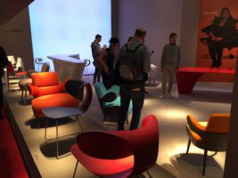
Axel Buether: Every era has its own canon of colors. For example, we associate the thirties, forties and fifties with very specific colors that are associated with fashions, trends, etc. Today there is more momentum in this development. Marketing acts as an accelerator. Color collections and fashions change more quickly. Here, too, the outstanding importance of color is evident: a fashion brand spends 70 to 80 percent of its energy on its color selection. The product shapes remain comparatively more stable than the colors. This also corresponds to our behavior as consumers: People buy something new because they have the impression,
that the old colors no longer fit – not so much because the old things are worn out. Colors are a huge driving force for change – this also applies to expensive consumer goods such as cars and living environments today.
Does this mean that a change of color is also good for senior living areas from time to time?
Axel Buether: For these reasons, it is generally advisable to paint more often than necessary. Incidentally, the color concept includes not only ceilings and walls, but also furniture, floors, doors, windows and lighting. In nursing and retirement homes, the color renewal is very interesting at least for the reception area, which is also used by the general public, relatives and employees. At this interface with society as a whole, where trends and fashions come from, it is particularly clear that you cannot avoid fashion: Trying to do so is a mistake – a neutral reception area tends to look sterile. Conversely, moving with the times has a positive effect. Striving for timeless design looks distant and impersonal, like someone who wants to escape. My advice is to learn to understand that you will always be categorized anyway: There is basically no such thing as a neutral color scheme. What the philosopher Paul Watzlawick says about communication in general also applies to color design: “Everything we see is made up of colors. “We therefore cannot communicate with colors.”
Let’s talk about the effect of colors in medical and health terms. What do we know about it today?
Axel Buether: Because colors affect our physical and emotional state, they also have an impact on our well-being. Hormone balance, metabolism, respiration, digestion, appetite, mood and motivation – positively or negatively. This makes it clear that colors have a very strong and direct effect on our health – including, for example, on our recovery time.
However, these effects are not absolute, but depend on the temporal context: in the 1920s, for example, hospitals were preferably kept in sterile white. The white color was considered to have a different quality back then than it does today – and the effect was correspondingly different. White stood for hygiene, it conveyed the confidence that everything was clean and therefore had a positive connotation in the hospital environment. Today, the preferences of the elderly and sick have shifted. Everyone knows today that you can’t see germs anyway. So today, white color can no longer convey hygiene – for example, an overall well-groomed impression is required. An anonymous or sterile color environment, on the other hand, which is alien to us and contradicts our preferences, will provoke resistance and slow down recovery. The esoteric idea that you can heal directly with colors is nonsensical – but conversely, you can certainly make people ill with colors. Those who are already weakened benefit from a familiar and emotionally positive environment. Homes for the elderly, sick and dying must not be anonymous, sterile and neutral transit wards or places of safekeeping, but must provide all users with an atmosphere that creates trust, encourages communication and facilitates well-being and recovery.
Many nursing homes work with interior designers and even also with color designers. This is about old people – and As we get older, our perception of color changes. What is the current state of affairs here?
Axel Buether: Physiologically speaking, visual acuity, the sharpness of resolution, decreases. But orientation is also affected. Clearly visible color contrasts on walls, ceilings and floors help here, as do passageway elements such as doors or guidance elements such as corridors and stairwells. Residents’ rooms, dining rooms and floors can convey graduated forms of identity and thus create orientation. One advantage of paint is that it also helps at long distances and is therefore more suitable for marking rooms than signs.
Children organize their world according to colors, as they are easier to distinguish than shapes, letters and numbers. This simple and immediately understandable form of order also becomes more important in old age. With dementia, colors help to maintain independence where all other orientation systems fail.
The reason for the deterioration of vision in old age is not so much the decline in mental abilities as the deterioration of the optics of our eyes. As the cells in the lens of the eye are not renewed, they are among the oldest parts of our body. The lens hardens and becomes cloudy. While the decrease in flexibility can be compensated for with glasses, the effects of clouding can only be reversed by harsh interventions such as surgical replacement of the lens. Old lenses filter out certain parts of the spectrum, which is why older people are less able to perceive warm red and orange tones. This makes the environment appear cooler and cooler. To maintain warmth, older people are therefore increasingly looking for reddish brown and beige tones and prefer warm natural materials such as wood, sand, clay and bricks.
What about the differentiation between wall, ceiling and floor?
Axel Buether: Color also plays a role here for safety, for the feeling of being able to move safely in a room. For example, if the floor is lighter in color than the ceiling and walls, it will appear unfamiliar, irritating and no longer safe. The floor should convey a sense of security, especially for the elderly and dementia patients, and should therefore be darker in color. Blue or vegetable green should be avoided at all costs. For walls, the situation is more differentiated. Clear color tones create clear boundaries, light tones can expand narrow spaces, green and blue have an opening effect towards the outside.
You deal with planning strategies in connection with with colors. Are there generally applicable rules that can be derived from the what has been said so far for the design of a nursing home for the elderly? can be derived?
Axel Buether: I think it’s essential to realize that blanket colour concepts or recipes for color design don’t work and make no sense for anyone involved. Instead, a differentiated usage concept is required, in which the color design plays a central role from the outset. To do this, you should get as clear a picture as possible of your users at an early stage, i.e. find out as much as possible about them.
For example, the staff need completely different environments for their own relaxation and work than the residents. Break rooms should also be differentiated from the other rooms in terms of color and offer a change from the everyday care routine. Rooms where relatives meet with residents look different again – the room atmosphere must convey to them that their parents, grandparents etc. are doing well here. Other colors are suitable for rooms intended for medical applications, sports activities, etc. The important thing in all of this is to talk to people as much as possible. It is very important to realize that all wall, ceiling, floor and furniture surfaces as well as the light must be taken into account. As every color tone changes greatly due to the contrast with its neighboring colors, color design is one of the most complex tasks in architecture and interior design. The subject of color is no longer part of the training canon of architects and interior designers. The ability to create a high-quality and sustainably effective color design can therefore no longer be taken for granted. This requires extensive training over several years, which must include practical trials. It is therefore advisable to consult a specialist color designer for every building project. A well-differentiated color concept makes a decisive contribution to the success of an investment in a building.
[download id=”49″]