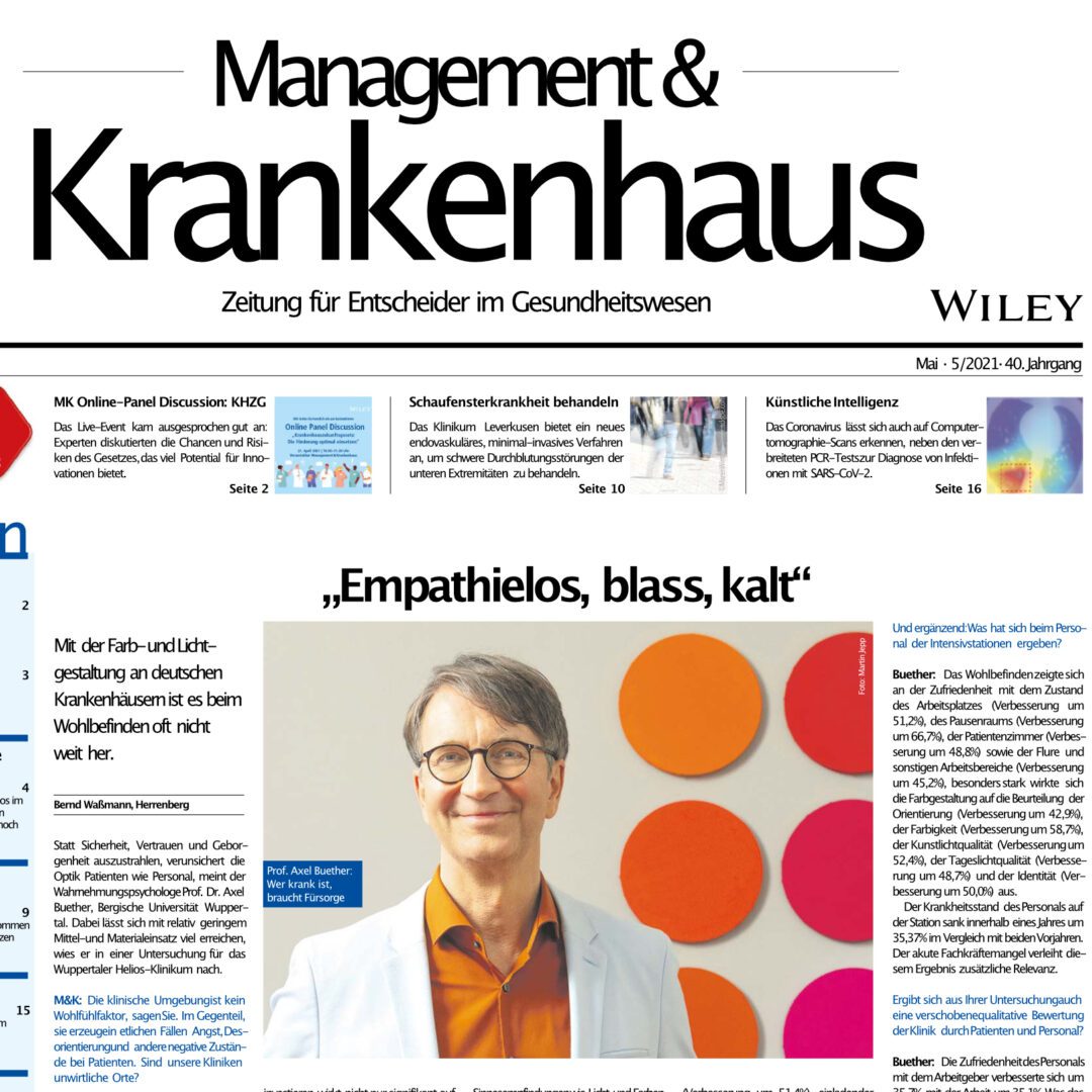
The color and lighting design in German hospitals is often not up to scratch when it comes to well-being.
Instead of radiating safety, trust and security, the visual appearance unsettles both patients and staff, says perception psychologist Prof. Dr. Axel Buether from the University of Wuppertal. He demonstrated in a study for the Helios Clinic in Wuppertal that a great deal can be achieved with relatively low expenditure of resources and materials.
M&K: The clinical environment is not a feel-good factor, you say. On the contrary, in many cases it causes anxiety, disorientation and other negative states in patients. Are our clinics inhospitable places?
Prof. Axel Buether: The ruling does not apply to all clinics, but to the vast majority. People cannot be isolated from their environment. The appreciation we invest in the color and lighting design of clinical environments not only has a significant effect on the well-being and health of patients, but also on job satisfaction and sickness rates among medical and nursing staff.
The effects of color and lighting design in intensive care units was the subject of a study that you conducted together with Dr. Gabriele Wöbker, the head physician responsible at the Helios Clinic in Wuppertal. Are patients and medical staff really sensitive to color and light?
Buether: Have you ever wondered why we see light and colors? The biological effort required for our color perception is extremely high. Our brain uses around 60% of its neuronal resources to process the information it receives and sends via the color spectrum of light. Sensory perceptions such as light and colors control human experience and behavior, because that is their biological and cultural function. Color is an atmospheric environmental factor that can make us tired, listless and ill or keep us awake, active and healthy.
Let us first ask about the well-being and health situation of the patients …
Buether: We chose the lighting and color scheme of the patient rooms to activate feelings of safety, trust and security. The slight variation in color tones emphasizes the individuality of the patients and at the same time blends harmoniously into the overall composition of the ward. After the redesign, the intensive care unit appeared much nicer (improvement of 56.8%), more stimulating (improvement of 51.4%), more inviting (improvement of 50.0%) and warmer (improvement of 34.6%). The atmosphere in the room seemed significantly quieter to the patients (noise level reduced by 48.6%) and less hectic (quiet level improved by 40.6%). After the color change, the medical and nursing staff were still perceived by patients as just as competent and appreciative during care, but significantly more relaxed (improvement of 35.7%).
If the state of recovery improves significantly, does this also have an impact on the use of medication?
Buether: There were significant changes in the acute neuroleptics (haloperidol, risperidone, chlorprothixene, etc.). In the same period, consumption fell by an average of 30.1 %.
And in addition: What has changed in terms of personnel in the intensive care units?
Buether: Well-being was reflected in satisfaction with the condition of the workplace (improvement of 51.2%), the break room (improvement of 66.7%), the patient rooms (improvement of 48.8%) and the corridors and other work areas (improvement of 45.2%), The color design had a particularly strong effect on the assessment of orientation (improvement of 42.9%), colorfulness (improvement of 58.7%), artificial light quality (improvement of 52.4%), daylight quality (improvement of 48.7%) and identity (improvement of 50.0%).
The sickness rate of staff on the ward fell by 35.37% within one year compared to the two previous years. The acute shortage of skilled workers lends additional relevance to this result.
Does your study also reveal a shift in the qualitative assessment of the clinic by patients and staff?
Buether: Staff satisfaction with their employer improved by 35.7% and with their work by 35.1%. It is easy to imagine what this means for the clinic’s reputation and staff situation based on the results, but we have not collected data on the reassessment of the facility by patients and staff. It is also important to note that the renovation measures that were necessary in the past hardly caused any additional costs compared to the usual expenditure.
In your opinion, is there a gap in research and perception regarding the atmospheric effect of space in healthcare buildings?
Buether: Before us, there were only a few studies on this topic worldwide, most of which only focused on one room. In this project, we redesigned the colors of a total of four intensive care units and examined the effects on patients and staff. We urgently need more research in this area, as this will not only result in significant improvements for patients and staff, but will also save costs.
You speak of a color homeland, i.e. a regionally different color perception. Does this have recognizable consequences for the design?
You can find the full interview on the website of the magazine“Management & Krankenhaus“. Issue 5/2021 is available for download here for a limited time.