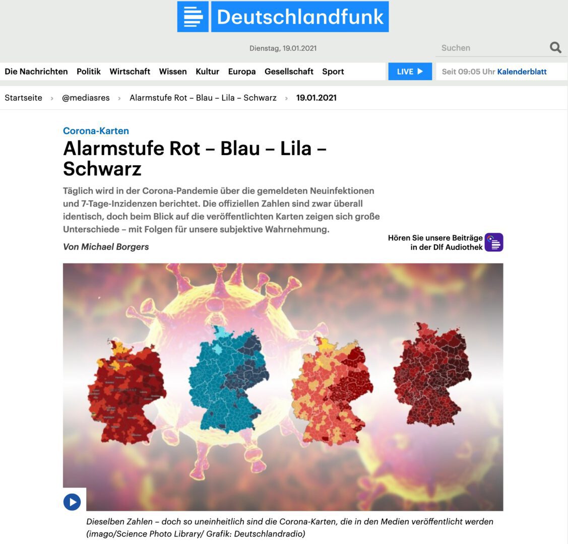
Red, red, red, are all the cards of Germany – this could currently be another verse of the famous children’s song in which the clothes are green. For months now, these maps, i.e. the charts used by the media to provide information about new coronavirus infections per 100,000 inhabitants per week, the so-called incidence rates, have looked red in different shades almost everywhere.
Like the one that viewers of MDR television were able to see at the beginning of December: “When corona started in Saxony in spring, we were in the green zone for a long time. The hotspots were elsewhere. Now, with the second wave, things are different: Within a few weeks, the map has turned an alarming shade of red, and Saxony is considered the hotspot throughout Germany.”
Red becomes the dominant color in the media
Other ARD stations are also dominated by this red, in various shades. The graphics of the Tagesschau look particularly dark, where regions with seven-day incidences above 100 now appear almost black.
Read and listen to the full article by Michael Borgers at Deutschlandfunk


