Color design is a participatory process. The added value of the overall interior design increases the better the color concept is matched to the specific requirements, emotional needs and practical activities of the users. In design, we use the term “customizing” for this, because the added value of personalized, individualized or tailor-made solutions is incomparably higher than with serial standards.

We have to find out who our target group is, how they think and feel, what they want and what they want to do in the rooms. Partiziaption does not mean that the users choose their favorite colors, but that they define how the room atmosphere should affect the people living, working and communicating in it. We adapt our social behavior intuitively and involuntarily to the prevailing environmental factors such as light and color.
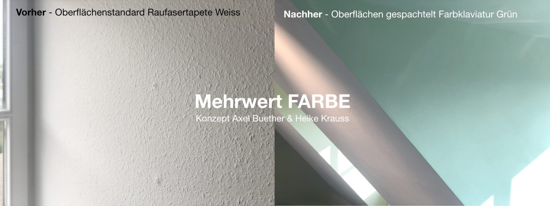
Pure white woodchip wallpaper is now the standard in interior design, which, according to painters’ associations, already accounts for up to 95% of the activity of painting companies in the field of painting work. But take a look at this example to see what happens to the entire room atmosphere when sunlight falls on the soft turquoise of a roughly trowelled wall surface. What was previously cheap suddenly becomes extremely valuable, the standard becomes something special that every user and every guest immediately notices, appreciates and subsequently no longer wants to do without.
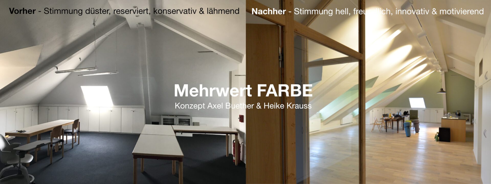
The two basic shades of orange and green are arranged in opposite parts of the building, so they are only in visual contact via the entrance area. They ensure good orientation and give the property an unmistakable identity.

This property is a start-up company in which a creative team is working together to find new ways to transform agriculture in a sustainable, health-oriented and environmentally conscious way. The color concept should create the right atmosphere for this – aesthetic, inviting and natural – but also inspiring, modern and innovative.
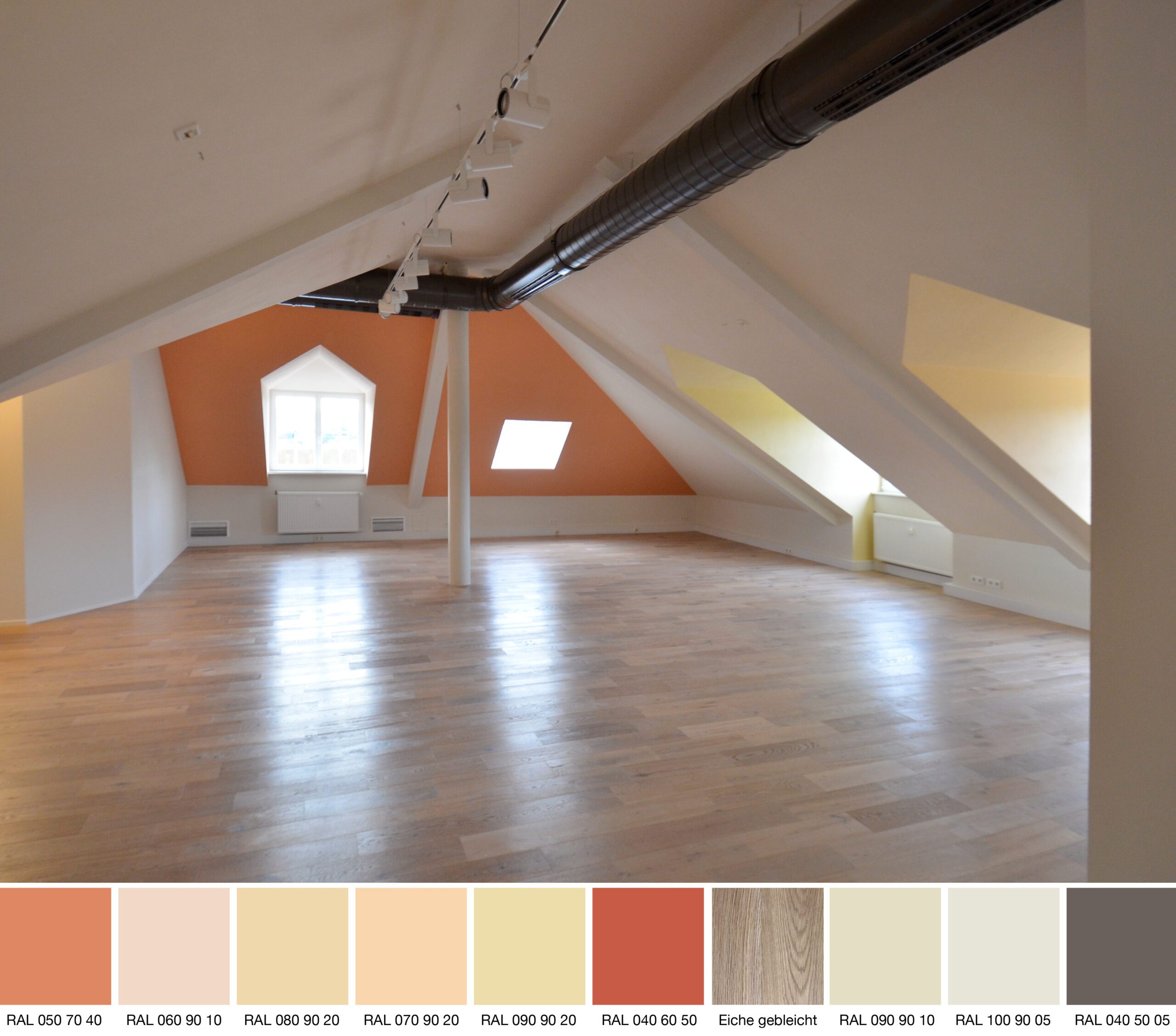
Color compositions usually follow harmonious principles, combining individual tones to create a pleasantly harmonious whole. The decision to use bleached oak parquet established the initial color scheme, which harmonizes with the warm white tone of the pitched roofs as well as the blue-green and orange-yellow color palettes of the gable walls and dormers.
Colorants: Keim mineral paints, RAL Design System color system, Trilux lighting system
Color and lighting concept: Axel Buether & Heike Krauss