Contents:
1. from the phenomenon to the systemic order of colors
2. the most important color registers and color collections in architecture
3. the topicality of Le Corbusier’s color collection “Polychromie Architecturale”
4. the most important color systems in architecture
5. the interaction of light and body colors in architecture
6. criteria for the selection and quality assurance of colors
1. from the phenomenon to the systemic order of colors
Color is a natural phenomenon, created by the refraction, reflection and absorption of light and a genetic factor in the emergence and diversification of life on earth. The entire environment is a color system that ensures the survival of countless species. The production of pigments in the plant world not only serves photosynthesis and thus the growth of organisms, but also provides orientation for insects, birds, mammals, reptiles and amphibians, which are specifically attracted to ensure dispersal and fertilization. Our perception of the beauty of natural colors is therefore based on an intuitive understanding of a system of symbols whose color codes are used by more than 20 million species to communicate. Man constantly transforms and expands this natural order of colors through the color design of his cultural space, whose colorfulness always reflects current social requirements for orientation, deterrence, attraction, camouflage, identity, behavior control and socio-cultural communication.
The pre-modern order of the colors of our villages and cities, buildings, infrastructures, parks, fields and commercial forests creates an intuitive form of orientation in the cultural space, as it clearly delineates functions and possible uses and designates them in a generally understandable way. Until the age of globalization, the colour design of the cultural area was based on natural resources of materials and dyes, resulting in the development of regionally diversified colour cultures. Precious building materials and dyes were often imported for particularly important buildings, which is why they often stand out as landmarks from the canon of regional architectural color. The same system was also used to clearly differentiate between the colors of public and private spaces. Important places and buildings are immediately recognizable, even to strangers, by their striking colors and shapes, thus assuming the function of an intuitive orientation and guidance system. We orient ourselves almost exclusively on the colorfulness of façade surfaces, which appear to us as a spatial composition of bodies against their background. The social order of pre-modern societies is therefore reflected not only in the repertoire of forms and the materiality of public space, but also in the architectural coloration. Color enables differentiation, categorization and identification. The aesthetics of historical architectural coloration follow this function. Due to this outstanding importance for the legibility of historic cityscapes, the color scheme is protected as an authentic component of our architectural heritage and is carefully reconstructed wherever possible.
The practice of systematic descriptions of color tones based on standardized colour samples and standard agreements therefore only developed with the industrialization of modern societies. The discovery of synthetic dyes accelerated the emergence of the chemical industry, which today produces more than 9 million dyes a year. tons of colorant produced. Global chemical companies such as Bayer, Merck, Hoechst and BASF began their development with patents on synthetically produced dyes that revolutionized the appearance of our living spaces and consumer goods worldwide. The quality of the new dyes had to meet international industry standards, which forced the development of scientifically based color systems. On behalf of the Deutscher Werkbund, Nobel Prize winner Wilhelm Ostwald was already researching a color system for practical use in architecture, crafts and industry in 1914. The “Ostwald double cone” named after him is still the basis of many color systems today.
2. the most important color registers and color collections in architecture
The industrialization of all areas of our lives demands globally binding colour standards to ensure consistent surface qualities for the planning and production of architecture and everyday objects. For this reason, the development of standardized colour collections began at the start of the 20th century, such as the RAL colour catalog created by the Reichsausschuss für Lieferbedingungen (RAL) in 1927. In today’s practice, color registers and color collections that are freely available or can be purchased for a nominal fee facilitate communication between manufacturers and customers. They consist of standardized reference color samples that enable legally binding agreements between customers and manufacturers. The manufacturer can produce the samples in the form of material samples, which gives the customer a realistic impression of the color effect, as influencing factors such as surface structure, color depth or gloss level can be included in the evaluation. Other manufacturers provide color registers or color collections of printed or coated papers whose color shades are designated according to an industry standard.
The most important color collection for the field of architecture is still the “RAL Classic”, which was introduced in 1927 and today contains 213 standardized colors that can be reproduced in large parts of the industry. When selecting new shades, the emphasis is on timelessness, which is why current shades such as trend colors can be found more easily in the “RAL Effect” color catalog, which contains 490 solid and 70 metallic shades. Anyone looking for plastic samples will find
“RAL Plastics”, a color collection that makes 100 of the most frequently requested colors available. In addition, the RAL Academy, in cooperation with the German Color Center and the House of Color Zurich, has been offering regular training courses for color design in architecture and trade since 2015.
The world’s most important color collection for the print sector is the “Pantone Color Matching System”, whose 1755 spot colors significantly expand the CMYK print color space. Due to increasing demand from architects, craftsmen and private customers, specialist paint retailers are now also increasingly stocking mixing units that can be used to produce Pantone shades to customer specifications. The most important Pantone color collections are standard in all Adobe programs, while print shops worldwide have access to original Pantone printing colors. This ensures security and diversity in the selection and realization of print products that can be used in many countries around the world with the same color reliability. A variety of color collections can be purchased in the form of color fans, books or ring binder pages that contain pastel, metallic and neon colors in addition to coated and uncoated papers. Most products are updated annually, which should be taken into account when making cost-intensive purchases. The product range of the Pantone color collections is no longer only aimed at graphic designers, but increasingly also at product designers and, with severe restrictions, also at interior designers. The use of Pantone color collections for cotton, nylon and plastics helps in the selection of textile colors for interior design. However, the products are only suitable for determining wall paints and product colors to a limited extent, as the color codes usually have to be converted into more common standards such as RAL or NCS. The sale of all products is supported by the publication of trend information and an international consulting and training network. Alternatively, the “HKS color fans” and color books that are widely used in Europe can be used, which, like the Pantone color collections, are standard in all Adobe programs, but are relatively inexpensive to purchase.
3. the topicality of Le Corbusier’s color collection “Polychromie Architecturale”
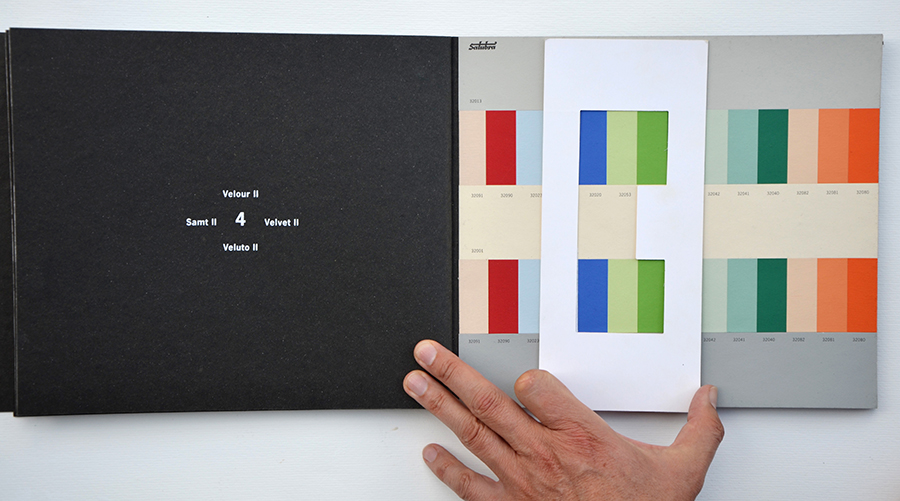
Le Corbusier recognized the power of color for modern architecture when he stated: “Colour in architecture is as powerful a means as the ground plan and the section. Or rather: polychromy, a component of the ground plan and the section itself.” Artur Rüegg’s newly compiled and highly successful “Polychromie Architecturale” not only documents an impressive collection of “Le Corbusier colors”, but also the theory and system for their application in architecture.
Le Corbusier’s theoretical approach is based on the form of abstract painting he practiced himself, in which he no longer used colors in a naturalistic way, but as a field of experimentation for human perception. It was clear to him that color itself expresses a message that is perceived and causes reactions, such as the purist revolutionary lime white in the middle of bourgeois quarters or the modernization of traditional interior concepts through free compositions of colour fields. For him, colors are a tool for the tectonic shaping of space, which is thus formed for the perceiving viewer, structured according to harmonious principles and brought into the work through the materialization of the three-dimensional composition.
In his color collection, he compiles a repertoire of white tones and colored grays, sandy and ochre-colored natural tones as well as strong chromatic colors. The color collections, which he describes as harmonious color keyboards, are each assigned to a theme such as “space, sky, velvet, wall, sand, landscape or colorful spots”. Each color keyboard is made up of three large color fields that form the background or environment for two melodic overtone series, each consisting of 14 small color fields. Users can develop their own color compositions from the repertoire of basic tones and overtones without creating formal errors or discords. It was important to Le Corbusier that the overall composition, which can be chosen with the help of templates or freely, remains harmonious and thematically clear in every arrangement. He realized the application of his system in the Villa La Roche.
The systemically applicable tool was conceived by him for the practice of architects, who generally have no basic training in painting and, due to the complexity of their profession, usually only insufficiently deal with the aesthetic, tectonic and semantic effects of colors in space. The shades of Le Corbusier’s keyboards are now produced and marketed by the Uster (Switzerland) based paint manufacturer kt.Color using largely original pigment formulas, even though the name “Le Corbusier Farben” may no longer be used for copyright reasons.
Image Color collection Polychromie Architecturale by Le Corbusier, photo Axel Buether
4. the most important color systems in architecture
The systematic ordering of colors is based on the three fundamental properties of color perception: hue, brightness and saturation. All color systems are structured in the form of three-dimensional coordinate systems whose axes function according to the polarity or opposition principle. Spheres, cubes, cones or rhombohedrons are used depending on the intended purpose. On the brightness scale, light and dark or black and white are contrasted. On the saturation scale, there is a gray tone and a colored tone opposite each other. The hue scale is very often arranged in the form of a color wheel in which the physiologically determined primary colors yellow and blue as well as red and green complement each other. Complementarity means that two color tones contrast to the maximum and produce an achromatic shade of grey when mixed. Any number of mixed color tones can be determined on the scales, which are tested by test subjects according to the principle of equal distance and adapted to the sensory spectrum of our visual perception system. In the center of the color wheel is usually a medium achromatic gray that darkens to black, while it lightens to white on the other side. The two most important color systems for architecture, urban planning, design, trade, building authorities and monument preservation are the “RAL Design System (RAL Design)” and the “Natural Colour System (NCS)”. Color readers are available for both systems, which can be used to decode the color designations on real surfaces. In practice, however, a color fan proves to be the more reliable tool, as surface characteristics and signs of aging lead to deviations in the digitization of the color tone found.
The “Natural Color System (NCS)” is based on the “Ostwald double cone” system, which describes a triangular body of rotation. The double cone is made up of triangles of the same color tone, the sides of which are defined by a specified hue as well as black and white. The triangles of the same color tone are made up of individual tones of different color saturation and brightness. each NCS color tone occupies a precisely defined position in the color system and can be clearly located. Color tones can be determined visually or numerically by the user. The designation NCS 1050 – R50B refers to a violet that is in the middle between red and blue (R50B) with a black content of 10% (10) and a color saturation of 50% (50). Numerical gradations can be made in all directions of the NCS color space with a factor of 10. (Image NCS color space) The NCS color space contains 1950 shades, which are available as a color fan, sample card or color atlas.
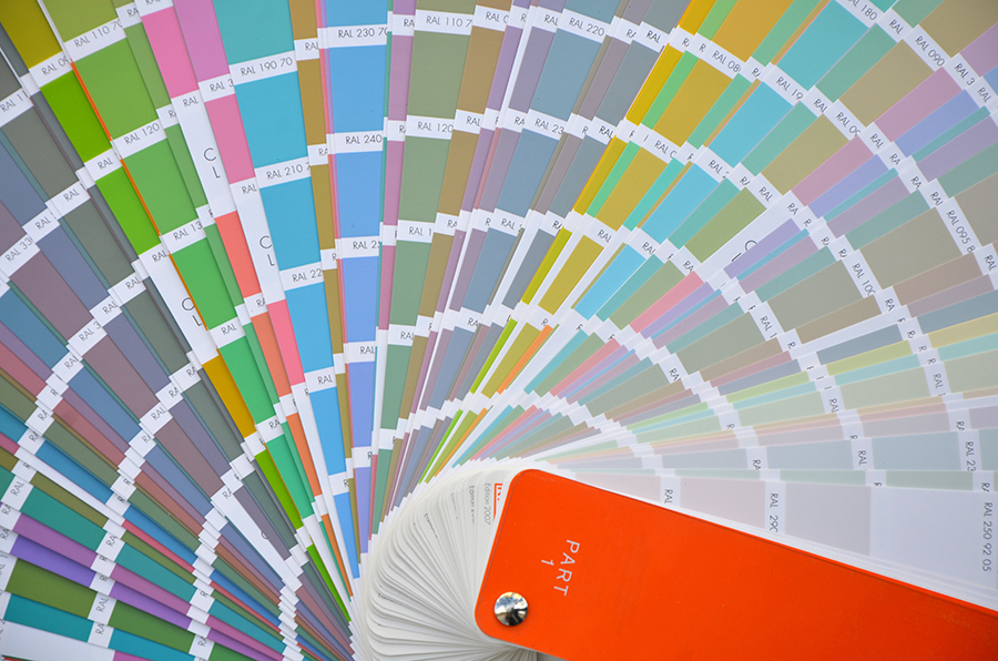
The “RAL Design System” consists of 1625 colorimetrically equally spaced shades, which are arranged according to the CIELab color space. This perceptual color space is the industry standard today and is easy to read for color measurement devices. It enables the continuous calculation of color tones that can be converted into other color spaces such as RGB, CMYK or HSB. Each hue has a unique identifier from which the basic hue (color circle 0-360°), the CIELAB brightness (scale 0-100 between black and white) and the saturation or chroma can be read. RAL 190 30 90 is a dark blue-green with a low lightness of 30 and a high saturation of 90. RAL Design is available as a color fan, sample card or color atlas.
For reasons of practicability, all color systems refrain from recording many qualitative properties of color such as luminosity, intensity, transparency, purity, gloss, dullness, texture or color depth, which limits their informative value for architectural practice. Surface effects, signs of ageing, proportions, neighborhood influences, irregularities or physical factors such as reflection, transmission and absorption of light cannot be recorded with this method. This reveals the application possibilities and limitations that color systems have for architectural practice.
Image RAL Design System, photo Axel Buether
5. the interaction of light and body colors in architecture
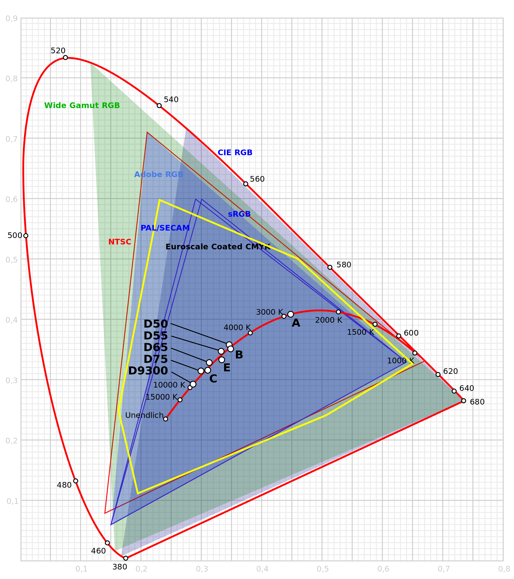
The mathematical definition and measurement of the technically usable color space led in 1931 to the definition of the “CIE standard valence system” (CIE International Commission on Illumination), which is still valid today in a modified form. Colorimetricians measure the perceptible color space by generalizing the sensations of color stimuli and defining them using colorimetric numbers. They speak of color valences, which characterize the average effect of a defined light source on a reference group. Today, color valences are measured with reference to the “CIE standard color chart”, which shows the different sensitivity of our visual perception system to spectral wavelength ranges. The blue-violet areas at the lower edge of the perceptible light spectrum (from 380 nanometers) are just as narrow as the red-orange areas at the upper edge (700 nm). The middle green range, on the other hand, comprises 90% of all perceptible color tones, if the green-yellow and blue-green ranges are added. The technically defined color spaces such as the “CMYK print color space” or the “RGB light color space” are inscribed in this mathematically defined color space, which determines the limits of our color perception.
The “CIE standard color chart” creates the basis for “color management”, which ensures the “true color” flow of information between input and output devices such as scanners, cameras, monitors and printers. Since all other technically usable color spaces are based on this, definitions and conversions between light and body colors are now possible without any problems. This globally valid, generally binding technical standard creates the prerequisite for checking the color representation of projectors, monitors, displays, lights and illuminants as well as the color accuracy of printed products, textiles and other consumer goods. There are no formulas for converting RGB and CMYK values to color collections such as RAL, HKS or Pantone, but there are tables that are freely available online.
The mathematically defined CIE color space is of great importance for architecture, as it serves as the basis for determining the “light color” and thus the “atmosphere” of rooms. We use the “color temperature” and the “color rendering index” to measure the atmospheric qualities of light sources. We always use the spectrum of sunlight as a reference, which gives all surfaces their usual body color. The color constancy of our visual system is responsible for the fact that we only perceive the diverse changes in all light and surface colors during the day if we observe them specifically. Without this power of our perceptual system, we would never be able to clearly determine body colors. Over the course of the day and seasons, sunlight often changes between the warm white range, which extends up to 3,300 Kelvin, and the cool white range, which runs from 5,000 – 16,000 Kelvin. Cool white daylight between 5,000 and 6,000 Kelvin characterizes the morning hours. It activates the human organism, creates a good working atmosphere and increases our alertness and motivation. The daylight white of fluorescent lamps and LED light sources offer approximations. Warm white light, on the other hand, characterizes the evening hours. The low color temperatures create atmospheres of calm and relaxation. We perceive color temperatures of approx. 1,500 K, which are reached by candlelight and open fire, as reddish warm and very cozy. The light from incandescent lamps and halogen lamps is somewhat higher in the warm white range at around 2,700 K and therefore has a slightly yellowish and pleasantly natural effect, especially because it also achieves good values in the “color rendering index”.
The color rendering index indicates the extent to which a light source changes the surface colors of its surroundings. Energy-efficient light sources often only emit parts of the visible light spectrum, which is why missing color components such as red cannot be reproduced. In the test procedure, the changes in 14 test colors are measured against the spectrum of sunlight. LED light sources achieve an average color rendering index of approx. 80%, while fluorescent lamps only achieve approx. 50% and thus cause strong changes in the body colors of people, rooms and objects. Many color ranges are no longer perceived or are completely distorted. The energy-inefficient incandescent lamp, on the other hand, achieves up to 100% and thus the closest approximation to the color spectrum of sunlight that can be achieved by conventional technical means. This is why color matching in the industry is carried out under standard light in special light booths. Where possible, samples of the colors of facades and interiors should be taken under daylight conditions at midday or under realistic artificial lighting conditions. Lighting parameters such as illuminance, color temperature and the color rendering index should be defined in order to rule out subsequent deviations in the sampled color tones.
Image: Color temperature (black-body curve), standard lighting, RGB and CMYK color spaces in the CIE standard color chart
7. criteria for the selection and quality assurance of colors
The aesthetic effect of architectural color is determined by the interaction of material color and the influence of light in the built space. The aesthetic effect of the color changes with the angle of the sun to the component, with the season, the time of day and the weather. Paintings and color prints on unstructured paper or representations on computer monitors are only meaningful if planners and designers know all the influencing factors and can assess their spatial effects. Ultimately, only sample surfaces that are inspected under real conditions at the place of use are binding in terms of color. But even here there is still a high planning risk, as for reasons of economy and practicality only a few variants can be sampled, which are determined on the basis of color systems and color collections. Controlling the aesthetic effects of color in space is only possible to a limited extent, even on large sample surfaces, as color tones influence each other (simultaneous contrast) and change with their extent and position in the visual field. The entire material aesthetic also changes with the viewer’s position in the room, which can never be captured in computer simulations. If all influencing factors of built spaces are taken into account, the informative value of color samples is considerably reduced.
Although our perception of color allows us to distinguish between many millions of shades, in architectural practice the palette is reduced to the building materials and paints available on the market. Since every building material has a color, color decisions in the planning process and on the building site are unavoidable. For the aesthetic assessment and selection of the color of building materials, most manufacturers provide color samples that can be pre-selected during a consultation, in the catalog or on the website. As a rule, the color collection is determined by the manufacturer before the production process, which is based on demand and current trends. To get an overview, planners and contractors should therefore take a look at the color collections of several manufacturers before deciding on a building material or product. Aesthetic orientation is provided by reference projects, the colorfulness of which should be assessed not only on the basis of illustrations but also, if possible, on the actual object. Building inspections can also be used to check color tones and color compositions of building materials and products that have been manufactured according to customer requirements (customizing) and are not available as samples. Reference objects are the most reliable basis for assessing the diverse effects of architectural color.
Image Sampling of color tones for the Marrahaus Heilbronn on a scale of 1:1 to check the contrast effects, light and shadow effects and visual perspectives, photo Axel Buether
If the promises of manufacturers and distributors are to be believed, all available color shades should be available for paints such as lacquers, emulsion paints, silicate and lime paints. However, the free choice of paint colors is impossible for technical and economic reasons. Paints consist not only of pigments, but also to a large extent of fillers, binders and solvents. The quality of the components determines the range of colors that can be produced, their effect and durability. The quality of ingredients has its market price, which is why the cost of commercially available paints varies greatly. If you request the color shade according to a common color system when ordering or in the tender text as usual, you will usually receive an inexpensive paint with a very low color depth, brilliance and durability for reasons of economy. Manufacturers have adapted to the demand for low-cost products and therefore usually only offer their higher quality paints on request.
Attention: The selection of the color tone according to color systems such as RAL or NCS makes binding statements about the hue, saturation and brightness of the paper sample! It is not possible to determine how the color tone actually affects the surface of the material in the room. The gloss level of the color tone is part of determining the perceptual quality of a coating, as powdery, matt or high-gloss surfaces reflect ambient light extremely differently. In addition, statements must be made about transparency, as thin glazes allow the material color of the surface to show through, while multi-layer glazes achieve a greater depth of color. Sunlight changes most paints to a great extent in a few months and years, which is why the light resistance of paints must be taken into account. To ensure the quality of surface paints, it is important to select and prepare a suitable substrate and to use processing techniques appropriate to the material. When tendering for painting and decorating work, therefore, only specialist companies should be used that have sufficiently qualified personnel and can provide competent advice to planners and building owners. Slightly higher costs for the quality of the paint and the workmanship pay for themselves after a short time, as the appearance is of a much higher quality and lasts much longer. With some paints, such as mineral paints, ageing processes that only occur after a very long time can also have a very attractive effect. Mineral pigments consist of mixtures of complementary-colored crystals that are barely visible to the naked eye. Nevertheless, a unique depth of color and brilliance can be perceived, as the countless crystal bodies are penetrated by light and allow the surface structure to glow from within after multiple reflections. The centuries-old lightfast quality of high-quality mineral pigments cannot be achieved with commercially available synthetic dyes.
If you want to achieve bright, long-lasting white tones, deep, shimmering blacks or mysteriously colored grays that won’t look dirty, yellowed or faded even after years of use, there’s no getting around high-quality paints. For this reason, high-quality paints should always be used for architectural paintwork, as small additional investments in paints pay for themselves in various ways over the service life of buildings. High-quality paints not only look better, they are also more resistant to light and age better. Mineral paints can last for hundreds of years and develop a natural-looking patina if they are applied professionally to suitable plaster substrates!
6. criteria for the successful use of color in construction:
1. development of a color concept taking into account the aesthetic, semantic and technical functions of colors in the context of the application situation at the place of use
2. binding determination of all color tones used on the basis of a color system or a color collection under real lighting conditions at the place of use
3. definition of further quality criteria such as light resistance, ageing resistance, gloss level, mattness, transparency, opacity, surface structure and texturing, effects (metallic effect, glimmer effect, mother-of-pearl effect, diamond effect, neon effect, etc.)
4. binding determination of all materials or coating agents, the composition and preparation of the substrate as well as the processing techniques used, taking into account applicable standards
5. sampling
- Creation of large sample areas of approx. 1 square meter at the correct angle to the light source
- Testing in daylight at lunchtime
- Use of the planned artificial light sources
- Observe the size contrast: the effect of each color surface changes with its size in the field of view
- Composition: The effect of all color surfaces changes with the proportion of all parts to the whole Facial impression
- Simultaneous contrast: The effect of a color surface is changed by color tones in the immediate vicinity and further surroundings (physiological effect of contrast enhancement)
- Successive contrast: The effect of a color surface changes due to changes caused by changes in light or movements of the viewer (physiological effect of complementary afterimages)
6. quality monitoring during the manufacturing process and quality control during acceptance as well as archiving of information on the color and product (product data sheets, photo documentation, etc.)

