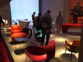
Color in the design process
The right degree of color design, which is always a color coding, must always be renegotiated in the design process in the context of the application situation and task, so that orientation is maintained, remains or is improved. Physical, chemical, neurobiological, psychological, philosophical, semiotic, cultural-historical, sociological and practical findings can provide assistance. Nevertheless, there is no calculation method, description model or planning procedure that can fully capture the multi-layered effects of color in space. Color becomes a design tool when designers, planners and decision-makers move away from conventional assessments such as “beautiful” and “ugly” and instead focus on the communicative functions of color perception and color design.
The function of colors
Colors characterize the climatically and topographically differentiated appearance of the natural area. They enable diverse ways of life, species-specific forms of orientation and communication, they form identity. These biological functions not only characterize the natural space, but also the aesthetics of the cultural space, which brings the forms of human visual communication to life. The expressive and communicative potential of color unfolds with the cultural development of individuals and societies, finding expression in all expressions of life, in words, images, objects, spaces and performances. Color is the most important design tool for the aesthetic design of the environment, as the abstract linear structures of the planning phase are concretized in the atmospheric and material appearance of built spaces. The entire material culture is designed according to the biological principles of visual perception, as people must be able to see the purpose of the artifacts so that they can orient themselves, use them or protect themselves from them.
Colors provide orientation
An indispensable function of color is orientation, since the spatial resolution of all material structures increases exponentially with every differentiable nuance of brightness and every perceptible hue. This principle can be seen in the pixel assignments of a digital image. Entire image planes disappear or appear, shift or enter into new relationships when color and brightness are manipulated. The separation of the color spectrum into chromatic and achromatic colors follows the way the visual system works, which processes the chromaticity and brightness of light and body colors separately. By practicing color perception, the achromatic components of a hue can be identified and assigned to a shade of gray in the spectrum between black and white. The colorful parts can also be assigned to pure colors or color mixtures, whose systematics reflect the processing of visual signals in the brain. By reducing the spectrum to achromatic colors, the perception of the environment shifts, as some levels of information such as light and shadow become more prominent, while others disappear completely. By dispensing with bright colors, the perception of the edges and volumes of buildings and objects increases to the extent that the surface loses significance. Lengths, widths, depths, proportions and joins are brought to the forefront of perception by emphasizing the boundary lines. Information about the time of day, mood, atmosphere, materiality and haptics lose their significance through the abstraction process of colorfulness and become background. Color, which in this way loses its meaning and is used only as a filler for linear structures, easily becomes decoration. The degree of colorfulness shifts the focus of object and spatial perception, which is why colors should always be used for a specific purpose in the design process of architecture and design. Too many colors, or more precisely: color-coded information, can be just as disorienting as too few. Color design is visual communication.
Colors form identity
With the design of the cultural space, the human species clearly distinguishes itself from the appearance of the natural space. The colorfulness of cities, buildings, interiors, everyday objects and works of art heralds new functions that characterize the coexistence of modern societies. Through the cultural evolution of mankind, many requirements for the color coding of the environment have changed. The taste and nutritional value of food, the shape and feel of surfaces, the atmosphere and comfort of living spaces are still assessed on the basis of their color-coded appearance. Added to this are the culturally coded surface colors of countless products, packaging, accessories, interiors and facades, which have significantly changed the evolutionary mechanisms of perception and orientation to this day. Until the formation of modern societies, the colorful design of the cultural space was largely based on the use and application of regional resources and technologies. Imports of building materials, materials and dyes were extremely expensive and could only be used for important building projects, products and works of art. The colorfulness of the historically evolved cultural space reflects economic processes and serves the biological purpose of representation, which controls social behavior within a species. Color and shape codes enable the social differentiation of public and private, poverty and wealth, religiosity and profanity, rurality and urbanity. In the course of cultural history, a regionally differentiated, global color coding system has developed through which we perceive, shape and communicate the identity of individuals and societies. Industrialization brought about a profound change in production, transport and communication conditions. The global use of modern building materials and technologies is standardizing the appearance of all the world’s urban areas, revealing great differences between poverty and wealth, while cultural characteristics are disappearing. The resulting loss of identity calls for a reorientation that poses major challenges for creative planning professions and political decision-makers and demands responsible action.
Colors create space and attract attention
Eye tracking demonstrates the necessity of composing all the significant individual elements in the visual field into a comprehensibly perceivable whole. Since only two degrees of the field of vision can be fixed and consciously seen, the entire rest forms the background of the perceptual situation at that moment. This is not only atmospherically significant, but also guides the gaze to the next significant target in the field of vision. Often there is no fixation of the elements, for which a dwell time of about one second is necessary, but rather only a sweeping glance, which is why many elements are not consciously perceived, although they are evaluated by implicit memory. Peripheral perception is sufficient to recognize important interior and exterior spatial reference elements such as the sky, topography, forests or buildings or walls, ceilings, floors, doors or movement corridors. Individual shapes merge to form larger shape contexts if there is insufficient color differentiation, as the peripheral regions of the retina hardly recognize any details. For this reason, people can find their way through natural and urban spaces without recognizing or remembering many elements. Color can bring things to the forefront of perception or leave them in the background. It therefore has a decisive influence on the culture of memory or visual education, on all visually coded information that people remember about images, objects and spaces. Color generates attention and interest in the perceptual situation, an effect that can be heightened to the point of fascination. Those who are inspired by the colors of the natural or cultural space and pause in front of it in amazement perceive the associated places, content and events more intensively, coherently and in greater detail and also remember them more lastingly.
Color language in the cultural area
The cultural evolutionary process of color perception and color language can be seen in the aesthetics and function of our media and communication technologies. Images, objects, built spaces and performances as well as the technological developments in the information, learning, planning, navigation and communication systems of modern societies illustrate the qualitative leap in the processing of color codes in the brain. The aesthetics of the socio-culturally designed environment serve to communicate thoughts, feelings and possibilities for action. The term beauty, on the other hand, expresses our value judgment, which is shaped by rational and emotional as well as social and individual factors. The appearance of settlement areas, buildings and infrastructures vividly reflects the function of society, which represents a decisive contribution to the cultural evolution of the human species. For visual perception, the cultural space functions like a “vivid memory store”, whose formal structures and content-related meanings guarantee a transfer of knowledge across generations. Urban spaces are inexhaustible learning spaces. Cultivating the language of color through the color codes of clothing, products, interiors, buildings and cities creates identity and provides orientation in an increasingly complex world. Through the conventional use of colour codes, age, gender, cultural affiliation, socialization of people as well as epoch, district formation and regionalization of places can be read from the appearance. Readability and the interpretation of content and function are made more difficult, distorted or prevented if the color design focuses solely on formal effects. The inherent color of materials as well as the colors of coatings and claddings refer to the material substance, the manufacturing process and the intended use. The aesthetics of a color design therefore primarily serve to create spatial orientation, to identify the content and purpose of an object, to create identity and to enable representation.
Color as a design tool
Parallel to the development of modernism, a separation of the design profession into a planning-conceptual and a craft-executing part has become established, which is problematic for many reasons. As a result, few architects and designers today can rely on their own experience of craftsmanship in their design work, which is essential for the visual design of material culture. However, color only becomes a modern design tool when planners have comprehensive theoretical knowledge that they can apply against the background of their own practical experience. As a medium of visual design, color formed an integral part of visual communication alongside form and writing. To date, this semiotically based field of knowledge has only become established in the area of visual design of image media, from which numerous practical applications benefit. Professional image producers from the fields of graphics, illustration, print, internet and film know the formal and content-related effects of colors and can use them in a targeted and efficient way to convey messages on the basis of practical application knowledge. In architecture and urban planning, on the other hand, education in the field of technology was made more scientific, which is why the canon of subjects still focuses primarily on engineering topics. Consequently, the communicative aspects of the built space are currently often pushed into the background. As a rule, planners do not use color and light strategically to vividly convey the meaning and functional characteristics of built spaces, as they lack knowledge and experience due to gaps in the curriculum of many educational institutions. Like the technological effects, the multi-layered communicative effects of color must be considered throughout the entire design, planning and implementation process. To achieve this, color must first of all experience a holistic perception of its function as a line-, surface-, body- and space-forming element, as an emotionalizing communication medium, as an identification-forming orientation system, as a visual-haptic surface quality as well as an atmospheric light quality. The communication science, cultural history, natural science, technology, aesthetics and practical application of color should therefore be dealt with in all educational institutions of crafts, technology, design, art and architecture. No one can avoid dealing with color, because Paul Watzlawick’s axiom also applies to the medium of visual design and communication: you cannot not design in color.
Remark:
This text contains excerpts from my article “Die Funktion der Farbe – Einführung in die Farbtheorie und Begriffsklärung”, in Axel Buether, FARBE, DETAIL PRAXIS 2014
Further information on the topic of color perception and communication in: Axel Buether: The formation of spatial-visual competence. Neurobiological foundations for the methodical promotion of vivid perception, imagination and representation in the design and communication process, Series No. 23 Burg Giebichenstein Halle 2010
Link to the luxlumina magazine
Link to column 15 2016 Color, light and atmosphere
[download id=”46″]


